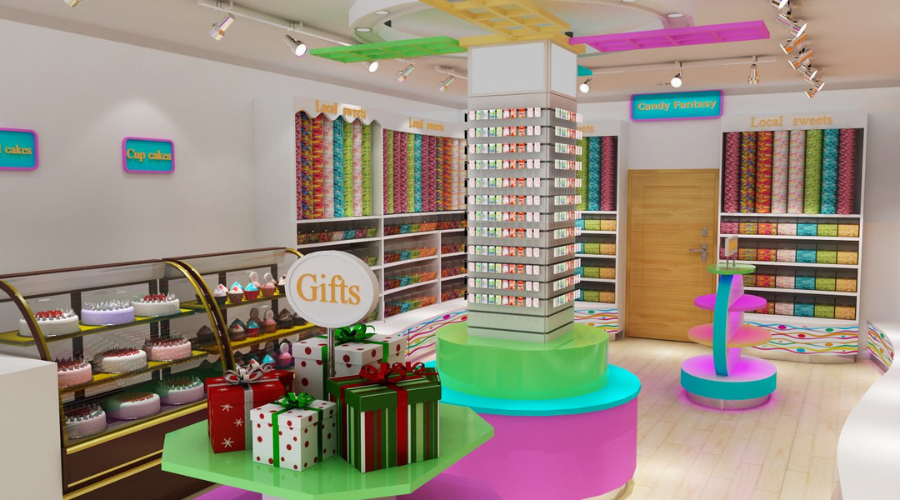

One of the main design theories, known as the “visual hierarchy”, concerns how elements are organised to create an impression of value. It changes the way the human eye perceives information in terms of order.
Designers guide the viewer’s gaze by creating a hierarchy that indicates where to look first, where to look next and where to look last. This is crucial in any design work, including visual merchandising, window advertising, websites and posters.
This article provides useful tips and real examples for creating functional and aesthetically pleasing layouts. Those working in graphic design, digital marketing and other areas of visual communication will find it very useful to increase the impact and clarity of their work.
The basis of the visual hierarchy
A variety of design features can be used to create a visual hierarchy, including size, colour, contrast, alignment, repetition, proximity, white space, texture and style.
The basic concepts of visual hierarchy are:
- Scale and size: Larger elements will attract more attention. They should be used to convey the most important information. For example, the band name is usually the largest text element in a music concert promotional poster.
- Colour and contrast: The eye is drawn to bright or brilliant colours. A call-to-action button in a bold colour will be easy to spot on a website.
- Alignment and proximity: objects that are parallel to each other appear connected. For clarity, for example, in a menu, items should be grouped together.
- White space: White space can be used to emphasise certain features and create a sense of harmony.
Using the right design elements such as size, colour, alignment and white space can help you create a visually appealing and eye-catching composition.
Visual hierarchy used in advertising
As display advertising is usually only casually viewed by consumers, the aim is often to convey the message in a concise and effective way.
This is how the visual hierarchy works:
- Headline: The headline, which conveys the main message, is usually the largest and most visible part.
- Images: Relevant, high-quality images can immediately grab attention and convey the message faster than text.
- Call to action (CTA): The call to action should include a clear, prominent, stand-out CTA such as ‘Buy now’ or ‘Learn more’.
- Brand logo: The logo should not overshadow the main message, even if it is very important for brand awareness. For this reason, it is usually smaller and placed in a less prominent advertising position.
For example, an advertising headline introducing a new product can be the largest element of a display ad. This would be followed by an eye-catching product image, a smaller sub-headline with additional information and a CTA button in bold colour.
Visual hierarchy in visual merchandising
In visual merchandising, whether it’s a store layout or a window display, visual hierarchy helps guide the customer’s journey.
- Window displays: The most eye-catching item, often the latest or most unique product, should be the focal point. This attracts customers. The other components should be listed in descending order of importance.
- Store layout: Products that are most important to customers should be placed at eye level and in the most accessible route.
- Signage: Smaller signage for individual items or lower priority items, larger signage for departments or high priority items.
For example, a clothing company may display the latest season’s assortment at the top of its window. Best-selling or high-margin items may be displayed at eye level inside the store, while sale items may be at the back of the store.

The structure of images in user experience (UX)
Visual hierarchy is a key aspect of user experience (UX) design. Good UX design relies heavily on visual hierarchy to be able to guide customers through the information flow and ensure a smooth and natural interaction with the product.
Eases navigation
A well thought-out visual hierarchy can make navigation easier. Users should be able to easily determine where to click next or where to look for certain content when reading a web page.
This can be done by creating a hierarchy that improves the flow of information on the page and directs the user’s gaze in the right directions. For example, web pages display the main content first, followed by the main navigation menu, the logo and the footer.
Improving readability
Readability is a fundamental part of user experience, and visual hierarchy contributes significantly to it. With the right use of typography—size, typeface, color, line spacing, etc.—important content can be highlighted.
It makes it easier for users to scan through the text and find the information they need. The typographical hierarchy, designed to promote readability, includes headings, subheadings, paragraphs and captions.
User behaviour management
The visual hierarchy of design also influences user interaction. Links and buttons that prompt users to perform actions (CTAs) should be clearly visible. This way, users understand where to click to perform specific tasks. For example, to draw users’ attention to the sign-in button, it can be placed larger and coloured better.
Improving the content structure
A well-designed visual hierarchy gives content an organisational structure by breaking it down into clear sections and arranging them in a logical sequence. This could include grouping related content and identifying individual sections using grids, spacing and alignment.
Reducing mental burden
A high visual hierarchy reduces the cognitive load of users. Instead of presenting a lot of information at once, designers can use visual hierarchy to convey information in order of importance. This makes the user interface easier to use and less intimidating.

UX design examples
The Google search results page is a great example of an effective visual hierarchy for UX design. The search bar stands out the most. The search results appear next, which are further organised with the URL in a smaller style and the page title in a larger style.
Less contrasting colours should be used, advertisements and other irrelevant data should be placed in the margin. Overall, the visual hierarchy greatly improves the user experience.
Designers can create interfaces that are not only aesthetically pleasing. But also successfully help users achieve their goals by carefully arranging and emphasising specific functions.
Visual hierarchy – fundamental principle in design
Visual hierarchy is a fundamental principle in design that plays a crucial role in how effectively we communicate our messages. That way you can draw the audience’s attention to the most important elements first. It ensures that the intended message delivers appropriately.
When choosing what to display in an online shop, what product to place online or what message to emphasise in an advertisement, the visual merchandising will be crucial. Mastering it will, therefore, help any designer or marketer to become more successful in their work.
If you found this article helpful, you might want to check out this blog – Key Principles for Eye-Catching Design. There you will find more information about the importance of visuals and the principles that makes furniture eye-catching.


