TVs displays

TVs Displays for Advertising Screens

In an age where digital advertising has taken center stage, TVs displays as advertising screens have become a powerful tool for businesses. So they offer a dynamic and engaging way to showcase products and services, especially in public places and high-traffic dining establishments.

Understanding the shift towards more interactive and visually appealing advertising methods. In this article provides an in-depth insight into the features needed to use TVs displays as practical advertising tools.

We will look at the best TV models that excel in this role, each with unique features to suit different advertising needs. And in addition, we’ll delve into the latest trends in promotional displays, offering insights that resonate with tech-savvy audience.

Functionality requirements for advertising TVs displays

When choosing a TV set for advertising purposes, consider the following essential features:

High brightness and contrast: Screens should be bright enough to be visible in various lighting conditions. A high contrast ratio ensures content stands out, making it more visible to the audience.

Durability and reliability: These TVs displays often run for extended periods, sometimes 24 hours a day, seven days a week. But they must, therefore, be designed to withstand continuous use without compromising performance.

Connectivity: Modern promotional TVs should have multiple connectivity options, including HDMI, USB, and Wi-Fi, allowing easy content updating and integration with different content management systems.

Flexible display options: So businesses should look for TVs with flexible display settings such as portrait or landscape orientation, split-screen options, and customizable layouts to suit different content types and spaces.

Remote management: TVs with remote management capabilities allow businesses to update and control content from a central location, improving operational efficiency.

Understanding these key features will help you choose a TV that displays your content and enhances its impact on your audience.

Top TVs displays models for advertising screens

Here’s a closer look at some of the best TV digital display menu models for advertising, for example:

Samsung QLED series: These TVs feature Quantum Dot technology for outstanding color accuracy and high brightness levels. They are ideal for bright, intensely lit rooms to attract attention in well-lit environments.

LG OLED series: LG OLED TVs are renowned for their deep blacks and infinite contrast, ensuring that content stands out even in dark environments. Wide viewing angles make them suitable for spaces where viewers are spread out.

Sony Bravia LED Series TVs: With Sony’s reputation for reliability and outstanding picture quality, their Bravia LED Series is the perfect choice for long-lasting use in public spaces. Their X-Reality PRO enhances every pixel to ensure clarity.

TCL Roku TV: TCL Roku TVs offer an outstanding balance between quality and affordability for businesses on a budget. Thanks to the integrated Roku platform, content management is simple and user-friendly.

Each model offers unique benefits, allowing businesses to choose based on their specific advertising objectives and budget constraints.

Trending in advertising TVs displays

Interactive and intelligent features are at the forefront of advertising display trends 2024. Here are some highlights:

Touchscreen capabilities: Touchscreen TVs displays are becoming more common, enabling interactive ads where customers can engage directly with the content.

Motion sensors and facial recognition: These features allow the display to change content based on audience engagement or demographics. Providing a more personalized advertising experience.

AI-driven content management: AI algorithms can analyze customer data and automatically adjust advertising content to target specific audiences. Increasing the effectiveness of marketing campaigns.

Incorporating these trends can create more engaging and impactful advertising experiences. Allowing companies to stay at the forefront of digital marketing innovation.

Stepping into a new era of digital advertising

However, with the development of digital display technology. It is becoming essential for companies to choose the correct TV set for their advertising. But from the high-end Samsung QLED to the budget-friendly TCL Roku TV. Each model offers unique features to suit different advertising needs.

So using these technologies raises the profile of your products and services and engages customers in new and exciting ways. For more comprehensive guidance on choosing technology. Visit our detailed guide on choosing a PC, and for caterers, check out the innovative menu options of digital displays.

Stay informed and updated with displayhype.com is your trusted source for the latest technology, computers, and phones.

Please check out these articles too:

Maximizing the Effectiveness of Outdoor Menu Display Stands

Immersive Brand Experience with Showroom Display Stands

Financing Advertising Displays

Financing Advertising Displays: A Guide to Loans and Options

This blog focuses on insights and strategies in advertising, merchandising, and brand awareness. Today, we’re taking a break from design trends and marketing strategies to discuss something equally vital – financing advertising displays.

High-quality advertising displays can make a powerful impact on customers but can also be a significant investment. Whether you’re a small business looking for an eye-catching window display or a large corporation planning a nationwide digital billboard campaign, understanding your financing options is essential. 

Let’s explore various loan options, discuss terms, interest rates, and more to find the right solution for your advertising needs.

Traditional bank loans

Traditional bank loans are a familiar option for a lot of businesses. These loans can be tailored to suit the specific needs of an advertising campaign.

Banks offer various business loans. They include secured and unsecured options, with various terms and interest rates. Approval and the specifics of the loan depend on factors like credit history, business profitability, and loan size.

● Interest Rates: Typically, interest rates for bank loans can range from 3% to 10% or more, depending on the loan’s type and duration.

● Loan Terms: The terms can vary from short-term loans (less than one year) to long-term loans extending to 10 years or more.

Example: A local retailer seeking to finance a new storefront display may approach their local bank for a small business loan, securing favorable terms based on their strong relationship and solid business performance.

Small business administration loans

For small businesses, SBA loans can be an attractive option for financing advertising displays.

The Small Business Administration offers various loan programs to help small businesses grow. These loans are often easier to qualify for and provide competitive terms.

● Interest rates: SBA loans offer interest rates typically ranging from 2.25% to 4.75% over the prime rate.

● Loan terms: The terms can range from 5 to 25 years, depending on the SBA program.

Example: A growing boutique looking to invest in a cutting-edge digital display may seek an SBA 7(a) loan, which offers long-term financing with competitive interest rates.

Alternative and online lenders

Online and alternative lenders provide additional financing options in today’s digital age.

Alternative lending platforms often offer a streamlined application process and faster funding. It can be particularly beneficial when financing a time-sensitive advertising campaign.

● Interest rates: In general, online lenders have higher interest rates, ranging from 7% to 30% or more.

● Loan terms: These loans usually have shorter terms, from 3 months to 5 years.

Example: An e-commerce business planning a pop-up display in a high-traffic area might choose an online lender like OnDeck or Kabbage for quick approval and funding.

Financing equipment

If your advertising display involves significant hardware, equipment financing could be an option. Equipment financing allows businesses to take out a loan specifically to purchase the equipment needed for their advertising display. The kit itself often serves as collateral for the loan.

● Interest rates: Rates for equipment financing typically range from 6% to 9%.

● Loan terms: In general, the loan term matches the equipment’s expected lifespan.

Example: A company planning to install an extensive LED billboard system might use equipment financing to fund the purchase, benefiting from tax incentives tied to equipment depreciation.

In conclusion

Financing advertising displays is not a one-size-fits-all scenario. The right solution depends on factors such as the nature of the display, the size of the investment, the financial health of your business, and your relationship with potential lenders.

By understanding the options detailed here, marketing professionals can take informed steps toward funding impactful advertising campaigns that align with their goals and budgets.

Corporate Narrative

Integrating the Corporate Narrative across Marketing Channels

In this blog we like to explore the latest trends in advertising, merchandising, and brand awareness. And in today’s post, we will dive into the integration of the corporate narrative across various marketing channels, a critical task that ensures a consistent, cohesive, and influential brand message. 

We’ll also provide a roadmap of strategies, real-world examples, and insights tailored for marketing professionals. 

Let’s get to it!

Understand the corporate narrative

The first thing you must know is that the corporate company narrative is the heart and soul of a company’s identity. It encapsulates the values, mission, vision, and overall essence that defines a brand. 

And understanding this narrative is not merely about identifying what a company sells but recognizing why it exists, who it serves, and how it resonates with its audience. 

For marketing professionals, it provides the foundational framework upon which all communications are built.

Key elements are – mission, vision, values, brand personality, and customer promise.

One example is Nike’s narrative that focuses on empowerment, inspiration, and achievement, not just athletic wear.

Craft a consistent voice

Creating a consistent voice across all marketing channels is like providing a recognizable face to the brand. It assures customers that no matter where they interact with the company, they are met with the same personality, values, and messaging. 

This coherence builds trust and strengthens brand identity, a critical consideration for marketing professionals aiming for lasting impact and customer loyalty.

A good strategy is to develop a brand guideline that includes the tone, language, and messaging styles. Apple is a great example. Apple’s consistently minimalist and innovative voice across advertising, website, and social media.

Make sure to integrate social media 

In the era of digital connection, social media becomes the voice and image of the brand for many consumers. So that is another valuable point to focus on. Integrating the corporate narrative into social media channels is a nuanced task that requires authenticity, creativity, and strategic alignment with the brand’s core values. 

So marketing professionals must carefully craft posts, stories, and interactions that reflect the brand’s essence without coming off as contrived or disconnected.

A good strategy is creating engaging content that tells the brand story through videos, images, and interactive posts. As an example we can mention Coca-Cola’s #ShareACoke campaign, which emphasized connections and shared experiences.

Always leverage press releases

Press releases are not just news bulletins; they are storytelling platforms. Marketing professionals can utilize press releases to articulate the brand narrative to journalists, investors, and the broader public. 

The challenge lies in weaving the corporate story into news content in a way that is informative yet consistent with the brand’s voice and mission.

Strategy to try out – embedding the brand’s mission and vision statements within press releases. A good example – Tesla’s press releases often include their mission to accelerate the world’s transition to sustainable energy.

Engage through email marketing

Email marketing is a direct line to the customer, a space where the brand narrative can unfold in a more personal and tailored manner. 

Marketing professionals must navigate this channel with precision, ensuring that the corporate story resonates in a way that feels individualized yet aligned with the broader brand ethos. 

The challenge here is to maintain the corporate voice while personalizing the experience for different segments of the audience.

Strategy could be segmenting email lists to send personalized stories, updates, and offers that align with the brand narrative. An example: is Airbnb’s personalized emails that emphasize community, adventure, and belonging.

Utilize influencers and brand ambassadors

Influencers and brand ambassadors act as human extensions of the brand, reaching audiences that might otherwise remain untapped. 

For marketing professionals, the task is to identify and collaborate with individuals who genuinely resonate with the corporate narrative. These partnerships must feel authentic and natural, reflecting a shared belief in the brand’s values, mission, and story.

A good strategy is to partner with influencers who resonate with the brand’s values and story. As an example take a look at Lululemon’s collaboration with fitness influencers who share the brand’s focus on wellness and community.

In conclusion

Integrating the corporate narrative across marketing channels is a complex, nuanced task that requires a deep understanding of both the brand and the varied platforms through which it communicates. 

Check out our other article to learn more on how to boost corporate narrative with brochure stands.

The success of this integration hinges on consistency, authenticity, and strategic alignment with the core essence of the brand. By embracing the strategies and insights shared in this article, marketing professionals can forge a unified brand presence that resonates and engages at every touchpoint.

Stay tuned for more!

car loans marketing

Effective Car Loan Offers that Drive Sales

Welcome to our blog, where we provide cutting-edge insights into advertising, merchandising, and brand awareness. Today, we’ll explore the exciting world of car loan marketing, explicitly focusing on the strategies that have led to tangible results in top car dealerships. 

In this article, we’ll delve into different types of car loan offers, the customer targeting involved, and the technologies that play a key role in this process.

Zero-interest financing 

Zero-interest financing allows customers to finance a car without interest over a specified term. It can be a significant selling point for buyers looking for affordable financing options. Let’s break down what makes it so effective.

Strategy – offering zero-interest financing on specific models for a limited period.

Customer targeting – targeting first-time buyers and those looking to upgrade without increasing monthly payments.

Technology used – online loan calculators enabling customers to compute their monthly payments quickly.

Example: Toyota’s 0% APR for 60 months on selected models.

Cash back offers 

Cash-back offers provide immediate monetary incentives to the customer, increasing the perceived value of the deal. Cash-back offers provide a lump sum to the buyer upon purchase, acting as an immediate discount on the vehicle.

Strategy – offering cash back on selected models or during particular sales events.

Customer targeting – aimed at budget-conscious buyers and those trading in older vehicles.

Technology used – digital advertising platforms to promote the offer and CRM systems to target specific customer segments.

Example: General Motors offering $4,000 cash back on specific SUV models.

Flexible loan terms 

Flexible loan terms can open doors to a broader range of customers, making financing more accessible.

Strategy – providing various loan structures to accommodate different financial situations.

Customer targeting – aimed at recent graduates, young professionals, or those with unique credit situations.

Technology used – AI-driven credit assessment tools that provide personalized loan options.

Example: Honda’s flexible financing for recent college graduates.

Additional services 

Bundling loans with additional services can create a comprehensive package that enhances the overall offer. It is an excellent way to attract customers always looking for the best deals.

Strategy – combining financing offers with value-added services.

Customer targeting – long-term car owners or those who value hassle-free ownership.

Technology used – integrated online platforms that allow customers to customize their bundles.

Example: Ford’s combination of zero-interest financing with free maintenance for a year.

Technology in car loan offers

From AI-driven analytics to digital marketing platforms, technology is essential to crafting and promoting successful loan offers.

Customer analysis – utilizing big data and AI to understand customer needs and preferences.

Promotion – leveraging social media advertising and email marketing to reach targeted audiences.

Sales process – integrating online applications and instant approval systems to expedite the loan process.

Usage of digital signage and interactive kiosks

Digital signages and interactive kiosks transform how car dealerships present and promote loan offers. This section delves into how these technologies can integrate various car loan marketing strategies. They are modern tools that catch the eye and provide personalized experiences. 

Showcasing offers – digital signages can dynamically present various loan offers, adjusting to current promotions or targeted customer segments.

Interactive calculations – kiosks may include calculators that allow customers to input their preferences and immediately see personalized loan options.

Enhancing engagement – incorporating videos or interactive kiosk demonstrations to explain complex terms or offers.

Customer data collection – using interactive forms to gather customer information, which can be used for subsequent targeted marketing.

Integration with other strategies – linking digital platforms to online apps and social media channels to create a seamless customer journey.

Technology used – touchscreen kiosks with intuitive interfaces and AI-powered digital signage that adapts to customer behavior.

As you can see from the list above, from displaying loan offers to facilitating interactive calculations, these platforms offer many possibilities. Learn more about digital signage regulations.

In conclusion 

The strategies and technologies we’ve explored in this article showcase the multifaceted approach needed to create and promote successful car loan offers. Each strategy can be amplified and tailored through these advanced digital platforms, from zero-interest financing to bundled services.

Whether you’re exploring ways to revitalize your current loan offers or looking to embark on new strategies, embracing technology like digital signages and interactive kiosks can significantly elevate your effectiveness in attracting and retaining customers. Stay tuned to DisplayHype.com for the latest insights, trends, and innovative solutions tailored for the marketing professionals.

digital signage

Best Practices for Complying with Digital Signage Regulations

In the evolving scene of digital advertising, digital signage has become as a powerful tool for marketers. They can grab attention, build brand awareness, and drive sales. But, like any potent tool, it comes with its regulations.  In this article, we will take a look at the best practices for complying with digital signage regulations.

For marketing professionals, understanding these rules is a legal necessity and a key to effective and responsible advertising. We will delve into the key legal considerations, the process of securing permits, and how to ensure that your signs are safe and accessible.

Being aware of legal factors

In the realm of digital signage, several legal aspects demand your attention. These can range from zoning laws that dictate where you can place your signs to regulations about the type of content you can display. For instance, in many areas, there are restrictions on signs that could be considered distracting to drivers. For example, signs with flashing or moving content. Similarly, some regions have restrictions on digital signage to reduce light pollution.

Understanding these laws is crucial to ensure your signage is compliant and doesn’t cause any legal issues. Consulting with a legal professional experienced in local advertising laws can help navigate these complexities.

Having the necessary permits

Several cities and towns require permits for outdoor digital signage. This process can vary widely from jurisdiction to jurisdiction and involves a detailed understanding of local regulations.

The permit process may involve:

providing detailed plans of your sign’s design and placement

paying a fee

undergoing a review by a local board or commission.

For example, New York City requires a detailed application process for outdoor signage.  It’s required to provide specifications such as sign size, illumination type, and installation method.

Following the permit application process carefully will help you avoid any legal roadblocks down the line.

Accessibility and safety

Digital signage needs to be accessible. For example, if your sign includes audio content, it may also need closed captioning to be accessible to those with hearing impairments.

Another crucial thing is safety. Your digital signage shouldn’t pose a risk to the public. Whether it is falling debris or causing distractions that could lead to accidents.

An accessible and safe sign is not just compliant. It can also effectively reach a wider audience.

Keeping up with changing regulations

As digital signage technology evolves, so do the laws and regulations around it. For marketing professionals, staying updated with these changes is critical.

It might involve regular check-ins with your legal team, attending industry workshops, or subscribing to relevant regulatory update feeds.

Conclusion

Navigating the world of digital signage regulations might seem complicated. But it’s essential to effective marketing. By understanding the key legal considerations, securing the necessary permits, and ensuring accessibility and safety, you can leverage digital signage to its full potential. 

As a marketing professional, your mission is to create compelling campaigns and ensure they comply with the rules of the land. And as you stay updated with the changing regulations, you’ll ensure your digital signage continues to serve your brand well into the future. If you want to learn even more, check out our article about digital outdoor advertising.

beverage accessories

Branding Essentials for Beverage Accessories

Branding is a critical aspect of any successful business. And one of the most effective ways to imprint your brand in the minds of your customers is through promotional accessories. For beverage businesses, beverage accessories like display stands, meter trays, unique coasters, and reusable straws offer an excellent opportunity to reinforce your brand identity. 

And there are many things to consider. So in this article let’s delve into how you can make your mark with ‘beverage accessories and all of the items it includes.

The art of choosing the right design and colors

Design and color are crucial elements when creating branded beverage accessories. The design should resonate with your target audience and echo your brand personality. 

So it’s worth answering a few questions for yourself. 

Are you a fun, trendy craft brewery? A quirky, abstract design might suit you well. Or if you’re going for a sustainable look, then some earthy and rustic beer accessories might be your pick.

A high-end wine bar? You might opt for a more elegant, minimalist design.

Colors, on the other hand, should align with your brand colors to promote recognition and cohesion. For example, Starbucks often uses its distinctive green color in its accessory design, strengthening its brand recognition.

Make sure to pick good logo placement

Incorporating your logo effectively is essential when branding beverage accessories. It should be visible but not overwhelming. 

So make sure to position it strategically so that it’s the first thing the customer sees when they pick up the coaster or straw. You might also consider embossing it for a more subtle, tactile experience.

Consider the example of Coca-Cola. They effectively use their logo on glass bottles, maintaining the simplicity yet ensuring their brand is unmistakable.

Accessorize with purpose – branded display stands 

Branded display stands and meter trays can serve multiple purposes. They not only keep your bar or counter organized but also provide additional advertising space. 

Therefore another great tip to consider is to ensure your brand logo and tagline are clearly visible. The design should be captivating enough to draw customers’ attention.

For instance, Heineken uses branded display stands in bars to showcase their beer, strengthening their brand presence.

And speaking of display stands, you might be interested in our article too – The Role of Lighting in Beverage Display Stands. 

Make a statement with unique coasters and reusable straws

Custom-made coasters and reusable straws can act as a constant reminder of your brand during the customer’s drinking experience. 

We love putting some extra thought into coasters because they provide ample space for creative designs or messages that reflect your brand’s ethos.

Meanwhile, reusable straws are an excellent choice for brands promoting environmental sustainability. They offer a perfect opportunity to highlight your brand’s commitment to the environment. Like how Starbucks offers reusable straws in its brand colors to reduce plastic waste.

Know the power of limited editions

Limited-edition accessories can create a sense of exclusivity and urgency, making your brand more desirable to customers. These could be linked with special occasions, holidays, or anniversaries. 

And collectible items, like limited-edition coasters or straws, can turn customers into brand ambassadors as they share their collections with others.

In conclusion always remember to leave a lasting impression

So in conclusion it is important to remember that branding beverage accessories is an effective way to enhance your brand identity and create a memorable customer experience. 

By carefully choosing designs and colors, effectively incorporating your logo, and creating branded accessories like display stands, meter trays, coasters, and straws, you can make your brand mark on every customer interaction. 

Be sure to keep an eye on emerging trends and customer preferences to keep your branding strategies fresh and relevant.

Lighting in Beverage Display Stands

The Role of Lighting in Beverage Display Stands

The beverage industry is a fiercely competitive market, with countless brands vying for consumer attention. As such, creating visually captivating display stands has become a necessity for any brand hoping to stand out. One of the key elements that can dramatically enhance the appeal of a beverage display stand is effective Lighting.

In this article, we’ll delve into the importance of Lighting in creating mood, highlighting products, and capturing customer attention.

Setting the mood with lighting

The way a product is lit can significantly influence the mood and atmosphere of your display, effectively capturing the essence of the beverage being promoted. Whether it’s the warm glow of a whiskey brand or a refreshing light for a line of fruit juices, the lighting can tell a story before the customer even tastes the product.

Lighting experts stress the importance of understanding the emotional response you want to evoke in your customers. Brands can use different colors and intensities of light to bring out specific feelings associated with their beverages, adding a depth of experience that goes beyond mere product presentation.

Product highlighting and visibility

Strategically placed lighting can effectively guide the customer’s gaze toward specific products, making them stand out on the display stand. Spotlights, for instance, can be used to highlight premium or new offerings. Ambient lighting can give an overview of the entire range of products, making the display visually appealing from a distance.

Additionally, Lighting can play a pivotal role in enhancing the colors of beverage packaging, making them more vibrant and enticing to customers. This is especially true for beverages in clear or semi-transparent containers, where internal Lighting can make the liquid inside the bottle shine, thereby enhancing its appeal.

Attracting customer attention

A well-lit display stand is naturally more eye-catching. Bright, dynamic lights can attract customers from afar and draw them toward the stand. Lighting can also create contrast with the surrounding environment, making the display stand pop and grab customer attention.

Brands can also use Lighting to create visual interest and dynamism. For instance, changing lights, scrolling lights, or even interactive lights that respond to customer movement can turn a simple display stand into an immersive experience.

The art of lighting design

To understand the importance of lighting in beverage display stands, let’s turn to the thoughts of some industry experts:

Jane Doe, renowned lighting designer: “The correct lighting setup can enhance product visibility, accentuate colors, and create a certain ambiance. It’s essential to understand the brand, the product, and the customer to effectively use Lighting in a display.”

John Smith, display design consultant: “Lighting can create hierarchy and focus within a display. The use of light and shadow can guide the customer’s eye towards key products and brand messaging.”

Emily Davis, visual merchandising expert: “Lighting can dramatically alter the perception of a product. It’s a powerful tool that can evoke emotion, create a mood, and tell a story.”

Martin Clark, retail design specialist: “Great lighting doesn’t just illuminate a product. It adds dimension and depth, breathing life into inanimate objects and turning ordinary products into must-have items.”

Susan White, branding consultant: “Effective lighting strategies can reinforce brand identity. By using light creatively, brands can establish a unique visual identity that resonates with consumers and sets them apart from competitors.”

These experts highlight how lighting isn’t just a functional element. It’s an integral component of effective display design and brand storytelling.

Effective lighting in beverage displays

Beverage giant Coca-Cola has been known for their effective use of Lighting in their display stands. The company uses dynamic, bright red lights to match their iconic brand color, making their displays instantly recognizable. This clever use of Lighting not only highlights their products but also reinforces their brand identity in the minds of the customers.

Wrapping up

As we’ve explored, Lighting is much more than a tool to illuminate a beverage display stand. It is a crucial aspect of visual merchandising that can set the mood, highlight products, attract customer attention, and enhance the overall brand experience. Brands aiming to make a lasting impression on their customers should consider investing in effective lighting design for their display stands.

In future posts on DisplayHype, we’ll delve into the technical aspects of lighting design, exploring different types of lights, installation tips, and the science of color temperatures. Stay tuned to make the most of your beverage display stands!

eco-friendly flower display stands

Be Green with Eco-Friendly Flower Display Stands

As marketing professionals, we know that every aspect of a retail store communicates a message about the brand, including the fixtures we use. 

With environmental concerns becoming increasingly important, considering the environmental impact of our display choices has never been more crucial. In this post, we explore how you can make your flower displays not just visually appealing but also eco-friendly.

Why choose eco-friendly display stands

As consumers become more eco-conscious, businesses are responding by prioritizing sustainability in their operations. Why should eco-friendly tiered display stands be part of your sustainability efforts?

Choosing eco-friendly flower display stands can align with your brand’s sustainability goals and appeal to green-minded consumers. A Nielsen global online study showed that 66% of consumers are willing to spend more on a product if it comes from a sustainable brand, demonstrating the commercial value of eco-conscious decisions.

Choosing sustainable display stand materials

When it comes to eco-friendly display stands, the choice of material is paramount. What options exist for retailers seeking green alternatives?

Consider stands made from recycled or sustainably sourced materials. Recycled metal or plastic stands can be just as durable and aesthetically pleasing as their new counterparts. Wood stands sourced from sustainably managed forests are another great option. 

For instance, a florist could use a tiered stand made from reclaimed barn wood, adding a rustic charm to the shop while keeping things eco-friendly. Learn more about key principles for eye-catching design on this page.

Upcycle your way to sustainability

The upcycling trend is a creative and eco-friendly solution for retail displays. How can upcycled tiered stands contribute to your green objectives?

Upcycling involves transforming waste materials or unwanted products into new materials or products of better quality or environmental value. An old ladder, for instance, could be repurposed into a unique and rustic tiered flower display. This not only reduces waste but also adds a story and character to your display.

Eco-friendly maintenance of your display stands

Keeping your display stands in good condition is crucial. How can this be achieved in an eco-friendly manner?

Use eco-friendly cleaning products to maintain your stands. These products, derived from natural ingredients, minimize the environmental impact of your maintenance routine and ensure the health and safety of your staff and customers. Also, consider a regular maintenance schedule to extend the lifespan of your displays, reducing the need for replacements.

Conclusion

Incorporating sustainability into your retail strategy can be as simple as choosing eco-friendly flower display stands. This small change can make a significant difference in your environmental footprint, align with your brand’s values, and appeal to your eco-conscious customers.

Looking to delve deeper into sustainability in retail? Stay tuned to DisplayHype for more posts on topics such as the role of technology in sustainable retail and marketing strategies for promoting your brand’s green initiatives.

outdoor digital signage

Metrics of Digital Outdoor Advertising

Digital Out-of-Home (DOOH) advertising has opened up new possibilities for measuring the impact and effectiveness of outdoor advertising campaigns. However, understanding these metrics can be challenging, especially if you’re new to the digital advertising world.

In this article, we’ll demystify these metrics, explaining what they mean and why they’re important. And, of course, how you can use them to optimize your campaigns.

Impressions: potential eyes on your ads

Impressions represent the potential number of times your ad has been seen or the number of opportunities your ad had to be seen. In the context of DOOH, impressions refer to the estimated number of people who have passed by your ad.

An impression doesn’t guarantee that someone has looked at your ad, only that they had the opportunity to do so. For instance, if your digital billboard is in a location that gets 10,000 passersby per day, that’s 10,000 potential impressions. Impressions are a crucial starting point for understanding the potential reach of your outdoor advertising campaigns.

When analyzing impressions, consider the location and timing of your ad display. An ad placed in a city center during peak hours will likely generate more impressions than one in a quiet suburb. This understanding can guide you in selecting the most optimal locations and times for your ad displays.

Reach: the breadth of your campaign

Reach refers to the number of unique individuals who have potentially seen your ad over a specific period. Unlike impressions, reach aims to identify the total unique audience exposed to your ad.

Reach provides a broader understanding of your ad’s audience. An ad might generate millions of impressions. But, If it’s the same people passing by repeatedly, your reach may be much smaller.

Advertisers can increase their reach by diversifying their ad placements. For instance, placing ads on multiple billboards across a city, or varying the timing of when your ads are displayed, can help ensure that your ads are seen by a larger, more diverse audience.

Frequency: how often people see your ads

Frequency refers to the average number of times each individual within your reach has potentially seen your ad. It’s a measure of repetition, demonstrating how often your message is getting in front of the same eyes.

While impressions and reach give you an idea of the size of your audience, frequency tells you how often you’re connecting with that audience. A high frequency means your audience is seeing your message repeatedly, which can be helpful for brand recognition and recall.

High frequency isn’t always better. Overexposure to the same ad can lead to ad fatigue, causing people to either tune out your message or develop negative feelings toward your brand. Balance is key – you want your audience to see your message enough to remember it, but not so much that it becomes annoying.

Engagement: interactions with your ads

Engagement measures the level of interaction that consumers have with your ad. In DOOH, this could include a variety of actions. Such as scanning a QR code displayed on the ad, visiting a promoted website, or using a hashtag associated with the ad on social media.

Engagement measures show how your audience is actively responding to your message. High engagement indicates that your ad is not just being seen but is also compelling enough to inspire action.

Engagement can often be boosted by incorporating interactive elements into your ad. For instance, adding a QR code that leads to a landing page with more information or a special offer can encourage viewers to interact with your ad. Make sure to track these actions meticulously to accurately measure engagement.

Conversion rates: from viewers to customers

Conversion rate is the percentage of individuals who take a desired action after viewing your ad. This could include making a purchase, filling out a form, downloading an app, or any other action that aligns with the goal of your campaign.

Conversion rates provide insight into the effectiveness of your ad in driving specific consumer behaviors. A high conversion rate indicates that your ad is not only attracting attention but is also persuasive enough to influence consumer actions.

To track conversions from DOOH advertising, you might need to get a bit creative. For instance, you can use unique discount codes, dedicated landing pages, or campaign-specific hashtags to track the actions of consumers who have interacted with your outdoor ads. Make sure that the conversion aligns with your campaign goal – if your goal is to increase brand awareness, tracking downloads of a branded content piece could be an appropriate conversion.

Conclusion

Understanding the metrics of digital outdoor advertising is crucial for campaign optimization. Impressions, reach, frequency, engagement, and conversion rates each provide unique insights into the effectiveness of your ads. By carefully tracking these metrics and adjusting your strategy accordingly, you can increase the ROI of your outdoor advertising efforts and ensure your message is getting in front of the right people, at the right time, in the most impactful way.

If you want to learn more about outdoor advertising, check out these articles:

Maximizing the Effectiveness of Outdoor Menu Display Stands

Key Principles for Eye-Catching Design

Best Practices for Complying with Digital Signage Regulations

There you will find more information about outdoor advertising and creating an appealing design for your potential customers.

Powerful visual hierarchy in a candy store

What is Visual Hierarchy

Visual hierarchy is a fundamental principle in design that deals with the arrangement and presentation of elements in a way that implies importance. It influences the order in which the human eye perceives the displayed information. 

By creating a hierarchy, designers guide the viewers’ eyes to where they should look first, next, and last. This is crucial in any design project, from websites and posters to display advertising and visual merchandising.

The fundamentals of visual hierarchy

You can establish visual hierarchy by using various design elements, including size, color, contrast, alignment, repetition, proximity, whitespace, texture, and style.

Here are the fundamentals of visual hierarchy:

Size and scale: Larger elements will attract more attention. You should use them to represent the most important information. In a poster for a music concert, for example, the name of the band would typically be the largest text element.

Color and contrast: Bright or contrasting colors draw the eye. A call-to-action button in a vibrant color will stand out on a webpage.

Alignment and proximity: Items that are close together or aligned appear related. For instance, in a menu, you should group similar items together for clarity.

Whitespace: You can use whitespace, a.k.a negative space, to give certain elements more prominence and create a sense of balance.

Application of visual hierarchy in display advertising

In display advertising, the goal is often to communicate a message quickly and effectively, as viewers typically only glance at an ad for a few seconds. 

Here’s how visual hierarchy comes into play:

Headline: The headline is usually the largest and most prominent element, conveying the main message.

Images: High-quality, relevant images can immediately grab attention and communicate a message faster than text.

Call-to-action (CTA): The CTA, such as “Buy Now” or “Learn More,” should be prominently placed and designed to stand out.

Brand logo: While the logo is important for brand recognition, it shouldn’t overshadow the main message, so it’s often smaller and positioned in a less dominant area of the ad.

For example, in a display ad for a new product, the headline announcing the product might be the largest element, followed by a compelling image of the product, a smaller subheadline with additional information, and finally, a brightly colored CTA button.

Visual hierarchy in visual merchandising

In visual merchandising, whether it’s a store layout or a window display, visual hierarchy helps guide the customer’s journey.

Window displays: The most eye-catching item, often the latest or most unique product, should be the focal point. This draws customers in. Other items should be arranged in descending order of importance.

Store layout: Higher-priority items should be placed at eye level and along the path that customers are most likely to take.

Signage: Larger signs for departments or high-priority products, smaller signs for individual items or lower-priority products.

For example, in a clothing store, the latest season’s collection would take center stage in the window display. Inside the store, best sellers or high-margin items might be displayed at eye level, while sale items might be in the back.

The role of visual hierarchy in user experience (UX)

In the realm of User Experience (UX) design, visual hierarchy plays a crucial role. Good UX design allows users to interact with a product smoothly and intuitively, guiding them through the flow of information, and visual hierarchy is a major component of achieving this goal.

Simplifying navigation

A well-implemented visual hierarchy can make navigation effortless. Users should be able to glance at a page and instantly know where to click next or where to look for specific information. This is achieved by creating a hierarchy that guides users’ eyes through the page in a manner that aligns with the flow of information. For example, in a website design, the logo usually resides at the top, followed by the main navigation menu, then the main content, and finally, the footer.

Improving readability

Readability is a fundamental part of user experience, and visual hierarchy contributes significantly to it. With the right use of typography—size, typeface, color, line spacing, etc.—important content can be highlighted. It makes it easier for users to scan through the text and find the information they need. Headers, subheaders, bullet points, and captions are all part of the typographic hierarchy that aids readability.

Guiding user actions

Visual hierarchy also affects how users interact with a design. Calls to action (CTAs), such as buttons and links, should stand out. So, users know where to click to perform specific actions. For instance, a sign-up button could be larger and in a contrasting color to guide users towards it.

Enhancing content organization

A good visual hierarchy brings structure to the content. Breaking it up into digestible chunks and arranging them in a way that makes sense. This could involve using grids, spacing, and alignment to group related content and distinguish different sections.

Reducing cognitive load

A well-thought-out visual hierarchy reduces the cognitive load for users. Instead of providing a lot of information at once, designers can use visual hierarchy to present information in order of importance. This makes the interface less intimidating and easier to understand.

Examples in UX design

A prime example of effective visual hierarchy in UX design is the Google search results page. The search bar is the most prominent feature. It is followed by the search results, which are further organized with the page title in a larger font and the URL in a smaller one. You should place ads and other less critical information on the sides, using less contrasting colors.

In essence, visual hierarchy is instrumental in providing a positive user experience. By thoughtfully arranging and emphasizing certain elements, designers can create interfaces that are not just visually pleasing but also user-friendly, intuitive, and effective in guiding users to achieve their goals.

Conclusion

Visual hierarchy is a fundamental principle in design that plays a crucial role in how effectively we communicate our messages. That way you can draw the audience’s attention to the most important elements first. It ensures that the intended message delivers appropriately. 

Whether in display advertising, visual merchandising, or other areas of design, understanding and correctly implementing visual hierarchy can greatly improve the clarity and impact of our visual communication.

By using techniques such as size and scale, color and contrast, alignment and proximity, and the effective use of whitespace, designers can guide the viewer’s eye and make the viewing process easier and more intuitive. From an advertising perspective, this means not only more efficient communication but also potentially higher engagement and conversion rates.

Whether it’s deciding what element to place in the window display, which product should take the most prominent position on a website, or what message to highlight in an ad, the visual hierarchy will be at the heart of those decisions. Mastering it will, therefore, help any designer or marketer to become more successful in their work.

If you found this article helpful, you might want to check out this blog – Key Principles for Eye-Catching Design. There you will find more information about the importance of visuals and the principles that makes furniture eye-catching.

outdoor menu display stand variants

Maximizing the Effectiveness of Outdoor Menu Display Stands

When operating a business on a bustling shopping street, attracting customers can be a competitive endeavor. One of your most potent tools is your outdoor menu display stand. These stands have a seemingly simple task: inform the public about your offering. But, the way you design and position them can have a profound impact on your success.

This article will walk you through various strategies to maximize the effectiveness of your outdoor menu display stands, ensuring they catch the eye and pique the interest of passersby.

Balancing aesthetics and readability

Creating an attractive menu that remains readable is a crucial balance that must be struck. Aesthetics can draw people in, but if your menu isn’t easy to read, potential customers may lose interest quickly.

When considering aesthetics, think about how the design reflects your brand. Use brand colors and incorporate your logo to create a cohesive look. However, ensure these elements don’t compromise readability. Use clear, legible fonts and maintain a good contrast between the text and background. For example, black text on a white background or white text on a dark background can improve visibility.

The power of color psychology

Colors evoke emotions and can subconsciously influence a person’s choices. Knowing color psychology can give you an edge in making your menu display stand more attractive and effective.

Research has shown that colors like red and yellow stimulate appetite, which is why they’re frequently used by fast-food chains. On the other hand, green can signify freshness and healthiness, which is ideal for salad bars or vegan restaurants. But remember, the colors should be consistent with your overall brand identity. The renowned ice-cream brand “Baskin-Robbins,” for example, uses a mix of blue (trustworthy, dependable) and pink (fun, youthful), reflecting their fun and trusted brand image.

Harnessing typography

Typography is another critical factor. The right typeface can communicate much about your business while enhancing readability.

If you’re running a classic Italian restaurant, a traditional Serif font may be a good fit, evoking a sense of tradition and elegance. If you’re operating a modern, trendy juice bar, a sleek, minimalist Sans Serif font could better reflect your brand. For instance, the logo of “Juice Press,” a popular organic food and beverage retailer, uses a modern sans-serif typeface that communicates a contemporary and clean feel.

Here are some more examples that illustrate the power of typeface choices:

Starbucks: The Starbucks logo uses a custom-designed typeface, but it closely resembles the style of a Serif typeface. The typography conveys a sense of authority and tradition yet remains stylish and contemporary.

McDonald’s: McDonald’s uses a customized version of Helvetica, a popular Sans Serif typeface known for its simplicity and readability. It mirrors the brand’s image of being straightforward, accessible, and universally recognizable.

Chipotle Mexican Grill: Chipotle uses a slightly rustic and bold Serif typeface, which reflects their commitment to traditional cooking methods and high-quality ingredients.

Subway: Subway’s logo uses a sans-serif typeface which conveys a modern, clean, and unpretentious image. It’s simple and easy to read, aligning with the brand’s straightforward and healthy offerings.

Taco Bell: Taco Bell uses a bold, custom Sans Serif font, which reflects its fun, youthful, and innovative brand. The simplicity of the typeface also enhances readability.

Burger King: The logo of Burger King uses a customized bubble Serif typeface. The rounded, playful letters reflect a sense of fun and approachability, aligning well with their target demographic of families and young people.

Each of these brands has carefully chosen typography that not only enhances readability but also helps communicate their brand story and connect with their target customers.

Mastering visual hierarchy

Visual hierarchy is the arrangement and presentation of elements in a way that implies importance. Mastering this in your menu can guide a customer’s eye and highlight your best offerings.

Start with the headline – the name of your establishment – it should be the largest text on the stand. List high-profit or signature items next, using a larger font size or distinct colors to attract attention. Keep other items grouped and categorized for easy readability. The “Steak n Shake” menu is a great example. The headline is prominent, and signature items like their “Original Steakburger” are highlighted in a visually distinct way.

The art of positioning

Once your menu design is perfect, the next challenge is positioning. The goal is to place your stand where it is most likely to draw attention.

A stand placed too far from the walking path may not get noticed, while one too close might obstruct pedestrian traffic. Place your stand where it is easily visible to both passersby and people from a distance. Also, consider the direction of sunlight during peak hours to avoid glare that could make the menu hard to read.

Leveraging local trends and culture

Understanding and embracing the local trends and cultural nuances can take your menu design from good to great. This strategy helps businesses establish a connection with the local audience, making your offerings more attractive and relatable to potential customers.

Local trends can span a range of aspects, from health trends to popular local ingredients, regional cuisine preferences, or even preferred dining styles. Paying attention to these trends can give you insights that can help you design a menu that resonates with your target audience. For instance, if your establishment is located in an area where people are particularly health-conscious, offering and highlighting vegan, gluten-free, or low-calorie options can make your business more appealing. If local produce or a particular cuisine is popular in your area, featuring those items can attract more customers.

Cultural preferences

Cultural preferences, on the other hand, can give your menu display a unique touch. If your business is located in an area with a strong cultural identity, incorporating elements of that culture into your design can make your menu stand out. For example, in a city like San Francisco, with a prominent Chinatown, using Chinese-inspired design elements such as traditional Chinese characters, colors (red and gold for good luck and prosperity), or even stylized representations of popular Chinese dishes can make your menu more appealing.

However, it’s crucial to approach this with sensitivity and authenticity, as misrepresentation can lead to negative reactions. The idea is to celebrate and respect the culture and trends of your local area, not to appropriate them. Remember, the goal is not only to reflect local trends and culture in the items you offer but also in the design of your outdoor menu display stand. A menu stand that reflects the local character and follows the latest local trends can draw attention, spark curiosity, and invite customers to step in and enjoy your offerings.

Testing and refining your display stand

One of the best strategies for optimizing your display stand is testing different versions and refining them based on results.

Try different color schemes, typography, and menu arrangements, and see which version attracts more customers. Collect customer feedback, if possible, to understand which elements of the display stand they find most attractive or engaging. This ongoing process of testing and refinement will ensure that your outdoor menu display stand remains effective and continues to drive customer interest and engagement.

Conclusion

In conclusion, crafting a successful outdoor menu display stand is an art that involves careful consideration of design elements and customer psychology. From striking the right balance between aesthetics and readability to leveraging color psychology, typography, visual hierarchy, and strategic positioning, each aspect plays a pivotal role in making your display stand effective. But remember, what works best can vary depending on the local context and target audience, so continuous testing, learning, and refining should be an integral part of your approach.

eye-catching design

Key Principles for Eye-Catching Design

Design is a crucial component in marketing. Well-designed marketing materials with eye-catching design can catch the attention of potential customers, build your brand identity, and engage customers effectively. Here are the key principles to consider when designing your marketing materials.

The importance of design in marketing

Every interaction a consumer has with your brand contributes to their overall impression of your business. That’s why design—encompassing everything from your logo to your website to your print materials—can make or break your marketing efforts.

Effective design can significantly improve engagement, drive conversions, and boost revenues. A report from Adobe titled “The Impact of Design on Business” found that companies that value design outperformed companies that do not by 219% over a decade. Therefore, investing in design is not merely an aesthetic decision—it’s a business one.

The basics of eye-catching design

There are several fundamental principles of design that serve as the building blocks of any successful marketing material. These principles, when applied effectively, can greatly increase the visual appeal and effectiveness of your campaigns.

Principles like balance (the distribution of visual weight in a design), contrast (the juxtaposition of different elements), emphasis (making one area of a design stand out), and rhythm (the repetition of elements) all play a part in creating engaging and visually appealing designs.

For instance, Apple’s minimalist aesthetic often features a balance of elements and a strong contrast between the product and the background, making the product stand out.

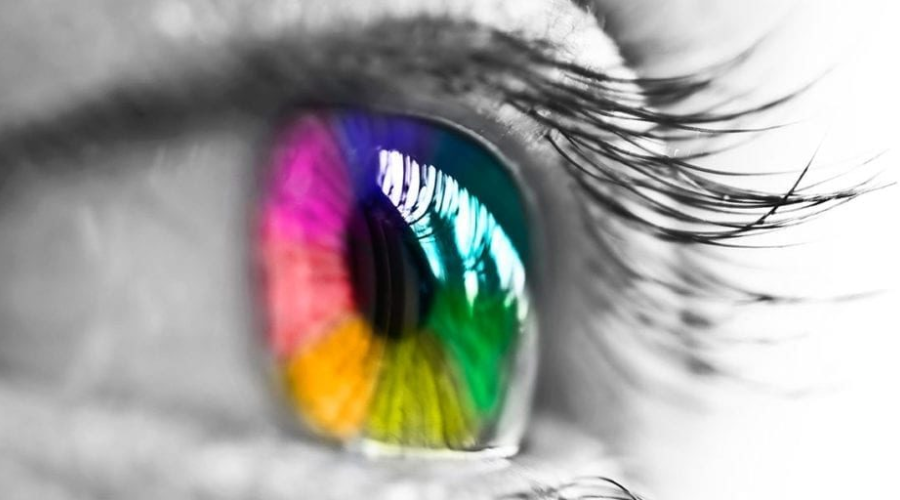
Color theory and its application in marketing design

Color can make a significant impact on a viewer’s perception and interpretation of a brand. Understanding and applying color theory in marketing design is therefore crucial for communicating your desired message and eliciting specific emotions from your audience.

Color theory is a framework that informs the use of color in art and design, aiming to create visual harmony and convey meaning. It is rooted in the color wheel, which is divided into primary colors (red, yellow, blue), secondary colors (green, orange, purple), and tertiary colors (mixes of primary and secondary colors).

Warm and cool colors

Colors are often grouped into warm (reds, yellows, oranges) and cool (blues, greens, purples) categories. Warm colors tend to evoke emotions ranging from feelings of warmth and comfort to feelings of anger and hostility. On the other hand, cool colors are often described as calming but can also call to mind feelings of sadness or indifference.

Color psychology in branding and marketing

Different colors can evoke different psychological responses. Let’s learn the role of different colors in eye-catching design.

For example:

Red is often associated with passion, excitement, and urgency, making it popular for clearance sales.

Blue symbolizes trust and stability, which are often used by financial institutions like banks.

Green is linked to nature and tranquility and is also associated with growth and health.

Yellow symbolizes happiness and optimism but can also signal caution.

The exact emotional responses can vary depending on culture, personal experiences, and context, so it’s crucial to know your audience.

Color combinations and schemes

Colors can be combined in various ways, guided by the color wheel:

Complementary colors are opposite each other on the color wheel (e.g., blue and orange). They create high contrast and are great for highlighting specific content.

Analogous colors are next to each other (e.g., yellow, yellow-green, and green), providing a harmonious look.

Monochromatic schemes use variations in lightness and saturation of a single color, offering a more subtle, elegant look.

Each color scheme can set a different mood and should be chosen based on the brand’s message and target audience.

Consistency and identity

Keeping a consistent color palette helps reinforce your brand identity across all marketing materials. This consistency makes your brand more recognizable and memorable. For example, Starbucks is closely associated with its distinctive green color, which symbolizes growth, freshness, and sustainability—values closely aligned with their brand.

To sum up, understanding color theory is a powerful tool in marketing design. By carefully choosing and combining colors, you can guide your audience’s emotional response and effectively convey your brand’s message.

Typography and its role in marketing design

Typography is a fundamental element of any design. It’s not just about making text legible—it’s about using typefaces strategically to set a mood, evoke emotions, and convey a message that resonates with your audience.

Understanding typography

Typography is the art of arranging a type to make it legible, readable, and visually appealing to the reader. It involves selecting typefaces, font sizes, line lengths, line-spacing (leading), letter-spacing (tracking), and adjusting the space within letter pairs (kerning).

The importance of typefaces

Typefaces significantly contribute to the viewer’s perception of a brand or a piece of content. Serif fonts (like Times New Roman), characterized by small lines or strokes attached to larger lines or strokes, tend to project a traditional, professional, or scholarly image. On the other hand, sans serif fonts (like Arial), without these embellishments, typically come across as modern, clean, and minimalist.

For instance, luxury brands like Tiffany & Co. often use serif typefaces to convey a sense of elegance and sophistication, while tech companies like Google and Facebook opt for simple sans serif fonts to reflect their modern and forward-thinking values.

Choosing and pairing fonts

The key to effective typography in marketing design is harmony and contrast. You want your fonts to complement each other without looking too similar. A common approach is to pair a serif font with a sans-serif font. This creates a clear contrast and hierarchy, allowing you to emphasize key points and make your content more digestible.

When choosing fonts, it’s also important to consider legibility, especially in smaller sizes or on different devices. Test your font choices in various contexts to ensure that they’re always easy to read.

Consistency and branding

Maintaining consistent typography across all your marketing materials helps establish a strong brand identity and makes your content more recognizable. A consistent typographic style, just like a consistent color palette, reinforces your brand personality and helps build trust with your audience.

For example, Coca-Cola’s iconic logo, written in the Spencerian script, is instantly recognizable and has remained consistent for over a century.

The impact of typography on user experience

Typography plays a key role in user experience. Good typography guides the reader’s eye across the page and makes the content more consumable and less overwhelming. Break up large blocks of text with headings, subheadings, bullet points, and quotes to facilitate readability.

In conclusion, typography is a powerful tool in marketing design. By understanding and skillfully applying the principles of typography, you can create designs that are not only visually appealing but also effectively communicate your brand’s message and values.

Effective use of images

In an increasingly visual world, images have become a cornerstone of effective marketing design. They can communicate complex messages quickly, evoke emotions, and significantly enhance the visual appeal of your materials.

Quality matters

The quality of the images you use in your marketing materials can reflect directly on your brand. High-resolution, professional-looking images project a sense of professionalism and credibility. On the other hand, low-quality or pixelated images can make your brand appear amateurish and unreliable.

Relevance is key

Images should be relevant to the content and should help convey your message. They should serve a purpose, whether it’s to illustrate a point, showcase a product, or set a mood. Irrelevant images can confuse the audience and detract from your message.

Using original images

Stock photos can be useful, but they’re not always the best option. Original, authentic images can make your brand stand out and show your brand’s unique personality. For example, if you’re a food business, professional photos of your actual dishes will be much more effective than generic stock photos.

Images and emotion

Images are powerful tools for evoking emotions. The right image can make your audience laugh, spark curiosity, or tug at their heartstrings. Emotional reactions can make your brand more memorable and help forge a deeper connection with your audience.

Consistency in style

Just like with color and typography, it’s important to maintain a consistent style with your images. This style could be related to the color palette, composition, subject matter, or editing style. A consistent image style helps reinforce your brand identity and makes your marketing materials more cohesive.

Use of infographics

When you need to present complex data or processes, infographics can be incredibly effective. They combine images with minimal text to explain, educate, and provide insights in an easily digestible format.

Balancing images with text

While images are important, they need to be balanced with the right amount of text. Too many images can be overwhelming and take away from the main message. Carefully consider the placement and size of your images to create a harmonious balance with your text.

Respecting copyrights

Always make sure to use images that you have the rights to. There are plenty of resources for free or paid images that can be used commercially. Always check the license and respect the work of photographers and designers.

In conclusion, effective use of images can significantly enhance the impact of your marketing materials. By carefully selecting and using images, you can create more engaging, visually appealing, and effective designs.

The power of visual hierarchy

Visual hierarchy is a powerful tool in design. It helps guide the viewer’s eye, prioritize information, and create a more enjoyable reading experience.

Visual hierarchy involves using design elements like size, color, contrast, and alignment to guide the viewer’s attention. For instance, the most important information is usually larger, bolder, or in a distinctive color. A classic example is a movie poster: the title is often the largest element, followed by the lead actors’ names and then the supporting details.

Consistency and brand identity

Brand consistency is the key to establishing a strong brand identity. Maintaining a consistent design across all marketing materials helps create a recognizable brand and builds trust with your audience.

Consistency in your marketing materials means more than just using the same logo. It extends to fonts, colors, image styles, tone of voice, and more. Coca-Cola, for instance, has maintained consistent branding for decades. Their distinctive red color, classic Spencerian script, and commitment to themes of happiness and sharing are instantly recognizable worldwide.

Understanding the target audience

The design does not exist in a vacuum—it must cater to the preferences and expectations of your target audience. Understanding who you’re designing for is a critical step in creating effective marketing materials.

Conducting audience research can help you understand your audience’s tastes and preferences. For example, younger audiences might appreciate bold, vibrant designs, while older audiences might prefer something more traditional and understated. Tailoring your design to your audience’s preferences can significantly improve engagement and conversions.

Importance of testing and iteration

Creating eye-catching designs for marketing materials isn’t a one-and-done process. It’s essential to test, iterate, and improve your designs based on feedback and performance.

A/B testing can be particularly useful in understanding what design elements work best for your audience. You might test different color schemes, images, or typography to see what generates the best response. As you gather data from your tests, you can continuously refine your designs to better suit your audience and achieve your marketing goals.

In conclusion, understanding and applying these key design principles can significantly enhance your marketing materials’ effectiveness. By focusing on basics like color theory, typography, visual hierarchy, and audience understanding, you can create designs that catch the eye, resonate with your audience, and reinforce your brand identity.

Incorporating motion into your design

The digital world is no longer static, and neither should your designs be. With the increasing prevalence of digital marketing, incorporating motion into your design can be a powerful way to attract and retain attention.

Motion can take many forms, from GIFs to animations to full-blown video content. When used properly, motion can tell a story, guide the user’s attention, and add a layer of interactivity to your marketing materials. Spotify, for example, often uses simple animations in its app and promotional materials to create engaging and dynamic user experiences.

Future of marketing design: augmented reality (AR) and virtual reality (VR)

As technology advances, so do the possibilities for marketing design. Emerging technologies like AR and VR are opening up new frontiers for immersive, interactive marketing experiences.

AR and VR can provide customers with unforgettable, immersive experiences that not only grab attention but also create deeper connections with your brand. Brands like IKEA and Sephora have already successfully integrated AR into their marketing, allowing customers to visualize furniture in their homes or try on makeup virtually. While these technologies might not be accessible to all businesses now, they’re a fascinating glimpse into the future of marketing design.

Conclusion

Creating eye-catching designs for marketing materials is a multifaceted process that involves understanding your audience, adhering to fundamental design principles, staying consistent with your brand identity, and keeping abreast of the latest trends and technologies. With careful attention to these factors, you can create marketing materials that don’t just catch the eye but also engage, inform, and inspire your audience. Keep iterating, keep testing, and, most importantly, keep your audience at the heart of all your design decisions.

If you found this blog helpful, make sure to check out this article – How to design eye-catching vendor display stands, for more in-depth information, with real examples about marketing your materials. In case you want more information about furniture placement, design, and advertisement, you might want to check our website for more blogs like this and future articles.

We hope you find this section of the blog interesting and useful. If you have any other ideas or have a specific need that you would like to see covered in an article on advertising, please let us know. We appreciate engaged and enthusiastic readers.