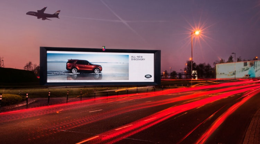
outdoor digital signage

Metrics of Digital Outdoor Advertising

Digital Out-of-Home (DOOH) advertising has opened up new possibilities for measuring the impact and effectiveness of outdoor advertising campaigns. However, understanding these metrics can be challenging, especially if you’re new to the digital advertising world.

In this article, we’ll demystify these metrics, explaining what they mean and why they’re important. And, of course, how you can use them to optimize your campaigns.

Impressions: potential eyes on your ads

Impressions represent the potential number of times your ad has been seen or the number of opportunities your ad had to be seen. In the context of DOOH, impressions refer to the estimated number of people who have passed by your ad.

An impression doesn’t guarantee that someone has looked at your ad, only that they had the opportunity to do so. For instance, if your digital billboard is in a location that gets 10,000 passersby per day, that’s 10,000 potential impressions. Impressions are a crucial starting point for understanding the potential reach of your outdoor advertising campaigns.

When analyzing impressions, consider the location and timing of your ad display. An ad placed in a city center during peak hours will likely generate more impressions than one in a quiet suburb. This understanding can guide you in selecting the most optimal locations and times for your ad displays.

Reach: the breadth of your campaign

Reach refers to the number of unique individuals who have potentially seen your ad over a specific period. Unlike impressions, reach aims to identify the total unique audience exposed to your ad.

Reach provides a broader understanding of your ad’s audience. An ad might generate millions of impressions. But, If it’s the same people passing by repeatedly, your reach may be much smaller.

Advertisers can increase their reach by diversifying their ad placements. For instance, placing ads on multiple billboards across a city, or varying the timing of when your ads are displayed, can help ensure that your ads are seen by a larger, more diverse audience.

Frequency: how often people see your ads

Frequency refers to the average number of times each individual within your reach has potentially seen your ad. It’s a measure of repetition, demonstrating how often your message is getting in front of the same eyes.

While impressions and reach give you an idea of the size of your audience, frequency tells you how often you’re connecting with that audience. A high frequency means your audience is seeing your message repeatedly, which can be helpful for brand recognition and recall.

High frequency isn’t always better. Overexposure to the same ad can lead to ad fatigue, causing people to either tune out your message or develop negative feelings toward your brand. Balance is key – you want your audience to see your message enough to remember it, but not so much that it becomes annoying.

Engagement: interactions with your ads

Engagement measures the level of interaction that consumers have with your ad. In DOOH, this could include a variety of actions. Such as scanning a QR code displayed on the ad, visiting a promoted website, or using a hashtag associated with the ad on social media.

Engagement measures show how your audience is actively responding to your message. High engagement indicates that your ad is not just being seen but is also compelling enough to inspire action.

Engagement can often be boosted by incorporating interactive elements into your ad. For instance, adding a QR code that leads to a landing page with more information or a special offer can encourage viewers to interact with your ad. Make sure to track these actions meticulously to accurately measure engagement.

Conversion rates: from viewers to customers

Conversion rate is the percentage of individuals who take a desired action after viewing your ad. This could include making a purchase, filling out a form, downloading an app, or any other action that aligns with the goal of your campaign.

Conversion rates provide insight into the effectiveness of your ad in driving specific consumer behaviors. A high conversion rate indicates that your ad is not only attracting attention but is also persuasive enough to influence consumer actions.

To track conversions from DOOH advertising, you might need to get a bit creative. For instance, you can use unique discount codes, dedicated landing pages, or campaign-specific hashtags to track the actions of consumers who have interacted with your outdoor ads. Make sure that the conversion aligns with your campaign goal – if your goal is to increase brand awareness, tracking downloads of a branded content piece could be an appropriate conversion.

Conclusion

Understanding the metrics of digital outdoor advertising is crucial for campaign optimization. Impressions, reach, frequency, engagement, and conversion rates each provide unique insights into the effectiveness of your ads. By carefully tracking these metrics and adjusting your strategy accordingly, you can increase the ROI of your outdoor advertising efforts and ensure your message is getting in front of the right people, at the right time, in the most impactful way.

If you want to learn more about outdoor advertising, check out these articles:

Maximizing the Effectiveness of Outdoor Menu Display Stands

Key Principles for Eye-Catching Design

Best Practices for Complying with Digital Signage Regulations

There you will find more information about outdoor advertising and creating an appealing design for your potential customers.
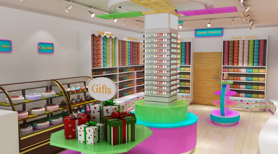
Powerful visual hierarchy in a candy store

What is Visual Hierarchy

Visual hierarchy is a fundamental principle in design that deals with the arrangement and presentation of elements in a way that implies importance. It influences the order in which the human eye perceives the displayed information. 

By creating a hierarchy, designers guide the viewers’ eyes to where they should look first, next, and last. This is crucial in any design project, from websites and posters to display advertising and visual merchandising.

The fundamentals of visual hierarchy

You can establish visual hierarchy by using various design elements, including size, color, contrast, alignment, repetition, proximity, whitespace, texture, and style.

Here are the fundamentals of visual hierarchy:

Size and scale: Larger elements will attract more attention. You should use them to represent the most important information. In a poster for a music concert, for example, the name of the band would typically be the largest text element.

Color and contrast: Bright or contrasting colors draw the eye. A call-to-action button in a vibrant color will stand out on a webpage.

Alignment and proximity: Items that are close together or aligned appear related. For instance, in a menu, you should group similar items together for clarity.

Whitespace: You can use whitespace, a.k.a negative space, to give certain elements more prominence and create a sense of balance.

Application of visual hierarchy in display advertising

In display advertising, the goal is often to communicate a message quickly and effectively, as viewers typically only glance at an ad for a few seconds. 

Here’s how visual hierarchy comes into play:

Headline: The headline is usually the largest and most prominent element, conveying the main message.

Images: High-quality, relevant images can immediately grab attention and communicate a message faster than text.

Call-to-action (CTA): The CTA, such as “Buy Now” or “Learn More,” should be prominently placed and designed to stand out.

Brand logo: While the logo is important for brand recognition, it shouldn’t overshadow the main message, so it’s often smaller and positioned in a less dominant area of the ad.

For example, in a display ad for a new product, the headline announcing the product might be the largest element, followed by a compelling image of the product, a smaller subheadline with additional information, and finally, a brightly colored CTA button.

Visual hierarchy in visual merchandising

In visual merchandising, whether it’s a store layout or a window display, visual hierarchy helps guide the customer’s journey.

Window displays: The most eye-catching item, often the latest or most unique product, should be the focal point. This draws customers in. Other items should be arranged in descending order of importance.

Store layout: Higher-priority items should be placed at eye level and along the path that customers are most likely to take.

Signage: Larger signs for departments or high-priority products, smaller signs for individual items or lower-priority products.

For example, in a clothing store, the latest season’s collection would take center stage in the window display. Inside the store, best sellers or high-margin items might be displayed at eye level, while sale items might be in the back.

The role of visual hierarchy in user experience (UX)

In the realm of User Experience (UX) design, visual hierarchy plays a crucial role. Good UX design allows users to interact with a product smoothly and intuitively, guiding them through the flow of information, and visual hierarchy is a major component of achieving this goal.

Simplifying navigation

A well-implemented visual hierarchy can make navigation effortless. Users should be able to glance at a page and instantly know where to click next or where to look for specific information. This is achieved by creating a hierarchy that guides users’ eyes through the page in a manner that aligns with the flow of information. For example, in a website design, the logo usually resides at the top, followed by the main navigation menu, then the main content, and finally, the footer.

Improving readability

Readability is a fundamental part of user experience, and visual hierarchy contributes significantly to it. With the right use of typography—size, typeface, color, line spacing, etc.—important content can be highlighted. It makes it easier for users to scan through the text and find the information they need. Headers, subheaders, bullet points, and captions are all part of the typographic hierarchy that aids readability.

Guiding user actions

Visual hierarchy also affects how users interact with a design. Calls to action (CTAs), such as buttons and links, should stand out. So, users know where to click to perform specific actions. For instance, a sign-up button could be larger and in a contrasting color to guide users towards it.

Enhancing content organization

A good visual hierarchy brings structure to the content. Breaking it up into digestible chunks and arranging them in a way that makes sense. This could involve using grids, spacing, and alignment to group related content and distinguish different sections.

Reducing cognitive load

A well-thought-out visual hierarchy reduces the cognitive load for users. Instead of providing a lot of information at once, designers can use visual hierarchy to present information in order of importance. This makes the interface less intimidating and easier to understand.

Examples in UX design

A prime example of effective visual hierarchy in UX design is the Google search results page. The search bar is the most prominent feature. It is followed by the search results, which are further organized with the page title in a larger font and the URL in a smaller one. You should place ads and other less critical information on the sides, using less contrasting colors.

In essence, visual hierarchy is instrumental in providing a positive user experience. By thoughtfully arranging and emphasizing certain elements, designers can create interfaces that are not just visually pleasing but also user-friendly, intuitive, and effective in guiding users to achieve their goals.

Conclusion

Visual hierarchy is a fundamental principle in design that plays a crucial role in how effectively we communicate our messages. That way you can draw the audience’s attention to the most important elements first. It ensures that the intended message delivers appropriately. 

Whether in display advertising, visual merchandising, or other areas of design, understanding and correctly implementing visual hierarchy can greatly improve the clarity and impact of our visual communication.

By using techniques such as size and scale, color and contrast, alignment and proximity, and the effective use of whitespace, designers can guide the viewer’s eye and make the viewing process easier and more intuitive. From an advertising perspective, this means not only more efficient communication but also potentially higher engagement and conversion rates.

Whether it’s deciding what element to place in the window display, which product should take the most prominent position on a website, or what message to highlight in an ad, the visual hierarchy will be at the heart of those decisions. Mastering it will, therefore, help any designer or marketer to become more successful in their work.

If you found this article helpful, you might want to check out this blog – Key Principles for Eye-Catching Design. There you will find more information about the importance of visuals and the principles that makes furniture eye-catching.

table talkers

Innovative Ideas for Using Table Talkers in Cafe

Table talkers, those mini billboards on your cafe tables, offer many possibilities beyond simply showcasing your menu or daily specials. With some creativity, these marketing tools can be used to engage customers, promote events, share testimonials, and more. 

Promoting events and special offerings

One creative use of table talkers is to promote upcoming events or unique offerings in your cafe. This could be a live music night, a special themed menu, a charity event, or a coffee-tasting session.

The table talker is an immediate and intimate channel to communicate these activities to your customers. When designed with eye-catching visuals and compelling text, it can generate interest and excitement among your patrons. It can encourage them to participate. On this page – Design Eye-Catching Vendor Display Stands- you will learn more about compelling designs you can use in your cafe to place and display table talkers.

Showcasing customer testimonials

Positive reviews and testimonials can be powerful marketing tool. Consider dedicating some of your table talkers to feature real customer testimonials. Not only does this strategy highlight the quality of your offerings, but it also builds trust and credibility.

For added authenticity, consider including the customer’s name (with their permission) and their picture. Testimonials that praise a specific menu item can be particularly effective, enticing other customers to try it.

Highlighting fun facts about your cafe

A table talker can also serve as an educational tool. Use it to highlight fun or interesting facts about your cafe. This could be the history of your cafe, information about the origin of your coffee beans. Even a brief explanation of the coffee brewing process would be suitable.

Fun facts provide a talking point for customers, enrich their visit with an educational aspect, and enhance their overall experience. The more a customer feels connected and knowledgeable about your cafe, the more likely they will return.

Introducing your team

Consider using table talkers to introduce your cafe’s team members to your customers. Sharing short bios or fun facts about your baristas or chefs can create a more personal and engaging environment. This approach builds a connection between your staff and customers, fostering a sense of community and improving customer loyalty.

Engaging customers with interactive content

Take your table talker strategy to the next level by incorporating interactive content. It could be a QR code that links to a survey for customer feedback. It could also be a mini-game. Or, for example, a quiz with a chance to win a free coffee or even a ‘did you know?’ fact section about coffee that changes regularly.

Interactive table talkers can create a memorable experience for your customers. They encourage them to engage more deeply with your cafe and return for more.

Conclusion

Table talkers present many opportunities to connect with customers, promote offerings, and create a unique cafe experience. These innovative ideas go beyond traditional advertising. They help your cafe to stand out from the competition and build a loyal customer base. Don’t underestimate the power of these mini billboards. With some creativity, they can be a game-changer for your cafe’s marketing strategy.

If you want to find more innovative and creative ideas about placing and displaying your table talkers, check out this article – Creative Possibilities with Digital Signage. There you will find more about ways to boost sales through unique furniture displaying and placing in your store.

Maximize Your Brand’s Impact with Roll-Up Banner Stands

In a crowded marketplace, standing out is essential for making a lasting brand impression. Roll-up banner stands are a cost-effective, versatile, and highly impactful marketing tool that can significantly enhance your brand recognition.

Understanding tool power, visual marketing psychology, and effective banner design can boost your brand’s visibility and appeal.

The psychology of visual marketing

It’s important to understand the overarching principles that make them effective: the fundamentals of visual marketing.

Humans are inherently visual creatures. Studies have shown that the brain processes images 60,000 times faster than text. Besides 90% of the information transmitted to the brain is visual. In marketing, this means that visual elements can convey your brand’s message quickly and effectively. Roll-up banners leverage this principle by serving as large, eye-catching displays that immediately draw attention and convey your brand’s message.

Moreover, due to the mere exposure effect — a psychological phenomenon where people develop a preference for things merely because they are familiar with them. Consistent visual branding on roll-up banners enhances brand recognition and preference. To learn more about brand recognition, check out this article – Immersive Brand Experience with Showroom Display Stands.

Harnessing the power of roll-up banners

Roll-up banners are a testament to the old saying, “Location, location, location.” Their power lies in their ability to put your brand right in the line of sight of potential customers.

Whether used at trade shows, conferences, product launches, or in retail spaces, roll-up banners can serve as “silent salespeople” that promote your brand to all passersby. They can draw attention, engage the audience, and increase footfall to your location, all while reinforcing your brand identity. Portable and easy to set up, roll-up banners allow flexible placement for maximum impact at each venue.

Key components of a roll-up banner design

While all roll-up banners have the potential to be impactful, the design can make or break their effectiveness. High-quality images, powerful taglines, and consistent company branding are critical.

High-quality images: The images used on your banner should be not only visually appealing but also high-resolution. This ensures that your banner looks professional and attracts attention even from a distance. Images that are related to your product or service, and resonate with your target audience, can create a connection and enhance recall of your brand.

Powerful taglines: A tagline or headline on your banner should be short, sharp, and memorable. It should convey your brand’s unique value proposition and induce curiosity or interest. Clever use of action words can inspire people to seek more information about your brand.

Consistent company branding: Consistent use of your company’s logo, color scheme, and typography across all marketing materials, including roll-up banners, helps reinforce your brand identity. This creates a cohesive brand experience that can drive brand recognition and loyalty.

Successful roll-up banner design examples

Successful roll-up banner designs come in all shapes and sizes. But they all have a few things in common. They attract attention, convey a clear message, and promote brand recognition.

One example is the roll-up banners used by tech giant Apple for their product launches. Known for their minimalist aesthetic, Apple’s banners often feature a high-resolution product image. Additionally, they have a short and catchy tagline, and their unmistakable logo. This simple yet effective design not only draws attention but also reinforces Apple’s brand identity. It represents them as a provider of sleek, cutting-edge technology.

Another example is Coca-Cola’s roll-up banners. Consistently incorporating their distinctive red-and-white color scheme, unique typography, and logo, these banners are instantly recognizable, even from a distance. Consistently using these brand elements has made Coca-Cola one of the world’s most recognized brands.

In a completely different sector, the World Wildlife Fund (WWF) also uses roll-up banners effectively for their campaigns. Famous for their impactful imagery and compelling taglines, these banners not only draw attention but also evoke an emotional response. It is crucial for their cause-related marketing.

Conclusion

In conclusion, roll-up banner stands are a powerful marketing tool that can significantly enhance your brand recognition when used effectively. Understanding the psychology of visual marketing, location importance, and effective banner design are crucial for harnessing these tools’ power.

A well-designed roll-up banner can attract attention, convey a clear message, and promote brand recognition. All of which are key to maximizing your brand’s impact.