fridge displays

Do Fridge Displays Improve Drinks Sales?

As the evening sun dips below the horizon and the world cools down, imagine walking to your favorite local café. As you push the door open, a blast of cool air hits you, and your gaze is immediately drawn to luminous fridge displays showcasing a mosaic of colorful beverages.

It’s almost like a silent invitation urging you to quench your thirst. But behind this luminescent attraction lies a question that few ponder: do these eye-catching fridge displays genuinely influence sales? Or are they merely ornamental? We will dive deep into the cold and refreshing world of drink displays.

The allure of visual appeal

Before diving into the numbers, let’s embrace the art behind these fridges. Humans are visually driven creatures, and businesses have known this for years. For example, by using the principle of visual hierarchy, business can control how customers notice their products.

Please close your eyes and think back to the last time you were irresistibly drawn to a product, not because you needed it but because it looked so darn appealing. In the fast-paced world of consumerism, where hundreds of brands vie for a sliver of our attention, the visual allure is no longer a luxury. It’s a necessity. Let’s learn how a simple fridge plays a much more significant role than it seems. 

An attractively organized fridge display doesn’t just keep drinks cold. It’s a silent salesperson, highlighting the colors, labels, and sometimes even the effervescence of the drinks inside. The logic is simple: what we see, we crave. An inviting display can coax a customer into making an impulse purchase or trying out a new beverage they might not have considered otherwise. There are many things to take into account to create a tempting visual appeal. For instance, you can learn more about the role of lighting.

The stats behind sales boost

But is there proof that these displays boost sales, or is it all aesthetic? While a stunning visual might captivate the heart, cold, complex numbers have always ruled the mind. Beyond the sparkling aesthetics of a drink fridge, it’s essential to peel back the layers and examine the tangible impact. Can a refrigerator genuinely elevate sales, or is it all fizz with no substance? Let’s decode the data.

Several studies have highlighted the role of effective visual merchandising in boosting sales. For instance, a study by the Marketing Science Institute revealed that beverage sales can increase by up to 30% with an effective fridge display strategy. Another research indicated that 60% of purchases are decided in-store, implying in-store displays’ esstential role in influencing buying decisions.

Cost vs. benefit

These fridges, while visually appealing, come with their own set of expenses. So, let’s weigh the scales. Venturing into any business decision often feels like standing at the edge of a cliff, wondering whether to jump. Investing in a high-tech, visually appealing drink display fridge can seem daunting, especially with the attached price tag. But sometimes, the wind beneath your wings—the potential sales boost—can make the leap worth it. Let’s assess the cost dynamics, shall we?

The initial cost of a high-quality drink display fridge can be substantial. Add to that the electricity costs, maintenance, and potential repair fees, and it might seem like a hefty investment. However, considering the potential boost in sales (as high as 30% as mentioned), the ROI can be pretty promising. For a busy café or restaurant, the fridge can pay for itself within a matter of months.

Risks involved

Like all investments, there are risks involved. What are the potential risks of investing in a fridge display? Every rose has its thorn, and while our glowing fridge displays might seem like blooming roses, they do come with their set of thorns. Beyond the allure and potential profit lies a realm of challenges and pitfalls. Before embarking on this frosty journey, it’s prudent to acquaint oneself with potential icy patches.

Space Constraints: Especially for smaller establishments, a large fridge can take up valuable space.

Maintenance Issues: Regular maintenance is a must. Any downtime, especially during peak hours or seasons, can have impact on sales.

Over-reliance: A fridge display isn’t a magic wand. It should complement other marketing strategies, like using effective restaurant menu boards.

Eco-friendly fridge displays

With sustainability becoming a buzzword, how are fridge displays keeping up? The winds of change are blowing and carry whispers of sustainability and eco-consciousness. As businesses worldwide pivot towards greener practices, how do our trusted fridge displays adapt? Can they toe the line between environmental consciousness and profitability? Let’s explore this green frontier.

Eco-friendly fridges, with energy-efficient mechanisms and environmentally friendly refrigerants, are the talk of the town. Not only do they reduce carbon footprints. They also significantly cut down on electricity bills. It is a bonus for businesses keen on sustainable practices and marketing themselves as eco-conscious brands.

Conclusion

To fridge or not to fridge? For businesses with the budget and space, it is a no-brainer. The boost in sales and the aesthetic and functional appeal make fridge displays a worthy addition.

Whether you’re planning to jazz up your café or just sipping a cold drink at your favorite joint, you now have a cool topic to ponder upon or discuss with friends! Cheers to informed choices and refreshing drinks!

Financing Advertising Displays

Financing Advertising Displays: A Guide to Loans and Options

This blog focuses on insights and strategies in advertising, merchandising, and brand awareness. Today, we’re taking a break from design trends and marketing strategies to discuss something equally vital – financing advertising displays.

High-quality advertising displays can make a powerful impact on customers but can also be a significant investment. Whether you’re a small business looking for an eye-catching window display or a large corporation planning a nationwide digital billboard campaign, understanding your financing options is essential. 

Let’s explore various loan options, discuss terms, interest rates, and more to find the right solution for your advertising needs.

Traditional bank loans

Traditional bank loans are a familiar option for a lot of businesses. These loans can be tailored to suit the specific needs of an advertising campaign.

Banks offer various business loans. They include secured and unsecured options, with various terms and interest rates. Approval and the specifics of the loan depend on factors like credit history, business profitability, and loan size.

● Interest Rates: Typically, interest rates for bank loans can range from 3% to 10% or more, depending on the loan’s type and duration.

● Loan Terms: The terms can vary from short-term loans (less than one year) to long-term loans extending to 10 years or more.

Example: A local retailer seeking to finance a new storefront display may approach their local bank for a small business loan, securing favorable terms based on their strong relationship and solid business performance.

Small business administration loans

For small businesses, SBA loans can be an attractive option for financing advertising displays.

The Small Business Administration offers various loan programs to help small businesses grow. These loans are often easier to qualify for and provide competitive terms.

● Interest rates: SBA loans offer interest rates typically ranging from 2.25% to 4.75% over the prime rate.

● Loan terms: The terms can range from 5 to 25 years, depending on the SBA program.

Example: A growing boutique looking to invest in a cutting-edge digital display may seek an SBA 7(a) loan, which offers long-term financing with competitive interest rates.

Alternative and online lenders

Online and alternative lenders provide additional financing options in today’s digital age.

Alternative lending platforms often offer a streamlined application process and faster funding. It can be particularly beneficial when financing a time-sensitive advertising campaign.

● Interest rates: In general, online lenders have higher interest rates, ranging from 7% to 30% or more.

● Loan terms: These loans usually have shorter terms, from 3 months to 5 years.

Example: An e-commerce business planning a pop-up display in a high-traffic area might choose an online lender like OnDeck or Kabbage for quick approval and funding.

Financing equipment

If your advertising display involves significant hardware, equipment financing could be an option. Equipment financing allows businesses to take out a loan specifically to purchase the equipment needed for their advertising display. The kit itself often serves as collateral for the loan.

● Interest rates: Rates for equipment financing typically range from 6% to 9%.

● Loan terms: In general, the loan term matches the equipment’s expected lifespan.

Example: A company planning to install an extensive LED billboard system might use equipment financing to fund the purchase, benefiting from tax incentives tied to equipment depreciation.

In conclusion

Financing advertising displays is not a one-size-fits-all scenario. The right solution depends on factors such as the nature of the display, the size of the investment, the financial health of your business, and your relationship with potential lenders.

By understanding the options detailed here, marketing professionals can take informed steps toward funding impactful advertising campaigns that align with their goals and budgets.

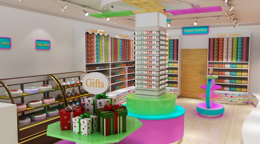
Powerful visual hierarchy in a candy store

What is Visual Hierarchy

Visual hierarchy is a fundamental principle in design that deals with the arrangement and presentation of elements in a way that implies importance. It influences the order in which the human eye perceives the displayed information. 

By creating a hierarchy, designers guide the viewers’ eyes to where they should look first, next, and last. This is crucial in any design project, from websites and posters to display advertising and visual merchandising.

The fundamentals of visual hierarchy

You can establish visual hierarchy by using various design elements, including size, color, contrast, alignment, repetition, proximity, whitespace, texture, and style.

Here are the fundamentals of visual hierarchy:

Size and scale: Larger elements will attract more attention. You should use them to represent the most important information. In a poster for a music concert, for example, the name of the band would typically be the largest text element.

Color and contrast: Bright or contrasting colors draw the eye. A call-to-action button in a vibrant color will stand out on a webpage.

Alignment and proximity: Items that are close together or aligned appear related. For instance, in a menu, you should group similar items together for clarity.

Whitespace: You can use whitespace, a.k.a negative space, to give certain elements more prominence and create a sense of balance.

Application of visual hierarchy in display advertising

In display advertising, the goal is often to communicate a message quickly and effectively, as viewers typically only glance at an ad for a few seconds. 

Here’s how visual hierarchy comes into play:

Headline: The headline is usually the largest and most prominent element, conveying the main message.

Images: High-quality, relevant images can immediately grab attention and communicate a message faster than text.

Call-to-action (CTA): The CTA, such as “Buy Now” or “Learn More,” should be prominently placed and designed to stand out.

Brand logo: While the logo is important for brand recognition, it shouldn’t overshadow the main message, so it’s often smaller and positioned in a less dominant area of the ad.

For example, in a display ad for a new product, the headline announcing the product might be the largest element, followed by a compelling image of the product, a smaller subheadline with additional information, and finally, a brightly colored CTA button.

Visual hierarchy in visual merchandising

In visual merchandising, whether it’s a store layout or a window display, visual hierarchy helps guide the customer’s journey.

Window displays: The most eye-catching item, often the latest or most unique product, should be the focal point. This draws customers in. Other items should be arranged in descending order of importance.

Store layout: Higher-priority items should be placed at eye level and along the path that customers are most likely to take.

Signage: Larger signs for departments or high-priority products, smaller signs for individual items or lower-priority products.

For example, in a clothing store, the latest season’s collection would take center stage in the window display. Inside the store, best sellers or high-margin items might be displayed at eye level, while sale items might be in the back.

The role of visual hierarchy in user experience (UX)

In the realm of User Experience (UX) design, visual hierarchy plays a crucial role. Good UX design allows users to interact with a product smoothly and intuitively, guiding them through the flow of information, and visual hierarchy is a major component of achieving this goal.

Simplifying navigation

A well-implemented visual hierarchy can make navigation effortless. Users should be able to glance at a page and instantly know where to click next or where to look for specific information. This is achieved by creating a hierarchy that guides users’ eyes through the page in a manner that aligns with the flow of information. For example, in a website design, the logo usually resides at the top, followed by the main navigation menu, then the main content, and finally, the footer.

Improving readability

Readability is a fundamental part of user experience, and visual hierarchy contributes significantly to it. With the right use of typography—size, typeface, color, line spacing, etc.—important content can be highlighted. It makes it easier for users to scan through the text and find the information they need. Headers, subheaders, bullet points, and captions are all part of the typographic hierarchy that aids readability.

Guiding user actions

Visual hierarchy also affects how users interact with a design. Calls to action (CTAs), such as buttons and links, should stand out. So, users know where to click to perform specific actions. For instance, a sign-up button could be larger and in a contrasting color to guide users towards it.

Enhancing content organization

A good visual hierarchy brings structure to the content. Breaking it up into digestible chunks and arranging them in a way that makes sense. This could involve using grids, spacing, and alignment to group related content and distinguish different sections.

Reducing cognitive load

A well-thought-out visual hierarchy reduces the cognitive load for users. Instead of providing a lot of information at once, designers can use visual hierarchy to present information in order of importance. This makes the interface less intimidating and easier to understand.

Examples in UX design

A prime example of effective visual hierarchy in UX design is the Google search results page. The search bar is the most prominent feature. It is followed by the search results, which are further organized with the page title in a larger font and the URL in a smaller one. You should place ads and other less critical information on the sides, using less contrasting colors.

In essence, visual hierarchy is instrumental in providing a positive user experience. By thoughtfully arranging and emphasizing certain elements, designers can create interfaces that are not just visually pleasing but also user-friendly, intuitive, and effective in guiding users to achieve their goals.

Conclusion

Visual hierarchy is a fundamental principle in design that plays a crucial role in how effectively we communicate our messages. That way you can draw the audience’s attention to the most important elements first. It ensures that the intended message delivers appropriately. 

Whether in display advertising, visual merchandising, or other areas of design, understanding and correctly implementing visual hierarchy can greatly improve the clarity and impact of our visual communication.

By using techniques such as size and scale, color and contrast, alignment and proximity, and the effective use of whitespace, designers can guide the viewer’s eye and make the viewing process easier and more intuitive. From an advertising perspective, this means not only more efficient communication but also potentially higher engagement and conversion rates.

Whether it’s deciding what element to place in the window display, which product should take the most prominent position on a website, or what message to highlight in an ad, the visual hierarchy will be at the heart of those decisions. Mastering it will, therefore, help any designer or marketer to become more successful in their work.

If you found this article helpful, you might want to check out this blog – Key Principles for Eye-Catching Design. There you will find more information about the importance of visuals and the principles that makes furniture eye-catching.

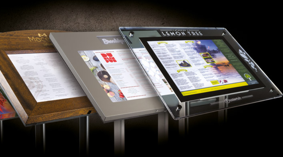
outdoor menu display stand variants

Maximizing the Effectiveness of Outdoor Menu Display Stands

When operating a business on a bustling shopping street, attracting customers can be a competitive endeavor. One of your most potent tools is your outdoor menu display stand. These stands have a seemingly simple task: inform the public about your offering. But, the way you design and position them can have a profound impact on your success.

This article will walk you through various strategies to maximize the effectiveness of your outdoor menu display stands, ensuring they catch the eye and pique the interest of passersby.

Balancing aesthetics and readability

Creating an attractive menu that remains readable is a crucial balance that must be struck. Aesthetics can draw people in, but if your menu isn’t easy to read, potential customers may lose interest quickly.

When considering aesthetics, think about how the design reflects your brand. Use brand colors and incorporate your logo to create a cohesive look. However, ensure these elements don’t compromise readability. Use clear, legible fonts and maintain a good contrast between the text and background. For example, black text on a white background or white text on a dark background can improve visibility.

The power of color psychology

Colors evoke emotions and can subconsciously influence a person’s choices. Knowing color psychology can give you an edge in making your menu display stand more attractive and effective.

Research has shown that colors like red and yellow stimulate appetite, which is why they’re frequently used by fast-food chains. On the other hand, green can signify freshness and healthiness, which is ideal for salad bars or vegan restaurants. But remember, the colors should be consistent with your overall brand identity. The renowned ice-cream brand “Baskin-Robbins,” for example, uses a mix of blue (trustworthy, dependable) and pink (fun, youthful), reflecting their fun and trusted brand image.

Harnessing typography

Typography is another critical factor. The right typeface can communicate much about your business while enhancing readability.

If you’re running a classic Italian restaurant, a traditional Serif font may be a good fit, evoking a sense of tradition and elegance. If you’re operating a modern, trendy juice bar, a sleek, minimalist Sans Serif font could better reflect your brand. For instance, the logo of “Juice Press,” a popular organic food and beverage retailer, uses a modern sans-serif typeface that communicates a contemporary and clean feel.

Here are some more examples that illustrate the power of typeface choices:

Starbucks: The Starbucks logo uses a custom-designed typeface, but it closely resembles the style of a Serif typeface. The typography conveys a sense of authority and tradition yet remains stylish and contemporary.

McDonald’s: McDonald’s uses a customized version of Helvetica, a popular Sans Serif typeface known for its simplicity and readability. It mirrors the brand’s image of being straightforward, accessible, and universally recognizable.

Chipotle Mexican Grill: Chipotle uses a slightly rustic and bold Serif typeface, which reflects their commitment to traditional cooking methods and high-quality ingredients.

Subway: Subway’s logo uses a sans-serif typeface which conveys a modern, clean, and unpretentious image. It’s simple and easy to read, aligning with the brand’s straightforward and healthy offerings.

Taco Bell: Taco Bell uses a bold, custom Sans Serif font, which reflects its fun, youthful, and innovative brand. The simplicity of the typeface also enhances readability.

Burger King: The logo of Burger King uses a customized bubble Serif typeface. The rounded, playful letters reflect a sense of fun and approachability, aligning well with their target demographic of families and young people.

Each of these brands has carefully chosen typography that not only enhances readability but also helps communicate their brand story and connect with their target customers.

Mastering visual hierarchy

Visual hierarchy is the arrangement and presentation of elements in a way that implies importance. Mastering this in your menu can guide a customer’s eye and highlight your best offerings.

Start with the headline – the name of your establishment – it should be the largest text on the stand. List high-profit or signature items next, using a larger font size or distinct colors to attract attention. Keep other items grouped and categorized for easy readability. The “Steak n Shake” menu is a great example. The headline is prominent, and signature items like their “Original Steakburger” are highlighted in a visually distinct way.

The art of positioning

Once your menu design is perfect, the next challenge is positioning. The goal is to place your stand where it is most likely to draw attention.

A stand placed too far from the walking path may not get noticed, while one too close might obstruct pedestrian traffic. Place your stand where it is easily visible to both passersby and people from a distance. Also, consider the direction of sunlight during peak hours to avoid glare that could make the menu hard to read.

Leveraging local trends and culture

Understanding and embracing the local trends and cultural nuances can take your menu design from good to great. This strategy helps businesses establish a connection with the local audience, making your offerings more attractive and relatable to potential customers.

Local trends can span a range of aspects, from health trends to popular local ingredients, regional cuisine preferences, or even preferred dining styles. Paying attention to these trends can give you insights that can help you design a menu that resonates with your target audience. For instance, if your establishment is located in an area where people are particularly health-conscious, offering and highlighting vegan, gluten-free, or low-calorie options can make your business more appealing. If local produce or a particular cuisine is popular in your area, featuring those items can attract more customers.

Cultural preferences

Cultural preferences, on the other hand, can give your menu display a unique touch. If your business is located in an area with a strong cultural identity, incorporating elements of that culture into your design can make your menu stand out. For example, in a city like San Francisco, with a prominent Chinatown, using Chinese-inspired design elements such as traditional Chinese characters, colors (red and gold for good luck and prosperity), or even stylized representations of popular Chinese dishes can make your menu more appealing.

However, it’s crucial to approach this with sensitivity and authenticity, as misrepresentation can lead to negative reactions. The idea is to celebrate and respect the culture and trends of your local area, not to appropriate them. Remember, the goal is not only to reflect local trends and culture in the items you offer but also in the design of your outdoor menu display stand. A menu stand that reflects the local character and follows the latest local trends can draw attention, spark curiosity, and invite customers to step in and enjoy your offerings.

Testing and refining your display stand

One of the best strategies for optimizing your display stand is testing different versions and refining them based on results.

Try different color schemes, typography, and menu arrangements, and see which version attracts more customers. Collect customer feedback, if possible, to understand which elements of the display stand they find most attractive or engaging. This ongoing process of testing and refinement will ensure that your outdoor menu display stand remains effective and continues to drive customer interest and engagement.

Conclusion

In conclusion, crafting a successful outdoor menu display stand is an art that involves careful consideration of design elements and customer psychology. From striking the right balance between aesthetics and readability to leveraging color psychology, typography, visual hierarchy, and strategic positioning, each aspect plays a pivotal role in making your display stand effective. But remember, what works best can vary depending on the local context and target audience, so continuous testing, learning, and refining should be an integral part of your approach.

eye-catching design

Key Principles for Eye-Catching Design

Design is a crucial component in marketing. Well-designed marketing materials with eye-catching design can catch the attention of potential customers, build your brand identity, and engage customers effectively. Here are the key principles to consider when designing your marketing materials.

The importance of design in marketing

Every interaction a consumer has with your brand contributes to their overall impression of your business. That’s why design—encompassing everything from your logo to your website to your print materials—can make or break your marketing efforts.

Effective design can significantly improve engagement, drive conversions, and boost revenues. A report from Adobe titled “The Impact of Design on Business” found that companies that value design outperformed companies that do not by 219% over a decade. Therefore, investing in design is not merely an aesthetic decision—it’s a business one.

The basics of eye-catching design

There are several fundamental principles of design that serve as the building blocks of any successful marketing material. These principles, when applied effectively, can greatly increase the visual appeal and effectiveness of your campaigns.

Principles like balance (the distribution of visual weight in a design), contrast (the juxtaposition of different elements), emphasis (making one area of a design stand out), and rhythm (the repetition of elements) all play a part in creating engaging and visually appealing designs.

For instance, Apple’s minimalist aesthetic often features a balance of elements and a strong contrast between the product and the background, making the product stand out.

Color theory and its application in marketing design

Color can make a significant impact on a viewer’s perception and interpretation of a brand. Understanding and applying color theory in marketing design is therefore crucial for communicating your desired message and eliciting specific emotions from your audience.

Color theory is a framework that informs the use of color in art and design, aiming to create visual harmony and convey meaning. It is rooted in the color wheel, which is divided into primary colors (red, yellow, blue), secondary colors (green, orange, purple), and tertiary colors (mixes of primary and secondary colors).

Warm and cool colors

Colors are often grouped into warm (reds, yellows, oranges) and cool (blues, greens, purples) categories. Warm colors tend to evoke emotions ranging from feelings of warmth and comfort to feelings of anger and hostility. On the other hand, cool colors are often described as calming but can also call to mind feelings of sadness or indifference.

Color psychology in branding and marketing

Different colors can evoke different psychological responses. Let’s learn the role of different colors in eye-catching design.

For example:

Red is often associated with passion, excitement, and urgency, making it popular for clearance sales.

Blue symbolizes trust and stability, which are often used by financial institutions like banks.

Green is linked to nature and tranquility and is also associated with growth and health.

Yellow symbolizes happiness and optimism but can also signal caution.

The exact emotional responses can vary depending on culture, personal experiences, and context, so it’s crucial to know your audience.

Color combinations and schemes

Colors can be combined in various ways, guided by the color wheel:

Complementary colors are opposite each other on the color wheel (e.g., blue and orange). They create high contrast and are great for highlighting specific content.

Analogous colors are next to each other (e.g., yellow, yellow-green, and green), providing a harmonious look.

Monochromatic schemes use variations in lightness and saturation of a single color, offering a more subtle, elegant look.

Each color scheme can set a different mood and should be chosen based on the brand’s message and target audience.

Consistency and identity

Keeping a consistent color palette helps reinforce your brand identity across all marketing materials. This consistency makes your brand more recognizable and memorable. For example, Starbucks is closely associated with its distinctive green color, which symbolizes growth, freshness, and sustainability—values closely aligned with their brand.

To sum up, understanding color theory is a powerful tool in marketing design. By carefully choosing and combining colors, you can guide your audience’s emotional response and effectively convey your brand’s message.

Typography and its role in marketing design

Typography is a fundamental element of any design. It’s not just about making text legible—it’s about using typefaces strategically to set a mood, evoke emotions, and convey a message that resonates with your audience.

Understanding typography

Typography is the art of arranging a type to make it legible, readable, and visually appealing to the reader. It involves selecting typefaces, font sizes, line lengths, line-spacing (leading), letter-spacing (tracking), and adjusting the space within letter pairs (kerning).

The importance of typefaces

Typefaces significantly contribute to the viewer’s perception of a brand or a piece of content. Serif fonts (like Times New Roman), characterized by small lines or strokes attached to larger lines or strokes, tend to project a traditional, professional, or scholarly image. On the other hand, sans serif fonts (like Arial), without these embellishments, typically come across as modern, clean, and minimalist.

For instance, luxury brands like Tiffany & Co. often use serif typefaces to convey a sense of elegance and sophistication, while tech companies like Google and Facebook opt for simple sans serif fonts to reflect their modern and forward-thinking values.

Choosing and pairing fonts

The key to effective typography in marketing design is harmony and contrast. You want your fonts to complement each other without looking too similar. A common approach is to pair a serif font with a sans-serif font. This creates a clear contrast and hierarchy, allowing you to emphasize key points and make your content more digestible.

When choosing fonts, it’s also important to consider legibility, especially in smaller sizes or on different devices. Test your font choices in various contexts to ensure that they’re always easy to read.

Consistency and branding

Maintaining consistent typography across all your marketing materials helps establish a strong brand identity and makes your content more recognizable. A consistent typographic style, just like a consistent color palette, reinforces your brand personality and helps build trust with your audience.

For example, Coca-Cola’s iconic logo, written in the Spencerian script, is instantly recognizable and has remained consistent for over a century.

The impact of typography on user experience

Typography plays a key role in user experience. Good typography guides the reader’s eye across the page and makes the content more consumable and less overwhelming. Break up large blocks of text with headings, subheadings, bullet points, and quotes to facilitate readability.

In conclusion, typography is a powerful tool in marketing design. By understanding and skillfully applying the principles of typography, you can create designs that are not only visually appealing but also effectively communicate your brand’s message and values.

Effective use of images

In an increasingly visual world, images have become a cornerstone of effective marketing design. They can communicate complex messages quickly, evoke emotions, and significantly enhance the visual appeal of your materials.

Quality matters

The quality of the images you use in your marketing materials can reflect directly on your brand. High-resolution, professional-looking images project a sense of professionalism and credibility. On the other hand, low-quality or pixelated images can make your brand appear amateurish and unreliable.

Relevance is key

Images should be relevant to the content and should help convey your message. They should serve a purpose, whether it’s to illustrate a point, showcase a product, or set a mood. Irrelevant images can confuse the audience and detract from your message.

Using original images

Stock photos can be useful, but they’re not always the best option. Original, authentic images can make your brand stand out and show your brand’s unique personality. For example, if you’re a food business, professional photos of your actual dishes will be much more effective than generic stock photos.

Images and emotion

Images are powerful tools for evoking emotions. The right image can make your audience laugh, spark curiosity, or tug at their heartstrings. Emotional reactions can make your brand more memorable and help forge a deeper connection with your audience.

Consistency in style

Just like with color and typography, it’s important to maintain a consistent style with your images. This style could be related to the color palette, composition, subject matter, or editing style. A consistent image style helps reinforce your brand identity and makes your marketing materials more cohesive.

Use of infographics

When you need to present complex data or processes, infographics can be incredibly effective. They combine images with minimal text to explain, educate, and provide insights in an easily digestible format.

Balancing images with text

While images are important, they need to be balanced with the right amount of text. Too many images can be overwhelming and take away from the main message. Carefully consider the placement and size of your images to create a harmonious balance with your text.

Respecting copyrights

Always make sure to use images that you have the rights to. There are plenty of resources for free or paid images that can be used commercially. Always check the license and respect the work of photographers and designers.

In conclusion, effective use of images can significantly enhance the impact of your marketing materials. By carefully selecting and using images, you can create more engaging, visually appealing, and effective designs.

The power of visual hierarchy

Visual hierarchy is a powerful tool in design. It helps guide the viewer’s eye, prioritize information, and create a more enjoyable reading experience.

Visual hierarchy involves using design elements like size, color, contrast, and alignment to guide the viewer’s attention. For instance, the most important information is usually larger, bolder, or in a distinctive color. A classic example is a movie poster: the title is often the largest element, followed by the lead actors’ names and then the supporting details.

Consistency and brand identity

Brand consistency is the key to establishing a strong brand identity. Maintaining a consistent design across all marketing materials helps create a recognizable brand and builds trust with your audience.

Consistency in your marketing materials means more than just using the same logo. It extends to fonts, colors, image styles, tone of voice, and more. Coca-Cola, for instance, has maintained consistent branding for decades. Their distinctive red color, classic Spencerian script, and commitment to themes of happiness and sharing are instantly recognizable worldwide.

Understanding the target audience

The design does not exist in a vacuum—it must cater to the preferences and expectations of your target audience. Understanding who you’re designing for is a critical step in creating effective marketing materials.

Conducting audience research can help you understand your audience’s tastes and preferences. For example, younger audiences might appreciate bold, vibrant designs, while older audiences might prefer something more traditional and understated. Tailoring your design to your audience’s preferences can significantly improve engagement and conversions.

Importance of testing and iteration

Creating eye-catching designs for marketing materials isn’t a one-and-done process. It’s essential to test, iterate, and improve your designs based on feedback and performance.

A/B testing can be particularly useful in understanding what design elements work best for your audience. You might test different color schemes, images, or typography to see what generates the best response. As you gather data from your tests, you can continuously refine your designs to better suit your audience and achieve your marketing goals.

In conclusion, understanding and applying these key design principles can significantly enhance your marketing materials’ effectiveness. By focusing on basics like color theory, typography, visual hierarchy, and audience understanding, you can create designs that catch the eye, resonate with your audience, and reinforce your brand identity.

Incorporating motion into your design

The digital world is no longer static, and neither should your designs be. With the increasing prevalence of digital marketing, incorporating motion into your design can be a powerful way to attract and retain attention.

Motion can take many forms, from GIFs to animations to full-blown video content. When used properly, motion can tell a story, guide the user’s attention, and add a layer of interactivity to your marketing materials. Spotify, for example, often uses simple animations in its app and promotional materials to create engaging and dynamic user experiences.

Future of marketing design: augmented reality (AR) and virtual reality (VR)

As technology advances, so do the possibilities for marketing design. Emerging technologies like AR and VR are opening up new frontiers for immersive, interactive marketing experiences.

AR and VR can provide customers with unforgettable, immersive experiences that not only grab attention but also create deeper connections with your brand. Brands like IKEA and Sephora have already successfully integrated AR into their marketing, allowing customers to visualize furniture in their homes or try on makeup virtually. While these technologies might not be accessible to all businesses now, they’re a fascinating glimpse into the future of marketing design.

Conclusion

Creating eye-catching designs for marketing materials is a multifaceted process that involves understanding your audience, adhering to fundamental design principles, staying consistent with your brand identity, and keeping abreast of the latest trends and technologies. With careful attention to these factors, you can create marketing materials that don’t just catch the eye but also engage, inform, and inspire your audience. Keep iterating, keep testing, and, most importantly, keep your audience at the heart of all your design decisions.

If you found this blog helpful, make sure to check out this article – How to design eye-catching vendor display stands, for more in-depth information, with real examples about marketing your materials. In case you want more information about furniture placement, design, and advertisement, you might want to check our website for more blogs like this and future articles.

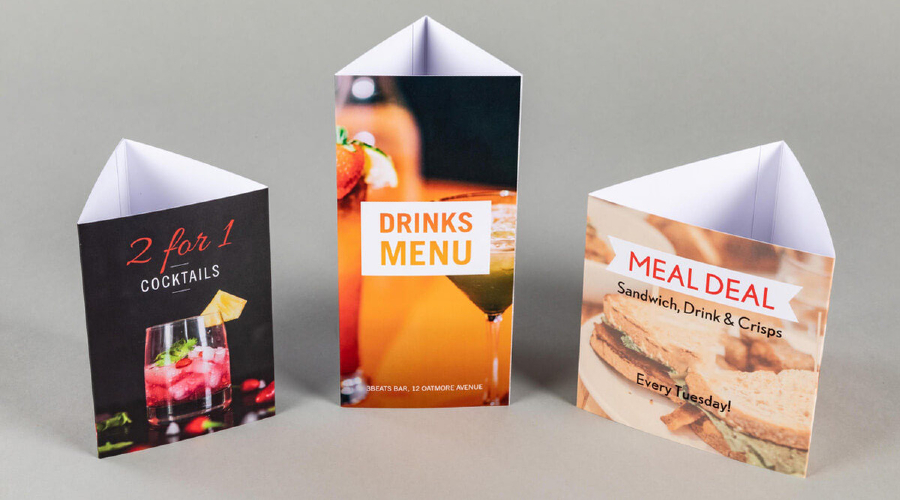
table talkers

Innovative Ideas for Using Table Talkers in Cafe

Table talkers, those mini billboards on your cafe tables, offer many possibilities beyond simply showcasing your menu or daily specials. With some creativity, these marketing tools can be used to engage customers, promote events, share testimonials, and more. 

Promoting events and special offerings

One creative use of table talkers is to promote upcoming events or unique offerings in your cafe. This could be a live music night, a special themed menu, a charity event, or a coffee-tasting session.

The table talker is an immediate and intimate channel to communicate these activities to your customers. When designed with eye-catching visuals and compelling text, it can generate interest and excitement among your patrons. It can encourage them to participate. On this page – Design Eye-Catching Vendor Display Stands- you will learn more about compelling designs you can use in your cafe to place and display table talkers.

Showcasing customer testimonials

Positive reviews and testimonials can be powerful marketing tool. Consider dedicating some of your table talkers to feature real customer testimonials. Not only does this strategy highlight the quality of your offerings, but it also builds trust and credibility.

For added authenticity, consider including the customer’s name (with their permission) and their picture. Testimonials that praise a specific menu item can be particularly effective, enticing other customers to try it.

Highlighting fun facts about your cafe

A table talker can also serve as an educational tool. Use it to highlight fun or interesting facts about your cafe. This could be the history of your cafe, information about the origin of your coffee beans. Even a brief explanation of the coffee brewing process would be suitable.

Fun facts provide a talking point for customers, enrich their visit with an educational aspect, and enhance their overall experience. The more a customer feels connected and knowledgeable about your cafe, the more likely they will return.

Introducing your team

Consider using table talkers to introduce your cafe’s team members to your customers. Sharing short bios or fun facts about your baristas or chefs can create a more personal and engaging environment. This approach builds a connection between your staff and customers, fostering a sense of community and improving customer loyalty.

Engaging customers with interactive content

Take your table talker strategy to the next level by incorporating interactive content. It could be a QR code that links to a survey for customer feedback. It could also be a mini-game. Or, for example, a quiz with a chance to win a free coffee or even a ‘did you know?’ fact section about coffee that changes regularly.

Interactive table talkers can create a memorable experience for your customers. They encourage them to engage more deeply with your cafe and return for more.

Conclusion

Table talkers present many opportunities to connect with customers, promote offerings, and create a unique cafe experience. These innovative ideas go beyond traditional advertising. They help your cafe to stand out from the competition and build a loyal customer base. Don’t underestimate the power of these mini billboards. With some creativity, they can be a game-changer for your cafe’s marketing strategy.

If you want to find more innovative and creative ideas about placing and displaying your table talkers, check out this article – Creative Possibilities with Digital Signage. There you will find more about ways to boost sales through unique furniture displaying and placing in your store.