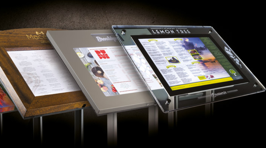
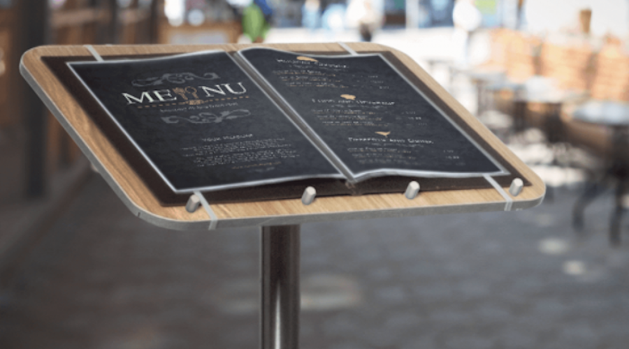
When operating a business on a bustling shopping street, attracting customers can be a competitive endeavor. One of your most potent tools is your outdoor menu display stand. These stands have a seemingly simple task: inform the public about your offering. But, the way you design and position them can have a profound impact on your success.
This article will walk you through various strategies to maximize the effectiveness of your outdoor menu display stands, ensuring they catch the eye and pique the interest of passersby.
Balancing aesthetics and readability
Creating an attractive menu that remains readable is a crucial balance that must be struck. Aesthetics can draw people in, but if your menu isn’t easy to read, potential customers may lose interest quickly.
When considering aesthetics, think about how the design reflects your brand. Use brand colors and incorporate your logo to create a cohesive look. However, ensure these elements don’t compromise readability. Use clear, legible fonts and maintain a good contrast between the text and background. For example, black text on a white background or white text on a dark background can improve visibility.
The power of color psychology
Colors evoke emotions and can subconsciously influence a person’s choices. Knowing color psychology can give you an edge in making your menu display stand more attractive and effective.
Research has shown that colors like red and yellow stimulate appetite, which is why they’re frequently used by fast-food chains. On the other hand, green can signify freshness and healthiness, which is ideal for salad bars or vegan restaurants. But remember, the colors should be consistent with your overall brand identity. The renowned ice-cream brand “Baskin-Robbins,” for example, uses a mix of blue (trustworthy, dependable) and pink (fun, youthful), reflecting their fun and trusted brand image.
Harnessing typography

Typography is another critical factor. The right typeface can communicate much about your business while enhancing readability.
If you’re running a classic Italian restaurant, a traditional Serif font may be a good fit, evoking a sense of tradition and elegance. If you’re operating a modern, trendy juice bar, a sleek, minimalist Sans Serif font could better reflect your brand. For instance, the logo of “Juice Press,” a popular organic food and beverage retailer, uses a modern sans-serif typeface that communicates a contemporary and clean feel.
Here are some more examples that illustrate the power of typeface choices:
- Starbucks: The Starbucks logo uses a custom-designed typeface, but it closely resembles the style of a Serif typeface. The typography conveys a sense of authority and tradition yet remains stylish and contemporary.
- McDonald’s: McDonald’s uses a customized version of Helvetica, a popular Sans Serif typeface known for its simplicity and readability. It mirrors the brand’s image of being straightforward, accessible, and universally recognizable.
- Chipotle Mexican Grill: Chipotle uses a slightly rustic and bold Serif typeface, which reflects their commitment to traditional cooking methods and high-quality ingredients.
- Subway: Subway’s logo uses a sans-serif typeface which conveys a modern, clean, and unpretentious image. It’s simple and easy to read, aligning with the brand’s straightforward and healthy offerings.
- Taco Bell: Taco Bell uses a bold, custom Sans Serif font, which reflects its fun, youthful, and innovative brand. The simplicity of the typeface also enhances readability.
- Burger King: The logo of Burger King uses a customized bubble Serif typeface. The rounded, playful letters reflect a sense of fun and approachability, aligning well with their target demographic of families and young people.
Each of these brands has carefully chosen typography that not only enhances readability but also helps communicate their brand story and connect with their target customers.
Mastering visual hierarchy
Visual hierarchy is the arrangement and presentation of elements in a way that implies importance. Mastering this in your menu can guide a customer’s eye and highlight your best offerings.
Start with the headline – the name of your establishment – it should be the largest text on the stand. List high-profit or signature items next, using a larger font size or distinct colors to attract attention. Keep other items grouped and categorized for easy readability. The “Steak n Shake” menu is a great example. The headline is prominent, and signature items like their “Original Steakburger” are highlighted in a visually distinct way.
The art of positioning
Once your menu design is perfect, the next challenge is positioning. The goal is to place your stand where it is most likely to draw attention.
A stand placed too far from the walking path may not get noticed, while one too close might obstruct pedestrian traffic. Place your stand where it is easily visible to both passersby and people from a distance. Also, consider the direction of sunlight during peak hours to avoid glare that could make the menu hard to read.
Leveraging local trends and culture
Understanding and embracing the local trends and cultural nuances can take your menu design from good to great. This strategy helps businesses establish a connection with the local audience, making your offerings more attractive and relatable to potential customers.
Local trends can span a range of aspects, from health trends to popular local ingredients, regional cuisine preferences, or even preferred dining styles. Paying attention to these trends can give you insights that can help you design a menu that resonates with your target audience. For instance, if your establishment is located in an area where people are particularly health-conscious, offering and highlighting vegan, gluten-free, or low-calorie options can make your business more appealing. If local produce or a particular cuisine is popular in your area, featuring those items can attract more customers.
Cultural preferences
Cultural preferences, on the other hand, can give your menu display a unique touch. If your business is located in an area with a strong cultural identity, incorporating elements of that culture into your design can make your menu stand out. For example, in a city like San Francisco, with a prominent Chinatown, using Chinese-inspired design elements such as traditional Chinese characters, colors (red and gold for good luck and prosperity), or even stylized representations of popular Chinese dishes can make your menu more appealing.
However, it’s crucial to approach this with sensitivity and authenticity, as misrepresentation can lead to negative reactions. The idea is to celebrate and respect the culture and trends of your local area, not to appropriate them. Remember, the goal is not only to reflect local trends and culture in the items you offer but also in the design of your outdoor menu display stand. A menu stand that reflects the local character and follows the latest local trends can draw attention, spark curiosity, and invite customers to step in and enjoy your offerings.
Testing and refining your display stand
One of the best strategies for optimizing your display stand is testing different versions and refining them based on results.
Try different color schemes, typography, and menu arrangements, and see which version attracts more customers. Collect customer feedback, if possible, to understand which elements of the display stand they find most attractive or engaging. This ongoing process of testing and refinement will ensure that your outdoor menu display stand remains effective and continues to drive customer interest and engagement.
Conclusion
In conclusion, crafting a successful outdoor menu display stand is an art that involves careful consideration of design elements and customer psychology. From striking the right balance between aesthetics and readability to leveraging color psychology, typography, visual hierarchy, and strategic positioning, each aspect plays a pivotal role in making your display stand effective. But remember, what works best can vary depending on the local context and target audience, so continuous testing, learning, and refining should be an integral part of your approach.