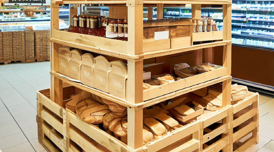
Wooden crate display stand

Wooden Crate Stands – Must-Have for Modern Bakeries

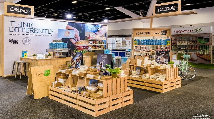
In today’s fast-paced digital world, where chrome finishes and sleek minimalism dominate modern retail design, one trend is quietly making a heartfelt comeback – wooden crate stands in bakeries. Rustic display elements are more than just charming to look at—they carry storytelling potential, emotional resonance, and marketing muscle that can transform how your bakery connects with customers.

You’re launching a boutique pastry shop or rebranding an established bakehouse, embracing the rustic revolution could be your sweetest decision yet. Let’s explore how wooden crate displays can enhance aesthetics, functionality, sustainability, and your brand story.

1. Tapping into nostalgia – emotional power of wooden displays

In an age dominated by sleek modernism, there’s a growing desire to reconnect with the past’s simplicity. Wooden crate stands in bakeries encapsulate this desire, offering a taste of nostalgia that resonates deeply with many customers.

●      Sentimental Appeal: For many, wooden crates evoke memories of farmer’s markets, homemade goods, and simpler times.

●      Example: Consider the artisanal bakeries that emphasize their history, showcasing black and white photographs of family recipes alongside wooden displays.

2. Rustic meets modern – visual contrast that captivates

Beyond nostalgia, wooden crate stands are aesthetically pleasing. They offer a touchable experience that’s visually captivating.

●      Texture & Color: Wood crates’ grain patterns and natural hues can provide a warm contrast to the glossy counters and tiles often found in bakeries.

●      Example: The juxtaposition of freshly baked, colorful macarons against the rustic, raw wood grain can enhance their appeal.

Creating an inviting bakery atmosphere

Ambiance plays an important role in customer experience. Include wooden elements in a bakery setting can craft a welcoming and vivid environment.

●      Holistic experience: Pairing the aroma of fresh bread with the sight of wooden displays can transport customers to a countryside bakery, creating an escape from the urban hustle.

●      Example: Bakeries like “Country Crust” utilize wooden crates for display and as wall shelves and light fixtures, creating an immersive rustic environment.

3. Functionality meets style – smart merchandising with crates

Aesthetics and nostalgia, wooden crate display stands are also lauded for their practical benefits.  They offer durable and versatile merchandising solutions.

●      Space optimization: Crates can be stacked, rotated, and rearranged quickly, allowing for dynamic displays.

●      Example: “Bread & Barrel” uses interlocking wooden crates to design custom display structures for different events and seasons. It ensures their layout remains fresh and engaging.

5. Telling a sustainable brand story

The choice of display materials speaks volumes about a brand’s ethos. Opting for wooden crates can send a strong message about sustainability, craftsmanship, and authenticity. Learn how to promote sustainability with eco-friendly display stands.

●      Sustainable: Wood, especially when reclaimed or sourced responsibly, is a sustainable choice. It signalizes a brand’s commitment to eco-friendliness.

●      Craftsmanship: Handcrafted crates echo the artisanal quality of baked goods, underscoring the skill and care invested in each product.

●      Example: “Green Grain Bakery” integrates its use of wooden crate display stands into its brand story, emphasizing its dedication to organic produce, traditional baking methods, and sustainability.

Elevate your bakery with rustic display stands

In the world of retail, where first impressions can make or break sales, wooden crate display stands offer bakeries a chance to stand out. They encapsulate a blend of nostalgia, beauty, functionality, and brand ethos, crafting an experience as delightful as the baked goods they showcase.

For more insights into a retail display, advertising trends, and brand strategies, refine your palate, and stay tuned to DisplayHype.com.
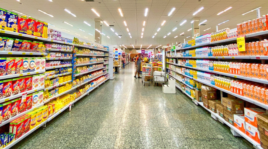
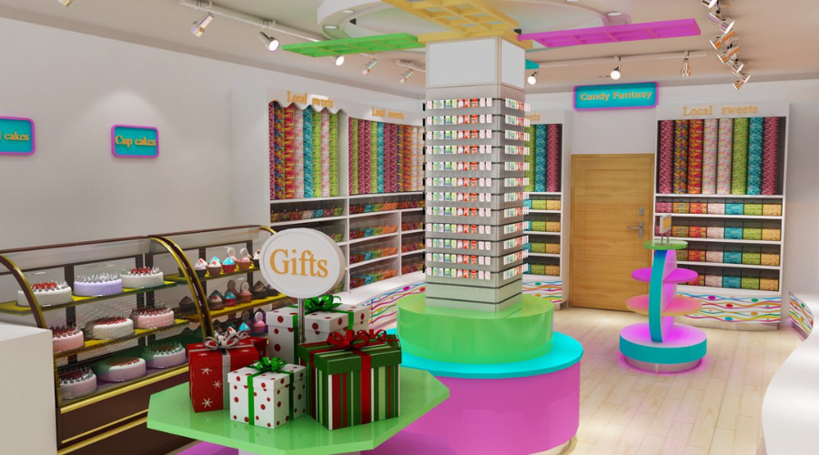
supermarket layouts boost sales

Optimizing Supermarket Layouts with Strategic Merchandising

Hello again, DisplayHype.com readers! Today we’ll explore the fascinating world of supermarket layouts and their impact on merchandising strategy. It is important for boosting sales, profit and customer satisfaction.

Understanding how to optimize a supermarket layout to facilitate maximum sales is critical. Today’s focus will be on precisely that subject.

The psychology of shopping

The psychology of shopping plays a huge role in influencing customer behavior. Strategic store layout and merchandise placement can lead to increased interaction with products, therefore higher sales.

For instance, most customers move counterclockwise around stores. Customers start their journey on the right side.

By placing new or high-demand products in these areas, retailers can increase their visibility and chance of purchase. Because consumers are more likely to look at eye-level shelves, placing higher-margin items there can boost sales.

Similarly, high foot traffic areas like checkout lines, entrances, and ends of aisles (endcaps) are prime real estate for promoting impulse buys or high-margin items. The layout can influence the pace at which customers move through the store.

Wider aisles typically encourage faster movement. Meanwhile narrower ones promote slower browsing. Remember, it’s not only about the layout but also strategic shelving in supermarket.

Positioning high-margin goods

High-margin items are the essential foundation of a retailer’s profit strategy. Their positioning in the store is critical. By placing these items at eye level, retailers can increase the possibility of selling them.

A great example is the cereal aisle. The more expensive, brand-name cereals are often found at eye level. Meanwhile, cheaper or store-brand options are positioned higher or lower on the shelf. It is known as vertical merchandising. It has a notable impact on propelling sales of high-profit items.

Stimulating impulse purchases

Spontaneous purchases are highly contributing to retail profits. These are typically small, inexpensive items that customers don’t necessarily need but might want to purchase spontaneously. Optimizing their placement can significantly increase sales.

Checkout lines are a classic example. It is where retailers place various small, often inexpensive items like candies, magazines, or novelty items. While waiting to pay, customers are more likely to impulse pick up one or two of these items.

Similarly, endcaps and promotional islands are also effective for impulse buys. These areas usually feature seasonal or promotional items that catch customers’ eye and spur unplanned purchases.

Using technology for layout optimization

With technology, retailers can take their layout optimization to a new level. Technologies like heat mapping can help identify high and low-traffic areas in the store. It can be instrumental in strategic product placement.

Data analytics can provide information on:

shopping patterns

customer preferences

the effectiveness of various merchandising approaches.

For instance, data may reveal that a particular endcap display is underperforming in terms of generating sales. Armed with this knowledge, the retailer can promptly adjust and modify the assortment or products being offered to improve results.

Important to keep changing your shop layout

Keeping your supermarket layout fresh is one of those small things that can make a big difference. Changing up the store’s setup every now and then can actually make the shopping experience a lot more interesting for your customers.

When things feel new, people pay more attention—and that often translates into more sales. For example, pallet display stands—those versatile setups for bulk items, seasonal goods, or special promotions—really benefit from a layout that isn’t set in stone.

Keeping customers interested

You know how it is when you walk into a store and everything looks the same as it did last time? It’s easy to just go on autopilot.

But when you shake things up a bit, customers start to notice different parts of the store, maybe even sections they’ve never explored before. This kind of subtle disruption can make shopping feel more like an adventure, which is exactly what you want.

People spend more time looking around, and who knows? They might just end up buying something they didn’t even know they needed.

The power of movable displays

Movable displays, like pallet dollies, are your best friends when it comes to keeping your store flexible. These displays are perfect for those high-margin items or last-minute impulse buys that you want to highlight.

The beauty of them is that they’re easy to move around—no heavy lifting required. This makes it super simple to adjust your layout based on where the foot traffic is, or to spotlight something seasonal or on sale. With these, you can keep your store looking fresh without much hassle.

Boosting impulse buys and smart product placement

When you regularly tweak the layout, it’s not just about keeping things interesting. It’s also a smart way to boost your sales.

Moving products around gives you the chance to put high-margin items or new arrivals in the spotlight—right where customers can’t miss them. And with movable pallet displays, you can experiment with different placements, see what catches people’s attention, and quickly adjust based on what’s working (or what isn’t).

It’s all about staying flexible and responsive to keep your store performing at its best.

Optimizing supermarket layouts

Optimizing supermarket layouts is both an art and a science, blending creativity with strategic analysis. It’s about understanding your customers, their shopping habits, and how to influence their decisions subtly.

By strategically placing high-margin items and impulse buys, using shopping psychology, and leveraging technology, retailers can boost sales and improve customer satisfaction.

Powerful visual hierarchy in a candy store

What is Visual Hierarchy?

One of the main design theories, known as the “visual hierarchy”, concerns how elements are organised to create an impression of value. It changes the way the human eye perceives information in terms of order.

Designers guide the viewer’s gaze by creating a hierarchy that indicates where to look first, where to look next and where to look last. This is crucial in any design work, including visual merchandising, window advertising, websites and posters.

This article provides useful tips and real examples for creating functional and aesthetically pleasing layouts. Those working in graphic design, digital marketing and other areas of visual communication will find it very useful to increase the impact and clarity of their work.

The basis of the visual hierarchy

A variety of design features can be used to create a visual hierarchy, including size, colour, contrast, alignment, repetition, proximity, white space, texture and style.

The basic concepts of visual hierarchy are:

Scale and size: Larger elements will attract more attention. They should be used to convey the most important information. For example, the band name is usually the largest text element in a music concert promotional poster.

Colour and contrast: The eye is drawn to bright or brilliant colours. A call-to-action button in a bold colour will be easy to spot on a website.

Alignment and proximity: objects that are parallel to each other appear connected. For clarity, for example, in a menu, items should be grouped together.

White space: White space can be used to emphasise certain features and create a sense of harmony.

Using the right design elements such as size, colour, alignment and white space can help you create a visually appealing and eye-catching composition.

Visual hierarchy used in advertising

As display advertising is usually only casually viewed by consumers, the aim is often to convey the message in a concise and effective way.

This is how the visual hierarchy works:

Headline: The headline, which conveys the main message, is usually the largest and most visible part.

Images: Relevant, high-quality images can immediately grab attention and convey the message faster than text.

Call to action (CTA): The call to action should include a clear, prominent, stand-out CTA such as ‘Buy now’ or ‘Learn more’.

Brand logo: The logo should not overshadow the main message, even if it is very important for brand awareness. For this reason, it is usually smaller and placed in a less prominent advertising position.

For example, an advertising headline introducing a new product can be the largest element of a display ad. This would be followed by an eye-catching product image, a smaller sub-headline with additional information and a CTA button in bold colour.

Visual hierarchy in visual merchandising

In visual merchandising, whether it’s a store layout or a window display, visual hierarchy helps guide the customer’s journey.

Window displays: The most eye-catching item, often the latest or most unique product, should be the focal point. This attracts customers. The other components should be listed in descending order of importance.

Store layout: Products that are most important to customers should be placed at eye level and in the most accessible route.

Signage: Smaller signage for individual items or lower priority items, larger signage for departments or high priority items.

For example, a clothing company may display the latest season’s assortment at the top of its window. Best-selling or high-margin items may be displayed at eye level inside the store, while sale items may be at the back of the store.

The structure of images in user experience (UX)

Visual hierarchy is a key aspect of user experience (UX) design. Good UX design relies heavily on visual hierarchy to be able to guide customers through the information flow and ensure a smooth and natural interaction with the product.

Eases navigation

A well thought-out visual hierarchy can make navigation easier. Users should be able to easily determine where to click next or where to look for certain content when reading a web page.

This can be done by creating a hierarchy that improves the flow of information on the page and directs the user’s gaze in the right directions. For example, web pages display the main content first, followed by the main navigation menu, the logo and the footer.

Improving readability

Readability is a fundamental part of user experience, and visual hierarchy contributes significantly to it. With the right use of typography—size, typeface, color, line spacing, etc.—important content can be highlighted.

It makes it easier for users to scan through the text and find the information they need. The typographical hierarchy, designed to promote readability, includes headings, subheadings, paragraphs and captions.

User behaviour management

The visual hierarchy of design also influences user interaction. Links and buttons that prompt users to perform actions (CTAs) should be clearly visible. This way, users understand where to click to perform specific tasks. For example, to draw users’ attention to the sign-in button, it can be placed larger and coloured better.

Improving the content structure

A well-designed visual hierarchy gives content an organisational structure by breaking it down into clear sections and arranging them in a logical sequence. This could include grouping related content and identifying individual sections using grids, spacing and alignment.

Reducing mental burden

A high visual hierarchy reduces the cognitive load of users. Instead of presenting a lot of information at once, designers can use visual hierarchy to convey information in order of importance. This makes the user interface easier to use and less intimidating.

UX design examples

The Google search results page is a great example of an effective visual hierarchy for UX design. The search bar stands out the most. The search results appear next, which are further organised with the URL in a smaller style and the page title in a larger style.

Less contrasting colours should be used, advertisements and other irrelevant data should be placed in the margin. Overall, the visual hierarchy greatly improves the user experience.

Designers can create interfaces that are not only aesthetically pleasing. But also successfully help users achieve their goals by carefully arranging and emphasising specific functions.

Visual hierarchy – fundamental principle in design

Visual hierarchy is a fundamental principle in design that plays a crucial role in how effectively we communicate our messages. That way you can draw the audience’s attention to the most important elements first. It ensures that the intended message delivers appropriately. When choosing what to display in an online shop, what product to place online or what message to emphasise in an advertisement, the visual merchandising will be crucial. Mastering it will, therefore, help any designer or marketer to become more successful in their work.If you found this article helpful, you might want to check out this blog – Key Principles for Eye-Catching Design. There you will find more information about the importance of visuals and the principles that makes furniture eye-catching.

vendor display stands

How to Design Eye-Catching Vendor Display Stands

In today’s crowded retail world, getting noticed is tougher than ever. But there’s a trick to standing out—creating vendor display stands that are not just visually appealing but also true to your brand.

Whether it’s a mobile pallet display stand or something more traditional. The goal is the same – draw people in, tell your brand’s story, and make shopping a little more fun. Check out another article – Innovative Ideas for Using Table Talkers in Cafe

Why looks matter?

Let’s be real—first impressions count, especially in retail. In a sea of products, your display needs to grab attention right away. This is where smart use of colors, layouts, and eye-catching visuals comes in.

When done right, these elements can turn a casual browser into a customer. And if you’re using something flexible like mobile pallet display stands, you’ve got the added bonus of being able to move things around to keep the shopping experience fresh.

First impressions

To get a customer interested, you’ve got to catch their eye first. A well-thought-out display can do that job silently, inviting shoppers to come closer and explore.

The more attractive your setup, the better the chance they’ll stop and take a look. Mobile pallet display stands are great for this because you can place them in high-traffic spots, ensuring they get noticed.

Creating a shopping experience

A good vendor display does more than just look nice—it makes shopping an experience. With online shopping being so convenient, physical stores need to offer something extra.

A visually interesting display can create a sense of discovery, making shopping in person more enjoyable. And since mobile pallet display stands can be moved and rearranged, they help keep your store layout exciting for repeat customers.

Key design tips

Designing a standout display means thinking about where it goes, what it looks like, and how well it represents your brand. Here are some simple tips to keep in mind:

1. Keep it simple

When it comes to display design, less is often more. A clean, straightforward setup lets customers quickly see what you’re offering without feeling overwhelmed.

This is especially important for mobile pallet display stands, where simplicity makes them easier to move and set up.

2. Use the rule of three

There’s a reason designers love the rule of three—things grouped in odd numbers just seem to look better. You can use this trick in your display by arranging products or visual elements in groups of three.

It’s a simple way to make your setup more appealing, particularly with mobile pallet display stands.

3. Balance and proportion

Balance is key in any design, and your vendor display is no different. Think about how the size and placement of products and design elements work together.

A balanced display is naturally pleasing to the eye and will draw people in. The good news is that mobile pallet display stands are pretty flexible, so you can easily adjust them to keep everything looking just right.

Brand identity is key

Your display should scream your brands identity—through colors, fonts, and images that tell your story.

Colors

Colors have a big impact on how people feel. Picking a color scheme that matches your brand can help create a strong visual identity and set the right mood for your shoppers.

With mobile pallet display stands, you can easily customize them with your brand’s colors, keeping everything consistent.

Typography

The font you choose speaks volumes about your brand. Whether you go for something bold and big or delicate and cursive, make sure it matches your brand’s personality.

Using your brand’s typography on mobile pallet display stands helps reinforce your brand’s look and feel.

Imagery

Images can say a lot about your brand. Whether it’s product photos, lifestyle shots, or abstract designs, the imagery should connect with your audience.

And with mobile pallet display stands, you’ve got the option to switch out images as often as you like, keeping things fresh and relevant.

Brands that get it right

Some brands really know how to create a great vendor display:

Apple: Apple’s minimalist displays are all about simplicity, focusing on the product with lots of clean, white space.

Lush: Lush Cosmetics goes bold with colors and visuals, creating vibrant displays that encourage customers to touch and explore.

Anthropologie: Anthropologie is known for its creative, often handmade displays that tell a story and spark curiosity.

Getting interactive

Adding interactive elements or tech to your display is a great way to engage customers even more.

Interactive elements

Interactive displays invite customers to get hands-on with your products. Whether it’s a “try me” sign or a demo area, these elements can make the shopping experience more engaging.

Mobile pallet display stands work well for creating these interactive zones, giving you the flexibility to move them around as needed.

Digital technology

Incorporating digital technology into your vendor display stands can elevate the shopping experience. Whether it’s a touch screen, digital price tags, or even augmented reality, these features can provide extra product info or create an immersive experience.

Mobile pallet display stands with digital screens are a versatile option for delivering this kind of dynamic content.

Final thoughts

Designing eye-catching vendor display stands—especially mobile pallet display stands—is all about creativity, functionality, and staying true to your brand. A great display doesn’t just look good—it tells your story, enhances the shopping experience, and ultimately boosts sales.

So, think of your display as a silent salesperson, one that should be just as convincing as your best pitch!

For more tips and ideas on how to create effective vendor displays and boost your store’s revenue, check out our other articles. They’re full of insights to help you make the most of your retail space.

outdoor menu display stand variants

Maximizing Effectiveness of Outdoor Menu Display Stands

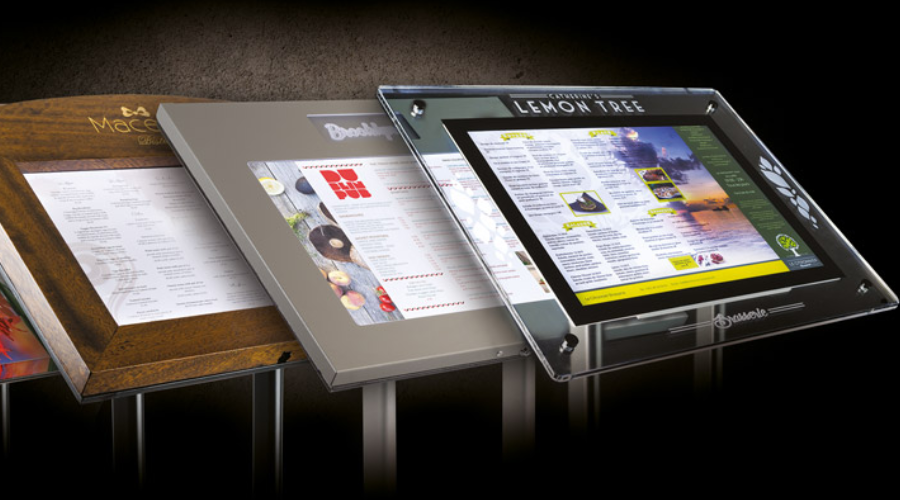
Attracting customers can be a challenge for a business owner on a busy retail shelving route. Your outdoor menu stand is one of your most powerful weapons. The purpose of these stands is simple – to tell people about what you have to offer.

But how you arrange and display them can make a big difference to how successful they are. In this article, we’ll take you through the different ways you can use your outdoor menu boards to make sure they attract customers.

Balancing aesthetics and readability

The key balance to strike is to create a menu that is attractive but at the same time readable. While aesthetics can attract customers, if your menu is difficult to understand, they may quickly get bored.Consider how your brand is reflected in the design while assessing aesthetics. To achieve a unified look, use your logo and brand colors. Be sure, nonetheless, that these elements don’t detract from reading. Make sure the text and background have a strong contrast and use readable typefaces. For better visibility, try using black text on a white backdrop or white text on a dark background.

The power of color psychology

Colors evoke emotions and can subtly influence a person’s choices. Knowing the psychology of color will help you create a more appealing and impactful menu.

Fast food companies often use colors such as red and yellow because studies have shown that these colors increase hunger. In contrast, green can symbolize health and freshness, which is great for salad bars and vegan eateries.

But keep in mind that colors should complement your brand’s overall aesthetic. For example, the well-known ice cream company Baskin-Robbins reflects its happy and trustworthy brand image by combining pink (young and cheerful) and blue (reliable and trustworthy).

Harnessing typography

Typography is another critical factor. The right typeface can communicate much about your business while enhancing readability.

If you’re running a classic Italian restaurant, a traditional Serif font may be a good fit, evoking a sense of tradition and elegance. If you’re operating a modern, trendy juice bar, a sleek, minimalist Sans Serif font could better reflect your brand. For instance, the logo of “Juice Press,” a popular organic food and beverage retailer, uses a modern sans-serif typeface that communicates a contemporary and clean feel.

Here are some more examples that illustrate the power of typeface choices:

Starbucks: The Starbucks logo uses a custom-designed typeface, but it closely resembles the style of a Serif typeface. The typography conveys a sense of authority and tradition yet remains stylish and contemporary.

McDonald’s: McDonald’s uses a customized version of Helvetica, a popular Sans Serif typeface known for its simplicity and readability. It mirrors the brand’s image of being straightforward, accessible, and universally recognizable.

Chipotle Mexican Grill: Chipotle uses a slightly rustic and bold Serif typeface, which reflects their commitment to traditional cooking methods and high-quality ingredients.

Subway: The sans-serif typeface used in the Subway logo is modern, clean and casual. It’s easy to read and simple, in keeping with the brand’s uncomplicated and healthy offerings.

Taco Bell: Taco Bell’s distinctive, bold sans-serif typeface perfectly reflects their vibrant, young and inventive brand. The simplicity of the font further enhances readability.

Burger King: The Burger King logo uses a specially designed bubble serif font. The pleasant, approachable atmosphere of the rounded, playful typefaces perfectly suits their target audience – young people and families.

Each of these companies has used a carefully selected typography to improve readability, connect with their target audience and tell their brand story.

Mastering visual hierarchy

The arrangement and presentation of objects in a visual hierarchy creates a sense of importance. By doing so, you can draw the customer’s attention and attract attention to the best items on your menu.The name of your organization, which should be the largest lettering on the stand, should be the main headline. Next, include high-margin or branded items. Use larger font sizes or bold colors to attract attention. Arrange and group the other items to make them easier to read. One such example is the Steak n Shake menu. Signature dishes such as the ‘Original Steakburger’ are visually striking and the headline is large.

The art of positioning

Once the menu design is perfect, the next difficult task is its placement. The aim is to place the stand where it is most likely to attract attention.

Too far a distance from the footpath can make the stand invisible, while too far a distance can make it difficult for people to walk. Position the stand so that passers-by and others looking from a distance can easily see it. Take into account the direction of sunlight to avoid glare, which can make it difficult to read the menu at peak times.

Leveraging local trends and culture

Using regional customs and trends can take your menu design to a whole new level. By connecting with the local market, businesses can make their offer more attractive and appealing to potential customers.

Local trends can include everything from health fads to popular local foods, tastes in specific cuisine regions to favorite ways to eat. Observing these trends can provide you with valuable information that will help you create a menu that will appeal to your target market.

For example, offering and emphasizing vegan, gluten-free or low-calorie alternatives can increase the appeal of your business if it is located in a region with a highly health-conscious population. If a particular cuisine or locally grown product is popular in your community, serving it will attract more consumers.

Cultural preferences

However, cultural tastes can add a special touch to the look of your menu. Your menu stands out if you incorporate cultural elements into the design, especially if your establishment is located in an area with a strong sense of identity.

Chinese-inspired design elements such as traditional Chinese symbols, colors (red and gold for good luck and prosperity) or even stylized images of popular Chinese dishes can add to the appeal of your menu. Especially in a place like San Francisco where there is a significant Chinatown district.

But it is very important to do so honestly and with understanding, as deception can cause a backlash. Instead of copying local customs and culture, the aim is to respect and enjoy them. Remember that the aim is to promote local customs and flavors not only in the menu on offer, but also in the design of your outdoor food stall.

A menu stand that reflects the spirit of the neighborhood and is in line with current trends can attract interest. Capture attention and entice customers to stop and use your goods.

Testing and refining your display stand

Testing multiple versions and making changes in response to feedback is one of the best ways to optimize the display stand’s capabilities. Find out which menu layout, style and color scheme attracts the most customers.

If possible, get feedback from customers to find out which aspects of the display stand they find most attractive or interesting. Your outdoor menu stand will be effective and will continue to generate interest and engagement from visitors through this ongoing process of testing and refinement.

Create an effective outdoor menu board

Overall, both consumer psychology and design elements need to be carefully considered in order to create an effective outdoor menu board. Each element is crucial to make your presentation stand out.

From the psychology of color, typography, visual hierarchy and thoughtful use of layout to finding the perfect balance between readability and aesthetics. Bear in mind, however, that the optimal strategy may vary depending on the target audience and local conditions, so constant testing, learning and refinement should be an essential part of your approach.

android tv digital signage

Creative Possibilities with Android TV Digital Signage

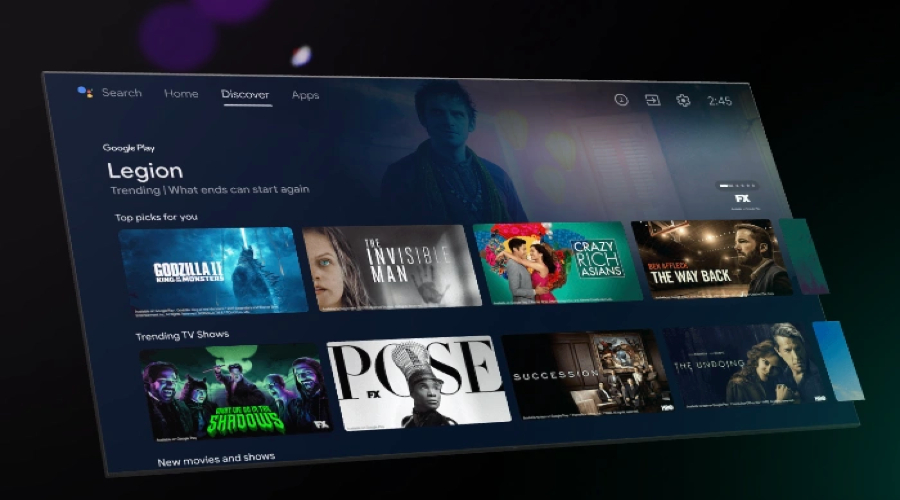
Companies are always looking for new and creative ways to engage their audiences in this age of digital transformation. With the diverse digital signage possibilities offered by Android TV, businesses can create dynamic, vibrant displays that inform and engage audiences.

In this article, we will look at how businesses can use Android TV’s features for digital signage.

Crafting visually appealing displays

One of the first steps to effective digital signage is to create visually appealing displays. Android TV supports high-resolution material, which allows you to create bright, clear and highly detailed displays. This tool allows businesses to showcase visually stunning and high-quality photos and videos.

For example, a retail business can showcase its products in high-definition clarity to attract more customers. A restaurant can show images of food melting in the mouth to whet customers’ appetites. When designing displays, never forget the importance of considering your brand’s aesthetics. Use typefaces and colors that are representative of your brand and try to create the same ‘feel’ that it does.

Integrating multimedia content

Digital signage can be made more dynamic and attractive by combining it with other media. Android TV supports many types of media, including photos, videos, web content and live broadcasts. You can include different media formats to make your content more interesting and engaging.

For example, fitness centre digital signage can show real-time class schedules, inspirational quotes, workout videos and wellness tips. Films, slideshows, live news feeds and interactive polls are some types of corporate office displays.

With multimedia content, you can address a wide range of audience interests and preferences and engage them on multiple levels. In addition, it enhances the visual appeal of your digital signage.

Utilizing real-time updates

Updating the content of the digital signage is essential to maintain the interest of viewers while providing relevant and timely information. With Android TV, you can access real-time updates to ensure your content is up-to-date. This can include showing real-time data from your company’s social media channels, or even live news or weather updates.

For example, a hotel can show live visitor reviews, weather forecasts for well-known tourist locations and real-time room availability. Conversely, a retail business may show instant sales offers or real-time stock levels to create a sense of urgency and encourage purchases.

Providing real-time updates improves your audience’s experience and perception of your business by giving them up-to-date and relevant information while keeping your content fresh.

Eye-catching and fashionable digital signage

With Android TV, businesses can create vibrant, eye-catching and fashionable digital signage thanks to the many creative possibilities. With real-time updates, a variety of media and eye-catching images, businesses can create digital signage that truly engages and resonates with audiences.

In an increasingly digital world, making the most of these opportunities can set your business apart and give you a major competitive advantage. If you enjoyed reading this post, don’t forget to visit DisplayHype.com for more tips on branding, merchandising and advertising.

TVs displays

TVs Displays for Advertising Screens

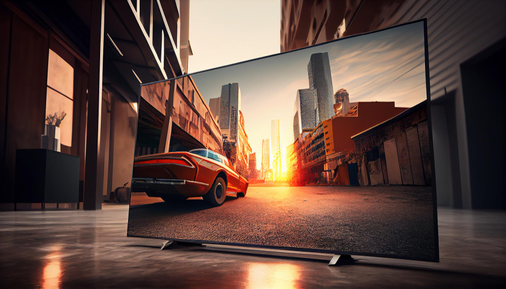
In an age where digital advertising has taken center stage, TVs displays as advertising screens have become a powerful tool for businesses. So they offer a dynamic and engaging way to showcase products and services, especially in public places and high-traffic dining establishments.

Understanding the shift towards more interactive and visually appealing advertising methods. In this article provides an in-depth insight into the features needed to use TVs displays as practical advertising tools.

We will look at the best TV models that excel in this role, each with unique features to suit different advertising needs. And in addition, we’ll delve into the latest trends in promotional displays, offering insights that resonate with tech-savvy audience.

Functionality requirements for advertising TVs displays

When choosing a TV set for advertising purposes, consider the following essential features:

High brightness and contrast: Screens should be bright enough to be visible in various lighting conditions. A high contrast ratio ensures content stands out, making it more visible to the audience.

Durability and reliability: These TVs displays often run for extended periods, sometimes 24 hours a day, seven days a week. But they must, therefore, be designed to withstand continuous use without compromising performance.

Connectivity: Modern promotional TVs should have multiple connectivity options, including HDMI, USB, and Wi-Fi, allowing easy content updating and integration with different content management systems.

Flexible display options: So businesses should look for TVs with flexible display settings such as portrait or landscape orientation, split-screen options, and customizable layouts to suit different content types and spaces.

Remote management: TVs with remote management capabilities allow businesses to update and control content from a central location, improving operational efficiency.

Understanding these key features will help you choose a TV that displays your content and enhances its impact on your audience.

Top TVs displays models for advertising screens

Here’s a closer look at some of the best TV digital display menu models for advertising, for example:

Samsung QLED series: These TVs feature Quantum Dot technology for outstanding color accuracy and high brightness levels. They are ideal for bright, intensely lit rooms to attract attention in well-lit environments.

LG OLED series: LG OLED TVs are renowned for their deep blacks and infinite contrast, ensuring that content stands out even in dark environments. Wide viewing angles make them suitable for spaces where viewers are spread out.

Sony Bravia LED Series TVs: With Sony’s reputation for reliability and outstanding picture quality, their Bravia LED Series is the perfect choice for long-lasting use in public spaces. Their X-Reality PRO enhances every pixel to ensure clarity.

TCL Roku TV: TCL Roku TVs offer an outstanding balance between quality and affordability for businesses on a budget. Thanks to the integrated Roku platform, content management is simple and user-friendly.

Each model offers unique benefits, allowing businesses to choose based on their specific advertising objectives and budget constraints.

Trending in advertising TVs displays

Interactive and intelligent features are at the forefront of advertising display trends 2024. Here are some highlights:

Touchscreen capabilities: Touchscreen TVs displays are becoming more common, enabling interactive ads where customers can engage directly with the content.

Motion sensors and facial recognition: These features allow the display to change content based on audience engagement or demographics. Providing a more personalized advertising experience.

AI-driven content management: AI algorithms can analyze customer data and automatically adjust advertising content to target specific audiences. Increasing the effectiveness of marketing campaigns.

Incorporating these trends can create more engaging and impactful advertising experiences. Allowing companies to stay at the forefront of digital marketing innovation.

Stepping into a new era of digital advertising

However, with the development of digital display technology. It is becoming essential for companies to choose the correct TV set for their advertising. But from the high-end Samsung QLED to the budget-friendly TCL Roku TV. Each model offers unique features to suit different advertising needs.

So using these technologies raises the profile of your products and services and engages customers in new and exciting ways. For more comprehensive guidance on choosing technology. Visit our detailed guide on choosing a PC, and for caterers, check out the innovative menu options of digital displays.

Stay informed and updated with displayhype.com is your trusted source for the latest technology, computers, and phones.

Please check out these articles too:

Maximizing the Effectiveness of Outdoor Menu Display Stands

Immersive Brand Experience with Showroom Display Stands

solar battery kiosk

Mobile Phone Charging Kiosks: Harnessing Solar Power for Modern Convenience

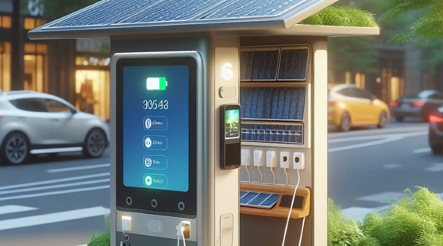
Imagine strolling through a bustling city, and your smartphone’s battery is running low. Rather than searching for an elusive power outlet, you stumble upon a sleek kiosk adorned with solar panels. Solar-powered kiosks provide a quick power boost and do so sustainably.

In this article, we’ll explore what these solar-powered kiosks are, why they’re on the rise, their technological underpinnings, and their standout features.

The rise of solar-powered charging kiosks

As environmental consciousness grows, the demand for sustainable solutions is rising. Solar-powered charging kiosks epitomize this trend by harnessing the sun’s energy to keep our devices charged. They offer a convenient way to recharge on the go while reducing our carbon footprint.

Solar charging kiosks have high-efficiency solar panels that convert sunlight into electricity. This clean energy is stored in batteries for later use. It ensures a continuous power supply even during cloudy days or nighttime.

Standout Features:

Environmentally Friendly: Solar charging kiosks reduce reliance on non-renewable energy sources, contributing to a greener planet.

Accessible Locations: These kiosks are strategically placed in high-traffic areas like parks, airports, and shopping centers, providing easy access to charging facilities.

User-Friendly: Most solar-powered kiosks offer various charging connectors, accommodating multiple devices, including smartphones, tablets, and laptops.

How solar-powered charging kiosks work

Solar charging kiosks are a marvel of technology, blending solar power generation, energy storage, and user-friendly design.

Here’s a simplified breakdown of how they work:

Solar Panels: Photovoltaic panels capture sunlight and convert it into electricity.

Energy Storage: Energy generated by the solar panels is stored in batteries, ensuring a constant power supply.

Charging Ports: Kiosks have various charging ports and cables to accommodate different device types.

User Interaction: Users can plug in their devices, select the desired charging option, and monitor the charging progress.

Standout Features:

Quick Charging: Solar kiosks offer fast charging to minimize user waiting times.

Remote Monitoring: Operators can remotely monitor the kiosk’s performance, ensuring it’s always in working order.

Advertising Opportunities: Some kiosks incorporate digital screens for advertising, making them financially sustainable for businesses.

Examples and applications

Solar-powered mobile phone charging kiosks are making their mark across the globe. In New York City’s parks, sleek kiosks provide eco-friendly phone charging options to park-goers. In London, the iconic red phone booths are transformed into solar charging stations. That way they preserve the historic charm while embracing modern technology.

These kiosks are typically connected to a central network for efficient management and monitoring. Operators can track usage, troubleshoot issues, and even schedule maintenance remotely.

Smart charging and IoT integration

As technology advances, solar-powered charging kiosks become smarter and more integrated with the Internet of Things (IoT). Smart kiosks can offer personalized charging experiences, allow users to make payments, and provide valuable data insights to operators for improved efficiency.

IoT-enabled solar kiosks can collect data on user behavior, energy generation, and even environmental conditions. This data is helpful to optimize kiosk placement and functionality.

In conclusion

Solar-powered mobile phone charging kiosks represent a harmonious mix of technology and sustainability. They offer a practical solution to our ever-present need for power while reducing our environmental impact. As the world continues to embrace renewable energy sources, these kiosks are poised to become even more prominent in our daily lives.

So, the next time you’re out and about, watch these innovative charging stations, and make the most of the sun’s energy to keep your devices powered up sustainably.

displaying bags

The Elegance of Displaying Designer Bags

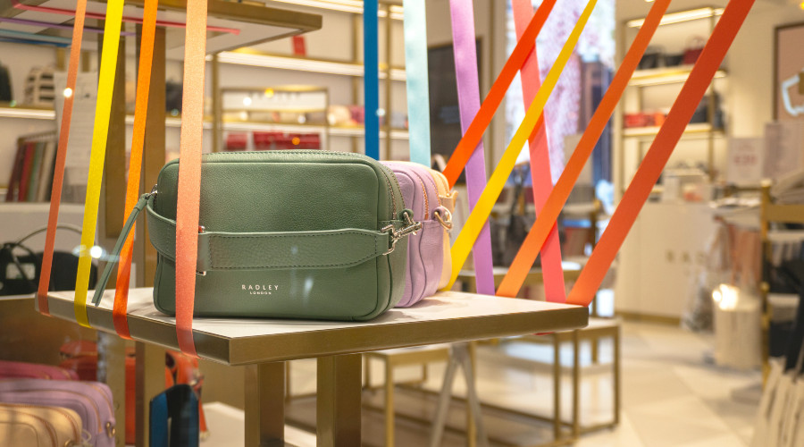
The luxurious allure of a designer handbag isn’t just in its craftsmanship or brand prestige. It’s in the way it’s presented. Much like artwork in a museum, the right bag display can amplify their desirability and perceived value.

Previously we discussed table top display stands for boutique space. Now it’s time to delve into the world of product displays tailored for the exclusive designer handbag sector. For retailers, especially those in the high-end spectrum, display choice is crucial.

The role of presentation

Every designer handbag is a piece of art. Thus, how it is showcased must not only protect its integrity but also augment its appeal. It’s not just about being functional. It’s about creating a visual narrative.

Functional aspects:

Protects bags from potential damage and ensures easy access for staff and customers.

Aesthetic aspects:

Enhances the beauty of the bag.

Showcases its unique features.

Aligns with the store’s overall theme.

Choosing the right bag display stand

When walking into a store, the first impression often lasts. This impression isn’t just shaped by the products on offer. It also matters how they’re displayed. A thoughtfully chosen display stand can elevate the inherent beauty of designer bags, providing both a practical and aesthetically pleasing platform for them.

Options to consider:

Freestanding displays: Ideal for showcasing a collection or a particular brand’s range.

Shelved displays: Perfect for a varied collection, allowing bags to sit side by side without overcrowding.

Wall-Mounted racks: A space-saver and a visually appealing option for limited spaces.

For a more in-depth look, consider visiting bag display stand for specific designs tailored to your needs.

Lighting

Lighting isn’t just about visibility. It’s an art form. The right kind of lighting can create moods, emphasize details, and even influence purchasing decisions. When combined with a perfect bag display, it plays an integral role in showcasing the true beauty and craftsmanship of designer bags.

Best lighting for bags:

Focused spotlights: Ideal for highlighting textures, colors, and intricate details of each bag.

Ambient lighting: Softens the overall ambiance of the store, making shopping a relaxed experience.

Bag display costs

Investing in your store’s display and ambiance is as critical as curating your products. Yes, it’s important to ensure the display resonates with the luxury and elegance of designer bags. But it’s equally important to balance quality and budget to achieve an optimal return on investment.

Display stands and racks: Prices can range from a few hundred to thousands, depending on material and craftsmanship.

Lighting: Depending on the type and brand, lighting setups can range from affordable to high-end.

Latest trends

With evolving design aesthetics and technological advancements, the realm of product displays is constantly adapting.

From sustainable materials to interactive displays, the world of handbag showcases is getting a trendy makeover.

Conclusion

At the heart of every successful designer handbag shop is the unsung hero: the display stand. While the handbags are the stars, it’s the stage they’re set upon that truly makes them shine.

Whether you’re an enthusiast browsing through clothing or a retailer setting up shop, understanding the interplay between product and presentation is essential. Explore, invest wisely, and watch as the world is drawn to the allure behind your display.

Don’t forget to read our other articles:

Maximizing Space and Sales Gondola Display Stands

Immersive Brand Experience with Showroom Display Stands

sustainable brochure stands

Eco-Friendly Materials for Brochure Stands

The environmental consciousness of consumers has significantly shifted in recent years, compelling businesses to adapt their practices for a greener tomorrow. But sustainable practices aren’t limited to just the products you sell or the energy you consume. They can be embedded in all facets of your business, right down to your merchandising.

Today, let’s explore the various eco-friendly materials available for constructing sustainable brochure stands. How they compare in durability, aesthetics, and, most importantly, environmental impact.

Importance of eco-friendly brochure stands 

In an age of increasing environmental awareness, businesses are re-evaluating every aspect of their operations, from sourcing to sales. While digital advertising continues to grow, brochures remain essential in disseminating information and attracting potential customers, especially in physical retail spaces. Making eco-friendly choices in this aspect can bolster your company’s green credentials and resonate strongly with a consumer base increasingly concerned with sustainability.

The materials used in manufacturing brochure stands often include plastics or metals, which have a notable environmental impact regarding resource extraction and end-of-life disposal. By opting for eco-friendly materials, you can drastically reduce the carbon footprint of your display solutions, align your brand with sustainable practices, and potentially attract environmentally conscious consumers.

Bamboo – the top choice

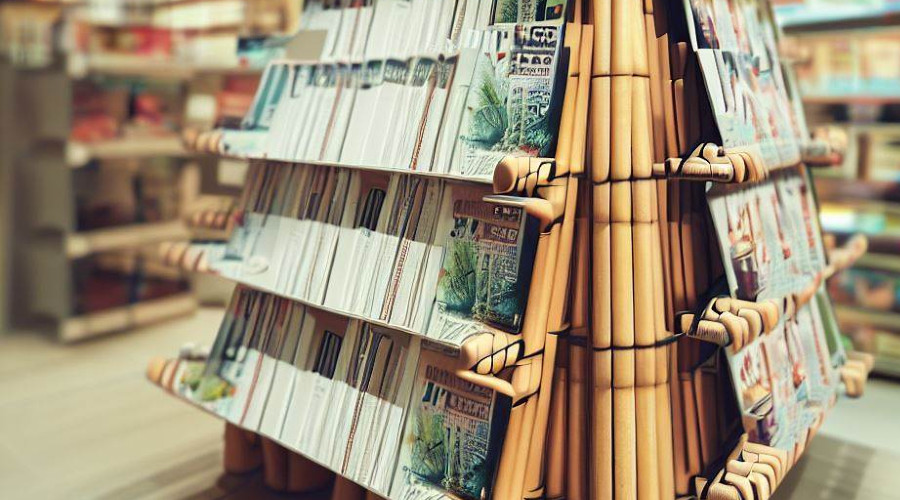
When it comes to eco-friendly materials, bamboo tops the list for several reasons. It’s not just about its natural aesthetic that adds a unique flair to your retail space. It’s also about its rapid growth and renewability.

Bamboo can grow up to three feet in just a single day. Furthermore, they can be harvested without killing the plants, making it a highly renewable resource. When used in brochure stands, it offers excellent durability and strength compared to traditional hardwoods. Moreover, bamboo stands can be easily disassembled and recycled, adding another layer of environmental responsibility to its use. Some popular brands offering bamboo brochure stands include GreenBoo and EcoDisplay.

Using recycled metals

Metal stands are famous for their durability and sleek, modern appearance. However, the mining and refining new metals can have devastating environmental consequences. Enter recycled metals—a sustainable alternative that does not compromise on strength.

Recycled aluminum and steel stands are increasingly popular. They provide the same durability and modern aesthetic without the high environmental cost. Using recycled metals can reduce greenhouse gas emissions and conserve energy and natural resources. Brands like EcoMetalStands offer a variety of designs that are as chic as they are sustainable.

Using bioplastics for sustainable brochure stands

Plastics are often demonized for their environmental impact. However, not all plastics are created equal. Bioplastics offer a greener alternative to renewable resources like cornstarch or sugarcane.

Bioplastics are emerging as a promising material for sustainable brochure stands, as they offer traditional plastics’ flexibility and lightweight properties without the associated guilt. Depending on the type of bioplastic used, these stands can be composted or recycled, thus offering a more responsible end-of-life option. Companies like GreenStand offer brochure holders made entirely of bioplastics.

Using matching materials

Selecting the right material for your sustainable brochure stands is not solely an environmental decision. It’s also a brand decision. Your choice of material can say a lot about your brand identity and values, creating a cohesive and authentic customer experience.

For instance, bamboo may align more with natural, organic brands, while recycled metals may suit tech-savvy, modern businesses. Bioplastics could be an ideal match for innovative brands looking towards the future. Hence, when choosing materials, consider how they align with your brand’s aesthetic and values.

Conclusion

Promoting sustainability can be a manageable task. Even small changes – like opting for an eco-friendly brochure stand – can make a meaningful difference in your brand’s overall environmental impact. 

As consumer awareness around sustainability grows, your commitment to eco-friendly practices won’t just be good for the Earth. It could also be a strategic business decision differentiating you from the competition. So, consider going green next time you want to revamp your retail space or trade show booth. It’s a choice that pays off in more ways than one.

gondola display stands

Maximizing Space and Sales Gondola Display Stands

Greetings, DisplayHype.com aficionados! Mastering your store layout can be a game-changer in merchandising, brand awareness, and advertising. Specifically, understanding the intricacies of gondola display stands configuration can transform your store from a simple shopping venue into a highly optimized sales-driving machine. 

Let’s explore the strategies and nuances that can elevate your gondola displays and supercharge your sales.

The potential of end caps

End caps serve as the retail equivalent of a billboard on a busy highway. These spots are at the end of gondola aisles and are prime real estate for showcasing products. Well-designed end caps can attract customer attention, drive spontaneous buying decisions, and greatly boost sales.

End caps should be strategically utilized to showcase your high-margin items, best sellers, or new arrivals. The idea is to grab attention and incite interest immediately.

The most effective end caps are dynamic and regularly updated based on:

seasons

promotions

weekly customer behavior analytics.

For instance, supermarkets often transform end caps into thematic showcases. Such as displaying BBQ essentials during the summer months or cookie-making ingredients around the holidays.

Effective shelf arrangement

Vertical space within gondola display stands is more than just an area to fill with products. The arrangement of each shelf and the specific placement of products on those shelves can substantially influence customer perception and purchasing behavior.

The conventional wisdom of “eye level is buy-level” still holds. Place your most profitable or critical items at the customer’s eye level to maximize visibility and sales. But the equation continues beyond there. Accessibility is crucial for lower shelves, making them ideal for bulk or heavy items. While the higher shelves can be reserved for less frequently purchased or specialized products. For example, children’s favorite toys might be placed at their eye level in a toy store. Meanwhile adult-oriented board games and hobby kits could be found on higher shelves. Furthermore, you can learn how to optimize supermarket layout.

Understanding product grouping

The art of product grouping dives into the subtle psychology of how customers perceive and relate to products displayed near each other. The purposeful grouping of items can significantly impact the sales of individual products and the likelihood of cross-selling and upselling.

Naturally, complementary products should be placed near each other to encourage combined purchases. Moreover, understanding the customer’s journey through the store allows for a hierarchical arrangement of products. Essentials can be positioned at the beginning of the aisle, gradually leading up to impulse buys or luxury items towards the end. In a grocery setting, you might find that pasta is conveniently placed next to pasta sauce near Parmesan cheese, inviting customers to purchase all three.

Understanding product grouping is more nuanced than just placing complementary items beside each other. Let’s delve deeper into various techniques that can guide your product placement strategy, enhancing both the customer experience and your sales metrics.

Zone design

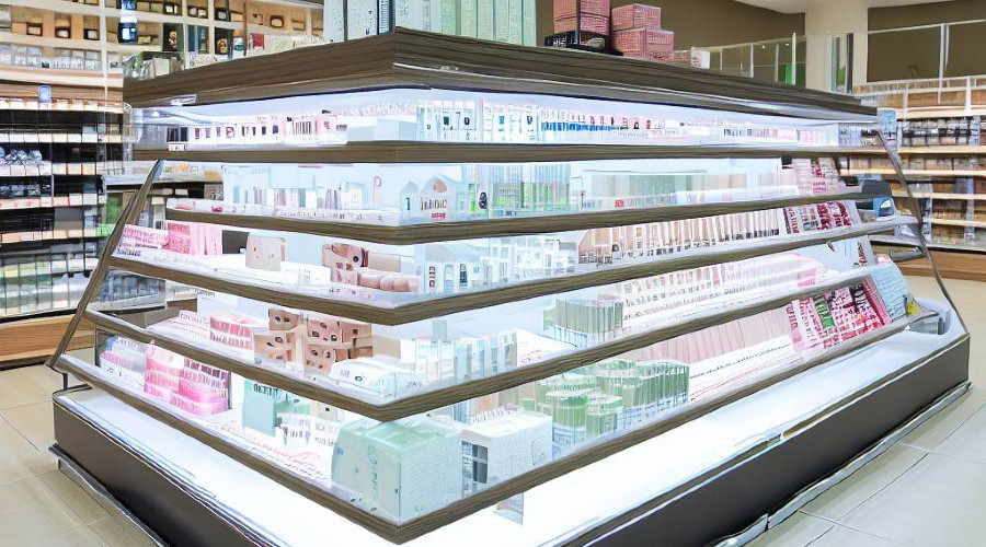
This technique involves dividing the gondola or retail space into specific ‘zones’. Each features a category or type of product. For example, in a health and beauty store, you might have a zone exclusively for skincare, another for makeup, and so on. It helps guide customers through the store. It makes their shopping journey more intuitive.

Block merchandising

This strategy groups products in ‘blocks’ on the gondola shelves. Similar products or brands are clustered together, giving the shopper a quick, at-a-glance comparison. It is beneficial for books, canned goods, or beauty products, where customers might want to review several similar items before choosing.

Vertical merchandising

Products are grouped vertically on a shelf instead of horizontally. It catches the customer’s eye as they look up and down, scanning various available products. It’s also an effective technique for directing focus to higher-margin products.

Pyramid display

It involves building a pyramid shape with products. The bulkier or foundation items are at the bottom and the more expensive or exclusive items are at the top. This visually appealing setup encourages customers to look at the entire range of products. Thereby increasing the likelihood of upselling.

Market basket analysis

This data-driven technique analyzes point-of-sale data to understand which items people frequently buy together. You can place such products close to each other to encourage additional sales. For example, if you find that people who purchase grilling meat also tend to buy charcoal, arranging these two products near each other makes sense.

Storytelling

This approach aims to create a narrative around the products. By carefully arranging items, you can guide the customer through a ‘story’ that ends with them making a purchase. For instance, placing hiking boots, socks, and trail mix together could tell the ‘story’ of an outdoor adventure.

Lifestyle merchandising

This method involves grouping products based on lifestyle choices or consumer habits. For example, in a grocery store, an organic foods section might include everything from organic vegetables to snacks and cleaning supplies, appealing to consumers who prefer organic products.

Cross-merchandising

It involves the strategic placement of products from different categories that are commonly used together. Think of placing wine glasses beside the wine section or grilling utensils beside the barbeque sauce and grills.

Understanding and implementing these product grouping techniques can go a long way in optimizing your gondola display. Each strategy has unique benefits and can be most effective in a well-planned layout. These techniques serve to not only enhance the aesthetic appeal of your store but also to facilitate the customer journey, ultimately leading to increased sales and improved customer satisfaction.

Technology and gondola displays

Incorporating technology into gondola displays adds a contemporary touch that can enrich the customer experience. Technology can provide dynamic flexibility and a wealth of information on the shelf, from digital price tags to interactive elements.

Digital price tags, for example, are convenient for real-time price updates and can display additional product information at a glance. Likewise, incorporating QR codes or interactive touch-screen panels on the gondola can engage customers by offering more detailed product specs, reviews, or tutorials. Cosmetic retail giant Sephora, for instance, integrates digital screens into its gondola display stands to provide customer reviews and video tutorials on makeup application.

Conclusion

The configuration of your gondola display stands should never be left to chance. It’s an intricate art form that demands a well-thought-out strategy backed by customer psychology, empirical data, and a comprehensive understanding of your merchandise. By optimizing end caps, maximizing vertical space, employing smart product groupings, and integrating technology, you can dramatically influence both sales and customer satisfaction.

Financing Advertising Displays

Financing Advertising Displays: A Guide to Loans and Options

This blog focuses on insights and strategies in advertising, merchandising, and brand awareness. Today, we’re taking a break from design trends and marketing strategies to discuss something equally vital – financing advertising displays.

High-quality advertising displays can make a powerful impact on customers but can also be a significant investment. Whether you’re a small business looking for an eye-catching window display or a large corporation planning a nationwide digital billboard campaign, understanding your financing options is essential. 

Let’s explore various loan options, discuss terms, interest rates, and more to find the right solution for your advertising needs.

Traditional bank loans

Traditional bank loans are a familiar option for a lot of businesses. These loans can be tailored to suit the specific needs of an advertising campaign.

Banks offer various business loans. They include secured and unsecured options, with various terms and interest rates. Approval and the specifics of the loan depend on factors like credit history, business profitability, and loan size.

● Interest Rates: Typically, interest rates for bank loans can range from 3% to 10% or more, depending on the loan’s type and duration.

● Loan Terms: The terms can vary from short-term loans (less than one year) to long-term loans extending to 10 years or more.

Example: A local retailer seeking to finance a new storefront display may approach their local bank for a small business loan, securing favorable terms based on their strong relationship and solid business performance.

Small business administration loans

For small businesses, SBA loans can be an attractive option for financing advertising displays.

The Small Business Administration offers various loan programs to help small businesses grow. These loans are often easier to qualify for and provide competitive terms.

● Interest rates: SBA loans offer interest rates typically ranging from 2.25% to 4.75% over the prime rate.

● Loan terms: The terms can range from 5 to 25 years, depending on the SBA program.

Example: A growing boutique looking to invest in a cutting-edge digital display may seek an SBA 7(a) loan, which offers long-term financing with competitive interest rates.

Alternative and online lenders

Online and alternative lenders provide additional financing options in today’s digital age.

Alternative lending platforms often offer a streamlined application process and faster funding. It can be particularly beneficial when financing a time-sensitive advertising campaign.

● Interest rates: In general, online lenders have higher interest rates, ranging from 7% to 30% or more.

● Loan terms: These loans usually have shorter terms, from 3 months to 5 years.

Example: An e-commerce business planning a pop-up display in a high-traffic area might choose an online lender like OnDeck or Kabbage for quick approval and funding.

Financing equipment

If your advertising display involves significant hardware, equipment financing could be an option. Equipment financing allows businesses to take out a loan specifically to purchase the equipment needed for their advertising display. The kit itself often serves as collateral for the loan.

● Interest rates: Rates for equipment financing typically range from 6% to 9%.

● Loan terms: In general, the loan term matches the equipment’s expected lifespan.

Example: A company planning to install an extensive LED billboard system might use equipment financing to fund the purchase, benefiting from tax incentives tied to equipment depreciation.

In conclusion

Financing advertising displays is not a one-size-fits-all scenario. The right solution depends on factors such as the nature of the display, the size of the investment, the financial health of your business, and your relationship with potential lenders.

By understanding the options detailed here, marketing professionals can take informed steps toward funding impactful advertising campaigns that align with their goals and budgets.