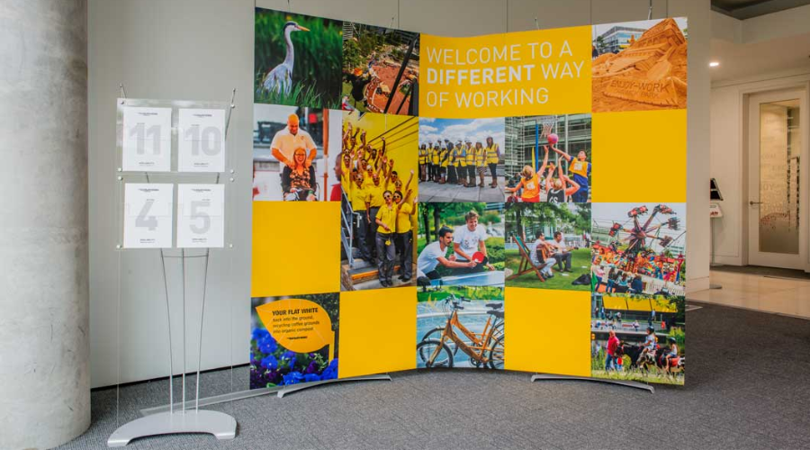
outdoor digital signage

Metrics of Digital Outdoor Advertising

Digital Out-of-Home (DOOH) advertising has opened up new possibilities for measuring the impact and effectiveness of outdoor advertising campaigns. However, understanding these metrics can be challenging, especially if you’re new to the digital advertising world.

In this article, we’ll demystify these metrics, explaining what they mean and why they’re important. And, of course, how you can use them to optimize your campaigns.

Impressions: potential eyes on your ads

Impressions represent the potential number of times your ad has been seen or the number of opportunities your ad had to be seen. In the context of DOOH, impressions refer to the estimated number of people who have passed by your ad.

An impression doesn’t guarantee that someone has looked at your ad, only that they had the opportunity to do so. For instance, if your digital billboard is in a location that gets 10,000 passersby per day, that’s 10,000 potential impressions. Impressions are a crucial starting point for understanding the potential reach of your outdoor advertising campaigns.

When analyzing impressions, consider the location and timing of your ad display. An ad placed in a city center during peak hours will likely generate more impressions than one in a quiet suburb. This understanding can guide you in selecting the most optimal locations and times for your ad displays.

Reach: the breadth of your campaign

Reach refers to the number of unique individuals who have potentially seen your ad over a specific period. Unlike impressions, reach aims to identify the total unique audience exposed to your ad.

Reach provides a broader understanding of your ad’s audience. An ad might generate millions of impressions. But, If it’s the same people passing by repeatedly, your reach may be much smaller.

Advertisers can increase their reach by diversifying their ad placements. For instance, placing ads on multiple billboards across a city, or varying the timing of when your ads are displayed, can help ensure that your ads are seen by a larger, more diverse audience.

Frequency: how often people see your ads

Frequency refers to the average number of times each individual within your reach has potentially seen your ad. It’s a measure of repetition, demonstrating how often your message is getting in front of the same eyes.

While impressions and reach give you an idea of the size of your audience, frequency tells you how often you’re connecting with that audience. A high frequency means your audience is seeing your message repeatedly, which can be helpful for brand recognition and recall.

High frequency isn’t always better. Overexposure to the same ad can lead to ad fatigue, causing people to either tune out your message or develop negative feelings toward your brand. Balance is key – you want your audience to see your message enough to remember it, but not so much that it becomes annoying.

Engagement: interactions with your ads

Engagement measures the level of interaction that consumers have with your ad. In DOOH, this could include a variety of actions. Such as scanning a QR code displayed on the ad, visiting a promoted website, or using a hashtag associated with the ad on social media.

Engagement measures show how your audience is actively responding to your message. High engagement indicates that your ad is not just being seen but is also compelling enough to inspire action.

Engagement can often be boosted by incorporating interactive elements into your ad. For instance, adding a QR code that leads to a landing page with more information or a special offer can encourage viewers to interact with your ad. Make sure to track these actions meticulously to accurately measure engagement.

Conversion rates: from viewers to customers

Conversion rate is the percentage of individuals who take a desired action after viewing your ad. This could include making a purchase, filling out a form, downloading an app, or any other action that aligns with the goal of your campaign.

Conversion rates provide insight into the effectiveness of your ad in driving specific consumer behaviors. A high conversion rate indicates that your ad is not only attracting attention but is also persuasive enough to influence consumer actions.

To track conversions from DOOH advertising, you might need to get a bit creative. For instance, you can use unique discount codes, dedicated landing pages, or campaign-specific hashtags to track the actions of consumers who have interacted with your outdoor ads. Make sure that the conversion aligns with your campaign goal – if your goal is to increase brand awareness, tracking downloads of a branded content piece could be an appropriate conversion.

Conclusion

Understanding the metrics of digital outdoor advertising is crucial for campaign optimization. Impressions, reach, frequency, engagement, and conversion rates each provide unique insights into the effectiveness of your ads. By carefully tracking these metrics and adjusting your strategy accordingly, you can increase the ROI of your outdoor advertising efforts and ensure your message is getting in front of the right people, at the right time, in the most impactful way.

If you want to learn more about outdoor advertising, check out these articles:

Maximizing the Effectiveness of Outdoor Menu Display Stands

Key Principles for Eye-Catching Design

Best Practices for Complying with Digital Signage Regulations

There you will find more information about outdoor advertising and creating an appealing design for your potential customers.

eye-catching design

Key Principles for Eye-Catching Design

Design is a crucial component in marketing. Well-designed marketing materials with eye-catching design can catch the attention of potential customers, build your brand identity, and engage customers effectively. Here are the key principles to consider when designing your marketing materials.

The importance of design in marketing

Every interaction a consumer has with your brand contributes to their overall impression of your business. That’s why design—encompassing everything from your logo to your website to your print materials—can make or break your marketing efforts.

Effective design can significantly improve engagement, drive conversions, and boost revenues. A report from Adobe titled “The Impact of Design on Business” found that companies that value design outperformed companies that do not by 219% over a decade. Therefore, investing in design is not merely an aesthetic decision—it’s a business one.

The basics of eye-catching design

There are several fundamental principles of design that serve as the building blocks of any successful marketing material. These principles, when applied effectively, can greatly increase the visual appeal and effectiveness of your campaigns.

Principles like balance (the distribution of visual weight in a design), contrast (the juxtaposition of different elements), emphasis (making one area of a design stand out), and rhythm (the repetition of elements) all play a part in creating engaging and visually appealing designs.

For instance, Apple’s minimalist aesthetic often features a balance of elements and a strong contrast between the product and the background, making the product stand out.

Color theory and its application in marketing design

Color can make a significant impact on a viewer’s perception and interpretation of a brand. Understanding and applying color theory in marketing design is therefore crucial for communicating your desired message and eliciting specific emotions from your audience.

Color theory is a framework that informs the use of color in art and design, aiming to create visual harmony and convey meaning. It is rooted in the color wheel, which is divided into primary colors (red, yellow, blue), secondary colors (green, orange, purple), and tertiary colors (mixes of primary and secondary colors).

Warm and cool colors

Colors are often grouped into warm (reds, yellows, oranges) and cool (blues, greens, purples) categories. Warm colors tend to evoke emotions ranging from feelings of warmth and comfort to feelings of anger and hostility. On the other hand, cool colors are often described as calming but can also call to mind feelings of sadness or indifference.

Color psychology in branding and marketing

Different colors can evoke different psychological responses. Let’s learn the role of different colors in eye-catching design.

For example:

Red is often associated with passion, excitement, and urgency, making it popular for clearance sales.

Blue symbolizes trust and stability, which are often used by financial institutions like banks.

Green is linked to nature and tranquility and is also associated with growth and health.

Yellow symbolizes happiness and optimism but can also signal caution.

The exact emotional responses can vary depending on culture, personal experiences, and context, so it’s crucial to know your audience.

Color combinations and schemes

Colors can be combined in various ways, guided by the color wheel:

Complementary colors are opposite each other on the color wheel (e.g., blue and orange). They create high contrast and are great for highlighting specific content.

Analogous colors are next to each other (e.g., yellow, yellow-green, and green), providing a harmonious look.

Monochromatic schemes use variations in lightness and saturation of a single color, offering a more subtle, elegant look.

Each color scheme can set a different mood and should be chosen based on the brand’s message and target audience.

Consistency and identity

Keeping a consistent color palette helps reinforce your brand identity across all marketing materials. This consistency makes your brand more recognizable and memorable. For example, Starbucks is closely associated with its distinctive green color, which symbolizes growth, freshness, and sustainability—values closely aligned with their brand.

To sum up, understanding color theory is a powerful tool in marketing design. By carefully choosing and combining colors, you can guide your audience’s emotional response and effectively convey your brand’s message.

Typography and its role in marketing design

Typography is a fundamental element of any design. It’s not just about making text legible—it’s about using typefaces strategically to set a mood, evoke emotions, and convey a message that resonates with your audience.

Understanding typography

Typography is the art of arranging a type to make it legible, readable, and visually appealing to the reader. It involves selecting typefaces, font sizes, line lengths, line-spacing (leading), letter-spacing (tracking), and adjusting the space within letter pairs (kerning).

The importance of typefaces

Typefaces significantly contribute to the viewer’s perception of a brand or a piece of content. Serif fonts (like Times New Roman), characterized by small lines or strokes attached to larger lines or strokes, tend to project a traditional, professional, or scholarly image. On the other hand, sans serif fonts (like Arial), without these embellishments, typically come across as modern, clean, and minimalist.

For instance, luxury brands like Tiffany & Co. often use serif typefaces to convey a sense of elegance and sophistication, while tech companies like Google and Facebook opt for simple sans serif fonts to reflect their modern and forward-thinking values.

Choosing and pairing fonts

The key to effective typography in marketing design is harmony and contrast. You want your fonts to complement each other without looking too similar. A common approach is to pair a serif font with a sans-serif font. This creates a clear contrast and hierarchy, allowing you to emphasize key points and make your content more digestible.

When choosing fonts, it’s also important to consider legibility, especially in smaller sizes or on different devices. Test your font choices in various contexts to ensure that they’re always easy to read.

Consistency and branding

Maintaining consistent typography across all your marketing materials helps establish a strong brand identity and makes your content more recognizable. A consistent typographic style, just like a consistent color palette, reinforces your brand personality and helps build trust with your audience.

For example, Coca-Cola’s iconic logo, written in the Spencerian script, is instantly recognizable and has remained consistent for over a century.

The impact of typography on user experience

Typography plays a key role in user experience. Good typography guides the reader’s eye across the page and makes the content more consumable and less overwhelming. Break up large blocks of text with headings, subheadings, bullet points, and quotes to facilitate readability.

In conclusion, typography is a powerful tool in marketing design. By understanding and skillfully applying the principles of typography, you can create designs that are not only visually appealing but also effectively communicate your brand’s message and values.

Effective use of images

In an increasingly visual world, images have become a cornerstone of effective marketing design. They can communicate complex messages quickly, evoke emotions, and significantly enhance the visual appeal of your materials.

Quality matters

The quality of the images you use in your marketing materials can reflect directly on your brand. High-resolution, professional-looking images project a sense of professionalism and credibility. On the other hand, low-quality or pixelated images can make your brand appear amateurish and unreliable.

Relevance is key

Images should be relevant to the content and should help convey your message. They should serve a purpose, whether it’s to illustrate a point, showcase a product, or set a mood. Irrelevant images can confuse the audience and detract from your message.

Using original images

Stock photos can be useful, but they’re not always the best option. Original, authentic images can make your brand stand out and show your brand’s unique personality. For example, if you’re a food business, professional photos of your actual dishes will be much more effective than generic stock photos.

Images and emotion

Images are powerful tools for evoking emotions. The right image can make your audience laugh, spark curiosity, or tug at their heartstrings. Emotional reactions can make your brand more memorable and help forge a deeper connection with your audience.

Consistency in style

Just like with color and typography, it’s important to maintain a consistent style with your images. This style could be related to the color palette, composition, subject matter, or editing style. A consistent image style helps reinforce your brand identity and makes your marketing materials more cohesive.

Use of infographics

When you need to present complex data or processes, infographics can be incredibly effective. They combine images with minimal text to explain, educate, and provide insights in an easily digestible format.

Balancing images with text

While images are important, they need to be balanced with the right amount of text. Too many images can be overwhelming and take away from the main message. Carefully consider the placement and size of your images to create a harmonious balance with your text.

Respecting copyrights

Always make sure to use images that you have the rights to. There are plenty of resources for free or paid images that can be used commercially. Always check the license and respect the work of photographers and designers.

In conclusion, effective use of images can significantly enhance the impact of your marketing materials. By carefully selecting and using images, you can create more engaging, visually appealing, and effective designs.

The power of visual hierarchy

Visual hierarchy is a powerful tool in design. It helps guide the viewer’s eye, prioritize information, and create a more enjoyable reading experience.

Visual hierarchy involves using design elements like size, color, contrast, and alignment to guide the viewer’s attention. For instance, the most important information is usually larger, bolder, or in a distinctive color. A classic example is a movie poster: the title is often the largest element, followed by the lead actors’ names and then the supporting details.

Consistency and brand identity

Brand consistency is the key to establishing a strong brand identity. Maintaining a consistent design across all marketing materials helps create a recognizable brand and builds trust with your audience.

Consistency in your marketing materials means more than just using the same logo. It extends to fonts, colors, image styles, tone of voice, and more. Coca-Cola, for instance, has maintained consistent branding for decades. Their distinctive red color, classic Spencerian script, and commitment to themes of happiness and sharing are instantly recognizable worldwide.

Understanding the target audience

The design does not exist in a vacuum—it must cater to the preferences and expectations of your target audience. Understanding who you’re designing for is a critical step in creating effective marketing materials.

Conducting audience research can help you understand your audience’s tastes and preferences. For example, younger audiences might appreciate bold, vibrant designs, while older audiences might prefer something more traditional and understated. Tailoring your design to your audience’s preferences can significantly improve engagement and conversions.

Importance of testing and iteration

Creating eye-catching designs for marketing materials isn’t a one-and-done process. It’s essential to test, iterate, and improve your designs based on feedback and performance.

A/B testing can be particularly useful in understanding what design elements work best for your audience. You might test different color schemes, images, or typography to see what generates the best response. As you gather data from your tests, you can continuously refine your designs to better suit your audience and achieve your marketing goals.

In conclusion, understanding and applying these key design principles can significantly enhance your marketing materials’ effectiveness. By focusing on basics like color theory, typography, visual hierarchy, and audience understanding, you can create designs that catch the eye, resonate with your audience, and reinforce your brand identity.

Incorporating motion into your design

The digital world is no longer static, and neither should your designs be. With the increasing prevalence of digital marketing, incorporating motion into your design can be a powerful way to attract and retain attention.

Motion can take many forms, from GIFs to animations to full-blown video content. When used properly, motion can tell a story, guide the user’s attention, and add a layer of interactivity to your marketing materials. Spotify, for example, often uses simple animations in its app and promotional materials to create engaging and dynamic user experiences.

Future of marketing design: augmented reality (AR) and virtual reality (VR)

As technology advances, so do the possibilities for marketing design. Emerging technologies like AR and VR are opening up new frontiers for immersive, interactive marketing experiences.

AR and VR can provide customers with unforgettable, immersive experiences that not only grab attention but also create deeper connections with your brand. Brands like IKEA and Sephora have already successfully integrated AR into their marketing, allowing customers to visualize furniture in their homes or try on makeup virtually. While these technologies might not be accessible to all businesses now, they’re a fascinating glimpse into the future of marketing design.

Conclusion

Creating eye-catching designs for marketing materials is a multifaceted process that involves understanding your audience, adhering to fundamental design principles, staying consistent with your brand identity, and keeping abreast of the latest trends and technologies. With careful attention to these factors, you can create marketing materials that don’t just catch the eye but also engage, inform, and inspire your audience. Keep iterating, keep testing, and, most importantly, keep your audience at the heart of all your design decisions.

If you found this blog helpful, make sure to check out this article – How to design eye-catching vendor display stands, for more in-depth information, with real examples about marketing your materials. In case you want more information about furniture placement, design, and advertisement, you might want to check our website for more blogs like this and future articles.


wooden easel stand in eco-friendly environment

The Role of Wooden Easel Stands in Eco-friendly Marketing

In an era where sustainability is increasingly important, many businesses are exploring eco-friendly approaches to their operations, including their advertising strategies. Wooden easel stands, made from renewable and biodegradable material, provide an effective and environmentally-friendly solution for displaying marketing materials. 

This article will explore the eco-friendly aspects of them and how they can enhance a brand’s image and demonstrate environmental responsibility.

The sustainability aspect

A shift towards environmentally conscious materials can significantly impact a brand’s public perception and sustainability credentials. Let’s discuss how using wooden easel stands fits into this narrative.

They are inherently eco-friendly due to the nature of their primary material. Wood is a renewable resource, meaning it can be replenished over time, unlike synthetic materials that can take hundreds of years to decompose. Moreover, when sourced responsibly, wood can contribute to sustainable forest management.

Employing wooden easel stands for marketing displays sends a clear message about a brand’s commitment to the environment. For example, a brand showcasing its products on wooden easel stands at a trade show not only creates an aesthetic appeal but also conveys a clear stance on sustainability.

The positive reflection on brand image

How can eco-friendly materials such as wooden easel stand positively affect a brand’s image?

In an era of conscious consumerism, businesses find that their environmental stance can significantly impact customer perception and loyalty. By choosing wooden easel stands for their marketing displays, brands signal a commitment to environmental stewardship. Which can enhance their image and appeal to consumers who value sustainability.

Additionally, they are not only environmentally friendly but also visually appealing. The natural, timeless aesthetic of wood can lend a unique, authentic touch to marketing displays, setting a brand apart from competitors.

Sourcing sustainable wooden easel stands

While opting for wooden easels is an eco-friendly choice, it’s essential to ensure that these stands are sourced sustainably.

Look for suppliers that adhere to responsible forestry practices. This often means that the wood is sourced from forests that are sustainably managed. Certifications like the Forest Stewardship Council (FSC) certification can help identify such suppliers.

Additionally, consider the life cycle of the easel stands. Opt for stands that are durable and can be reused for multiple events. This not only extends the life of the stand but also reduces waste.

Conclusion

In conclusion, using wooden easel stands for marketing displays offers a practical and visually appealing way for brands to demonstrate their commitment to sustainability. By selecting sustainable suppliers and considering the stands’ life cycle, brands can further enhance their eco-friendly practices and foster a positive brand image. As more consumers become environmentally conscious, such practices can contribute significantly to a brand’s success and reputation.

brochure display stands

Harnessing Brochure Stands to Boost Your Corporate Narrative

Storytelling is an integral part of effective communication. This rings true even in the corporate world. Brochure display stands provide an excellent platform for companies to weave a compelling narrative about their history, mission, and values. This article explores strategies to use brochure stands to enhance your corporate narrative visually and contextually.

Structuring content for a compelling narrative

A well-structured corporate narrative goes beyond presenting a sequence of events—it tells a story that engages, informs, and inspires. Begin by highlighting your company’s inception and the inspiration behind it. This creates a solid foundation for your narrative.

Then, detail significant milestones and achievements, emphasizing how they contribute to your company’s growth and mission. Also, present your company’s values and how they drive your actions and decisions. Companies like Nike effectively use this approach, telling a compelling story of their humble beginnings, growth, and commitment to innovation and sustainability.

Incorporating design elements for visual appeal

The design of your brochures significantly influences their effectiveness in communicating your corporate narrative. You can create a visually appealing narrative that complements your content by integrating thoughtful design elements.

Utilize colors that resonate with your brand image. For instance, if your company prioritizes sustainability, hues of green can symbolize this commitment. The use of imagery is also crucial—photographs from different eras of your company’s journey can bring your narrative to life. Furthermore, you can also use eco-friendly materials for brochure stands.

Incorporate graphs or infographics to represent your growth and achievements in a digestible format. Airbnb, for example, uses thoughtful design elements in their brochures to showcase its journey and unique home-sharing concept.

Case studies: successful corporate narratives through brochure stands

Several companies have successfully used brochure display stands to boost their corporate narrative. 

Let’s take a look at a couple of examples:

Apple: Known for its compelling narrative, Apple’s brochures feature their journey from a garage start-up to a tech giant. They showcase their innovation timeline, focusing on landmark products and patents. The design reflects their minimalist aesthetic, creating a visually consistent narrative.

Starbucks: Starbucks uses brochure stands to tell their story of transforming a single Seattle store into an international coffeehouse chain. Their brochures highlight their commitment to sourcing ethical coffee and creating a third place between work and home. With earthy tones and warm images, the design aligns perfectly with their narrative.

Patagonia: Renowned for its environmental activism, Patagonia uses brochure stands to communicate their commitment to sustainability. They tell a story of their efforts towards responsible manufacturing, promoting fair trade, and encouraging customers to repair and recycle their products. The brochures are designed using earthy tones, further emphasizing their environmental ethos.

Tesla: Tesla’s brochures stand out by narrating the story of their mission to accelerate the world’s transition to sustainable energy. They showcase their journey of innovation, from their initial electric Roadster to their advanced autonomous vehicles. The sleek, futuristic design of their brochures mirrors the innovation they stand for.

More examples

Unilever: This multinational consumer goods company uses brochure stands to share their story of commitment to sustainable living. They highlight key initiatives, such as improving health and well-being, reducing environmental impact, and enhancing livelihoods. The design is clear and informative, reflecting their message of transparency and responsibility.

Ben & Jerry’s: Known for their social activism as much as their ice cream, Ben & Jerry’s uses brochure stands to share their mission of creating a business that respects and supports all its stakeholders. They discuss their efforts in areas like climate justice, democracy, and equality, engagingly presented with vibrant colors and whimsical designs.

Lego: Lego’s brochures narrate the story of their journey from a small carpenter’s workshop to a global enterprise. They focus on their mission of inspiring and developing the builders of tomorrow. The brochures, full of bright colors and playful imagery, reflect the creative and fun spirit of the Lego brand.

These examples demonstrate that whether a company sells outdoor clothing, ice cream, or building blocks, a compelling corporate narrative presented through well-designed brochure stands can enhance brand identity, engage stakeholders, and foster a deeper connection with the brand.

Brochure stand impact on the corporate narrative

Brochure display stands can significantly impact how your corporate narrative is perceived and engaged with by various stakeholders.

Through an engaging narrative, customers can connect with your brand on a deeper level, employees feel part of something larger, and potential partners better understand your journey and values. Further, these stands can remind you daily of your company’s purpose and vision. A company like Microsoft, for instance, uses brochures to consistently remind stakeholders of their mission to empower every person and organization on the planet to achieve more.

Conclusion

Brochure display stands can be an effective tool for enhancing your corporate narrative. By carefully structuring your content and incorporating thoughtful design elements, you can create a compelling, visually appealing narrative that resonates with your stakeholders. Remember, every company has a unique story—brochure stands offer a creative platform to tell yours.

If you’re interested in buying one, we’re here to help! We’ve prepared a list of places to buy a brochure display stand. From online marketplaces to manufacturers, these options offer a wide range of styles, designs, and materials to suit any need.

retail shelving in a store

Maximizing Supermarket Sales with Strategic Retail Shelving

The success of any supermarket relies not only on the variety of products available but also on how these products are presented. Strategic retail shelving plays a significant role in influencing purchasing behavior and shopping experience.

In this article, we will delve into how to understand the psychology of consumer behavior. The strategic use of shelf height and effective product grouping for optimizing your supermarket sales.

Understanding the psychology of consumer behavior

To strategically position products on retail shelves, it’s crucial to comprehend the psychology of consumer behavior. The placement of goods can subtly influence shoppers’ decisions, steering them towards purchasing more items or choosing higher-value products.

A fundamental principle to consider is the ‘decoy effect’. It is when retailers place higher-priced items next to moderately priced items. This makes the latter seem more attractive and reasonable. Similarly, you can encourage impulse buying by placing small, lower-priced items near the checkout counters.

Understanding customers’ shopping patterns also plays a role. For instance, most customers tend to move counterclockwise around stores. Placing high-demand or high-profit items at the right of the entrance can increase their visibility and, in turn, their sales.

The importance of shelf height

The height at which products are placed on supermarket shelves can significantly impact their visibility and sales. Generally, products placed at eye level tend to sell the most as they are directly in the line of sight of customers.

High-profit items or best sellers are typically placed at eye level. While cheaper or lesser-known brands are positioned on lower or higher shelves. Furthermore, you should place children’s products at a lower height to be within their eye level. Understanding and utilizing these strategies can help maximize product visibility and sales.

The effect of product grouping and pairing

Product grouping and pairing is another strategic element of retail shelving. This involves arranging products that people often buy together in close proximity. For instance, placing pasta sauce next to pasta, or chips near soda, can encourage customers to purchase both items.

Thematic grouping is another effective strategy. You should group products based on themes like holiday items, back-to-school supplies, or summer essentials. This not only makes shopping more convenient for customers but can also inspire additional purchases.

Implementing planogram for efficient shelving

A planogram, often referred to as a POG, is a tool in the retail industry to visually map out and direct where and in what quantity products should be displayed. The term may be new to some, but the concept behind it is almost as old as retail itself. Organizing and optimizing retail shelf space is crucial for maximizing sales and ensuring a smooth and enjoyable shopping experience for customers.

What is a Planogram?

Essentially, a planogram is a detailed diagram or model that illustrates the placement of retail products on shelves with the aim to increase customer purchases. Its design can vary from a simple sketch to sophisticated 3D renderings, depending on the complexity and needs of the store.

Planograms go beyond just aesthetics. They create them with strategic objectives in mind. Such as optimizing the use of shelf space, boosting sales, improving inventory management, minimizing stockouts or overstocks, and enhancing customer satisfaction. These diagrams take into account the correlation between product placements and consumer buying behavior.

Recommendations for Implementing an Efficient Planogram

Implementing a planogram requires careful thought, precision, and continuous refinement. Here are some key considerations when designing a planogram:

Understand Your Customers: Knowing your customers’ preferences, habits, and behaviors is fundamental. Use data from sales history, customer feedback, and market research to inform your decisions on product placement.

Product Hierarchies: Implement vertical and horizontal merchandising techniques. Vertically, place best-selling products at eye level, whereas, horizontally, place complementary products side-by-side to encourage additional purchases.

Space Utilization: Not all products are equal. Some products may sell better, have higher margins, or be more popular than others. These products should be allocated more space.

Accessibility and Visibility: Ensure that all products are easy to see and reach. It is frustrating for customers if they struggle to find or physically reach the products they are looking for.

Consistency: Try to maintain consistency in your product placements. Constantly changing the layout can confuse regular customers and negatively impact their shopping experience.

Seasonality: Keep in mind the time of the year and adjust your planogram accordingly. Feature seasonal items or promotions in high traffic areas.

Testing and Refining: Continuously monitor and measure the performance of your planogram. Don’t be afraid to make adjustments based on the insights you gain.

Train Your Staff: Once you have created your planogram, make sure to train your staff to understand it and know how to implement it correctly. Your planogram is only as effective as the staff that executes it.

By following these recommendations, your planogram will not only serve as a strategic guide for product placement but will also serve as an essential tool for maintaining organized, efficient, and effective inventory management. With an efficient planogram, you’re well on your way to maximizing your sales and enhancing your customers’ shopping experience.

Conclusion

Strategic retail shelving is a nuanced and critical aspect of boosting supermarket sales. Supermarkets can significantly enhance their sales by understanding and implementing the psychology of consumer behavior. Optimizing the use of shelf height and employing effective product grouping.

Incorporating these principles into a well-structured planogram can further optimize these strategies, ensuring consistency and balance across all shelves. With these strategies in place, supermarkets can significantly enhance their customer experience and bottom line.

If you are interested in maximizing sales in your store, make sure to check out these articles:

Leveraging Point of Sale Merchandising to Increase Profits

Key Principles for Eye-Catching Design

There you will find information about furniture placement, design, and advantages in your store, that you can use to your benefit.

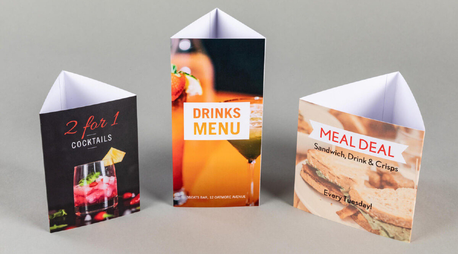
table talkers

Innovative Ideas for Using Table Talkers in Cafe

Table talkers, those mini billboards on your cafe tables, offer many possibilities beyond simply showcasing your menu or daily specials. With some creativity, these marketing tools can be used to engage customers, promote events, share testimonials, and more. 

Promoting events and special offerings

One creative use of table talkers is to promote upcoming events or unique offerings in your cafe. This could be a live music night, a special themed menu, a charity event, or a coffee-tasting session.

The table talker is an immediate and intimate channel to communicate these activities to your customers. When designed with eye-catching visuals and compelling text, it can generate interest and excitement among your patrons. It can encourage them to participate. On this page – Design Eye-Catching Vendor Display Stands- you will learn more about compelling designs you can use in your cafe to place and display table talkers.

Showcasing customer testimonials

Positive reviews and testimonials can be powerful marketing tool. Consider dedicating some of your table talkers to feature real customer testimonials. Not only does this strategy highlight the quality of your offerings, but it also builds trust and credibility.

For added authenticity, consider including the customer’s name (with their permission) and their picture. Testimonials that praise a specific menu item can be particularly effective, enticing other customers to try it.

Highlighting fun facts about your cafe

A table talker can also serve as an educational tool. Use it to highlight fun or interesting facts about your cafe. This could be the history of your cafe, information about the origin of your coffee beans. Even a brief explanation of the coffee brewing process would be suitable.

Fun facts provide a talking point for customers, enrich their visit with an educational aspect, and enhance their overall experience. The more a customer feels connected and knowledgeable about your cafe, the more likely they will return.

Introducing your team

Consider using table talkers to introduce your cafe’s team members to your customers. Sharing short bios or fun facts about your baristas or chefs can create a more personal and engaging environment. This approach builds a connection between your staff and customers, fostering a sense of community and improving customer loyalty.

Engaging customers with interactive content

Take your table talker strategy to the next level by incorporating interactive content. It could be a QR code that links to a survey for customer feedback. It could also be a mini-game. Or, for example, a quiz with a chance to win a free coffee or even a ‘did you know?’ fact section about coffee that changes regularly.

Interactive table talkers can create a memorable experience for your customers. They encourage them to engage more deeply with your cafe and return for more.

Conclusion

Table talkers present many opportunities to connect with customers, promote offerings, and create a unique cafe experience. These innovative ideas go beyond traditional advertising. They help your cafe to stand out from the competition and build a loyal customer base. Don’t underestimate the power of these mini billboards. With some creativity, they can be a game-changer for your cafe’s marketing strategy.

If you want to find more innovative and creative ideas about placing and displaying your table talkers, check out this article – Creative Possibilities with Digital Signage. There you will find more about ways to boost sales through unique furniture displaying and placing in your store.

Maximize Your Brand’s Impact with Roll-Up Banner Stands

In a crowded marketplace, standing out is essential for making a lasting brand impression. Roll-up banner stands are a cost-effective, versatile, and highly impactful marketing tool that can significantly enhance your brand recognition.

Understanding tool power, visual marketing psychology, and effective banner design can boost your brand’s visibility and appeal.

The psychology of visual marketing

It’s important to understand the overarching principles that make them effective: the fundamentals of visual marketing.

Humans are inherently visual creatures. Studies have shown that the brain processes images 60,000 times faster than text. Besides 90% of the information transmitted to the brain is visual. In marketing, this means that visual elements can convey your brand’s message quickly and effectively. Roll-up banners leverage this principle by serving as large, eye-catching displays that immediately draw attention and convey your brand’s message.

Moreover, due to the mere exposure effect — a psychological phenomenon where people develop a preference for things merely because they are familiar with them. Consistent visual branding on roll-up banners enhances brand recognition and preference. To learn more about brand recognition, check out this article – Immersive Brand Experience with Showroom Display Stands.

Harnessing the power of roll-up banners

Roll-up banners are a testament to the old saying, “Location, location, location.” Their power lies in their ability to put your brand right in the line of sight of potential customers.

Whether used at trade shows, conferences, product launches, or in retail spaces, roll-up banners can serve as “silent salespeople” that promote your brand to all passersby. They can draw attention, engage the audience, and increase footfall to your location, all while reinforcing your brand identity. Portable and easy to set up, roll-up banners allow flexible placement for maximum impact at each venue.

Key components of a roll-up banner design

While all roll-up banners have the potential to be impactful, the design can make or break their effectiveness. High-quality images, powerful taglines, and consistent company branding are critical.

High-quality images: The images used on your banner should be not only visually appealing but also high-resolution. This ensures that your banner looks professional and attracts attention even from a distance. Images that are related to your product or service, and resonate with your target audience, can create a connection and enhance recall of your brand.

Powerful taglines: A tagline or headline on your banner should be short, sharp, and memorable. It should convey your brand’s unique value proposition and induce curiosity or interest. Clever use of action words can inspire people to seek more information about your brand.

Consistent company branding: Consistent use of your company’s logo, color scheme, and typography across all marketing materials, including roll-up banners, helps reinforce your brand identity. This creates a cohesive brand experience that can drive brand recognition and loyalty.

Successful roll-up banner design examples

Successful roll-up banner designs come in all shapes and sizes. But they all have a few things in common. They attract attention, convey a clear message, and promote brand recognition.

One example is the roll-up banners used by tech giant Apple for their product launches. Known for their minimalist aesthetic, Apple’s banners often feature a high-resolution product image. Additionally, they have a short and catchy tagline, and their unmistakable logo. This simple yet effective design not only draws attention but also reinforces Apple’s brand identity. It represents them as a provider of sleek, cutting-edge technology.

Another example is Coca-Cola’s roll-up banners. Consistently incorporating their distinctive red-and-white color scheme, unique typography, and logo, these banners are instantly recognizable, even from a distance. Consistently using these brand elements has made Coca-Cola one of the world’s most recognized brands.

In a completely different sector, the World Wildlife Fund (WWF) also uses roll-up banners effectively for their campaigns. Famous for their impactful imagery and compelling taglines, these banners not only draw attention but also evoke an emotional response. It is crucial for their cause-related marketing.

Conclusion

In conclusion, roll-up banner stands are a powerful marketing tool that can significantly enhance your brand recognition when used effectively. Understanding the psychology of visual marketing, location importance, and effective banner design are crucial for harnessing these tools’ power.

A well-designed roll-up banner can attract attention, convey a clear message, and promote brand recognition. All of which are key to maximizing your brand’s impact.

We hope you find this section of the blog interesting and useful. If you have any other ideas or have a specific need that you would like to see covered in an article on advertising, please let us know. We appreciate engaged and enthusiastic readers.